Tree tree display
Effect demonstration
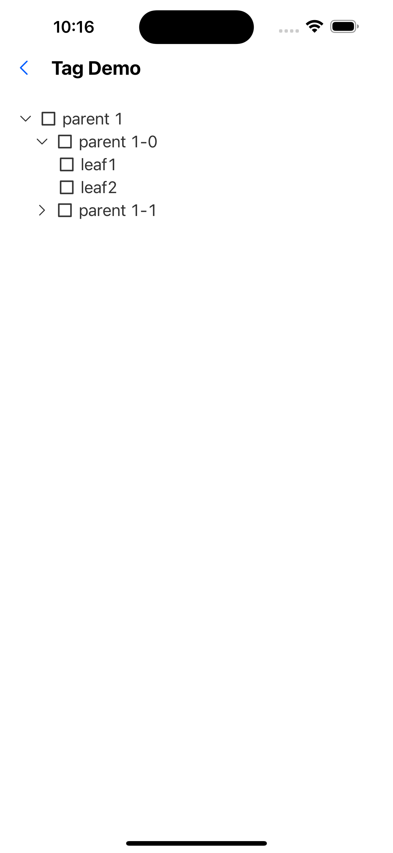
1. Default effect
const treeData = [
  {
    text: "parent 1",
    id: "0-0",
    items: [
      {
        text: "parent 1-0",
        id: "0-0-0",
        items: [
          {
            text: "leaf1",
            id: "0-0-0-0",
          },
          {
            text: "leaf2",
            id: "0-0-0-1",
          },
        ],
      },
      {
        text: "parent 1-1",
        id: "0-0-1",
        items: [{ text: "sss", id: "0-0-1-0" }],
      },
    ],
  },
];

<Tree treeData={treeData} />;

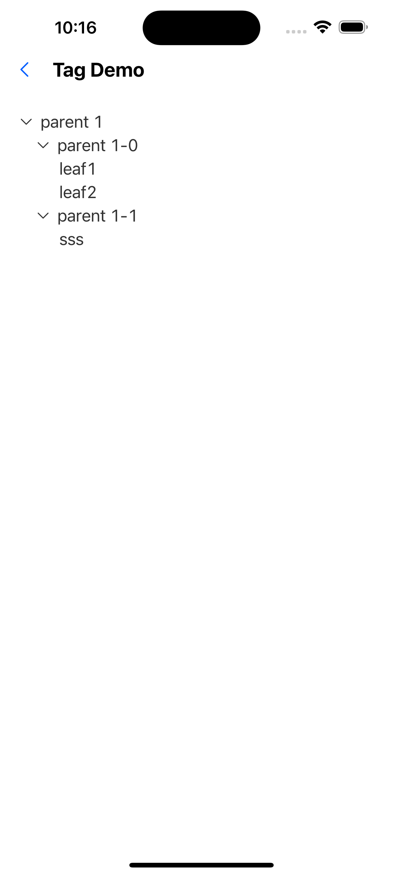
2. Expand all by default
const treeData = [
  {
    text: "parent 1",
    id: "0-0",
    items: [
      {
        text: "parent 1-0",
        id: "0-0-0",
        items: [
          {
            text: "leaf1",
            id: "0-0-0-0",
          },
          {
            text: "leaf2",
            id: "0-0-0-1",
          },
        ],
      },
      {
        text: "parent 1-1",
        id: "0-0-1",
        items: [{ text: "sss", id: "0-0-1-0" }],
      },
    ],
  },
];

<Tree treeData={treeData} expandAll />;
3. No selection allowed
const treeData = [
  {
    text: "parent 1",
    id: "0-0",
    items: [
      {
        text: "parent 1-0",
        id: "0-0-0",
        items: [
          {
            text: "leaf1",
            id: "0-0-0-0",
          },
          {
            text: "leaf2",
            id: "0-0-0-1",
          },
        ],
      },
      {
        text: "parent 1-1",
        id: "0-0-1",
        items: [{ text: "sss", id: "0-0-1-0" }],
      },
    ],
  },
];

<Tree treeData={treeData} checkable={false} />;
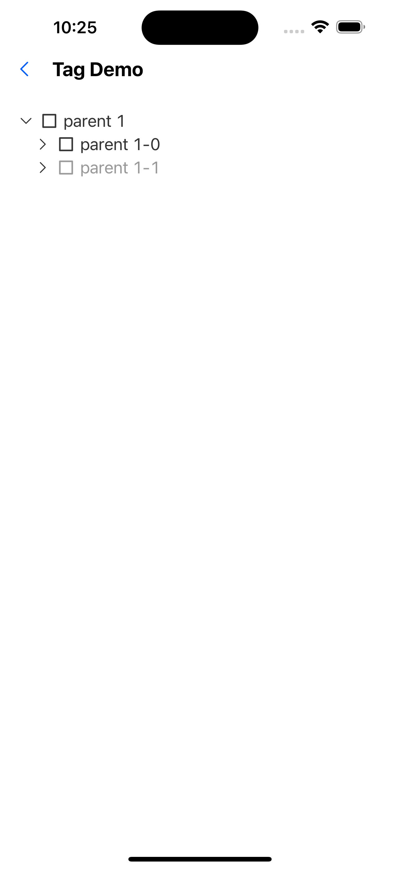
4. Expand certain nodes by default
const treeData = [
  {
    text: "parent 1",
    id: "0-0",
    items: [
      {
        text: "parent 1-0",
        id: "0-0-0",
        items: [
          {
            text: "leaf1",
            id: "0-0-0-0",
          },
          {
            text: "leaf2",
            id: "0-0-0-1",
          },
        ],
      },
      {
        text: "parent 1-1",
        id: "0-0-1",
        items: [{ text: "sss", id: "0-0-1-0" }],
      },
    ],
  },
];
<Tree treeData={treeData} defaultExpandedKeys={["0-0"]} />;
5. Select some nodes by default
const treeData = [
  {
    text: "parent 1",
    id: "0-0",
    items: [
      {
        text: "parent 1-0",
        id: "0-0-0",
        items: [
          {
            text: "leaf1",
            id: "0-0-0-0",
          },
          {
            text: "leaf2",
            id: "0-0-0-1",
          },
        ],
      },
      {
        text: "parent 1-1",
        id: "0-0-1",
        items: [{ text: "sss", id: "0-0-1-0" }],
      },
    ],
  },
];

<Tree treeData={treeData} defaultCheckedKeys={["0-0-0-1"]} />;

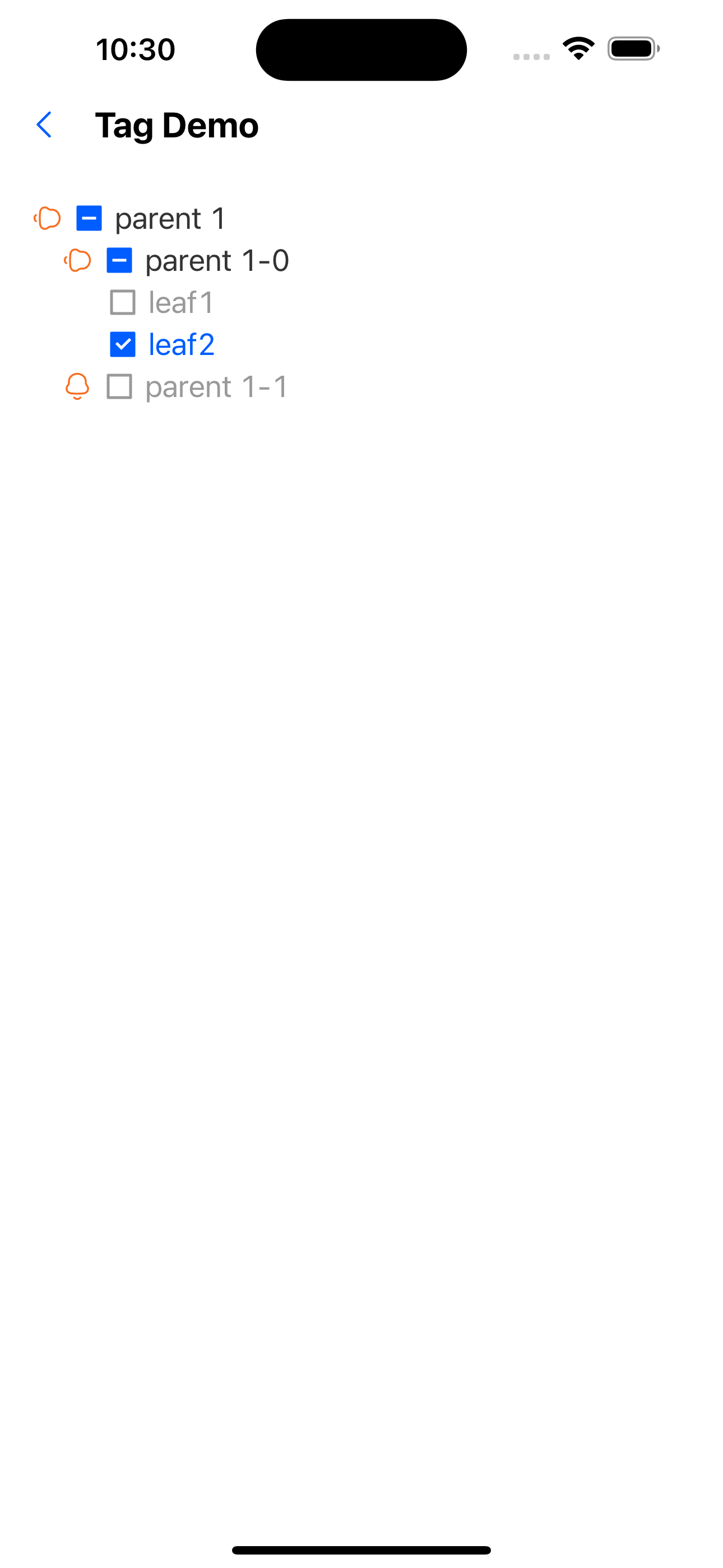
6. Disable some nodes
const treeData = [
  {
    text: "parent 1",
    id: "0-0",
    items: [
      {
        text: "parent 1-0",
        id: "0-0-0",
        items: [
          {
            text: "leaf1",
            id: "0-0-0-0",
            disabled: true,
          },
          {
            text: "leaf2",
            id: "0-0-0-1",
          },
        ],
      },
      {
        text: "parent 1-1",
        id: "0-0-1",
        disabled: true,
        items: [{ text: "sss", id: "0-0-1-0" }],
      },
    ],
  },
];

<Tree treeData={treeData} expandAll />;

7. Custom expand icon
const CustomExpandIcon: FC<{ progress: Animated.SharedValue<number> }> = ({
  progress,
}) => {
  const theme = useTheme<AppTheme>();
  const style = useAnimatedStyle(() => ({
    transform: [{ rotateZ: `${mix(progress.value, 0, Math.PI / 2)}rad` }],
  }));

  return (
    <Animated.View style={style}>
      <SvgIcon name="bells" color={theme.colors.warningColor} />
    </Animated.View>
  );
};

const treeData = [
  {
    text: "parent 1",
    id: "0-0",
    items: [
      {
        text: "parent 1-0",
        id: "0-0-0",
        items: [
          {
            text: "leaf1",
            id: "0-0-0-0",
          },
          {
            text: "leaf2",
            id: "0-0-0-1",
          },
        ],
      },
      {
        text: "parent 1-1",
        id: "0-0-1",
        items: [{ text: "sss", id: "0-0-1-0" }],
      },
    ],
  },
];
<Tree
  treeData={treeData}
  customExpandIcon={(progress) => <CustomExpandIcon {...{ progress }} />}
/>;
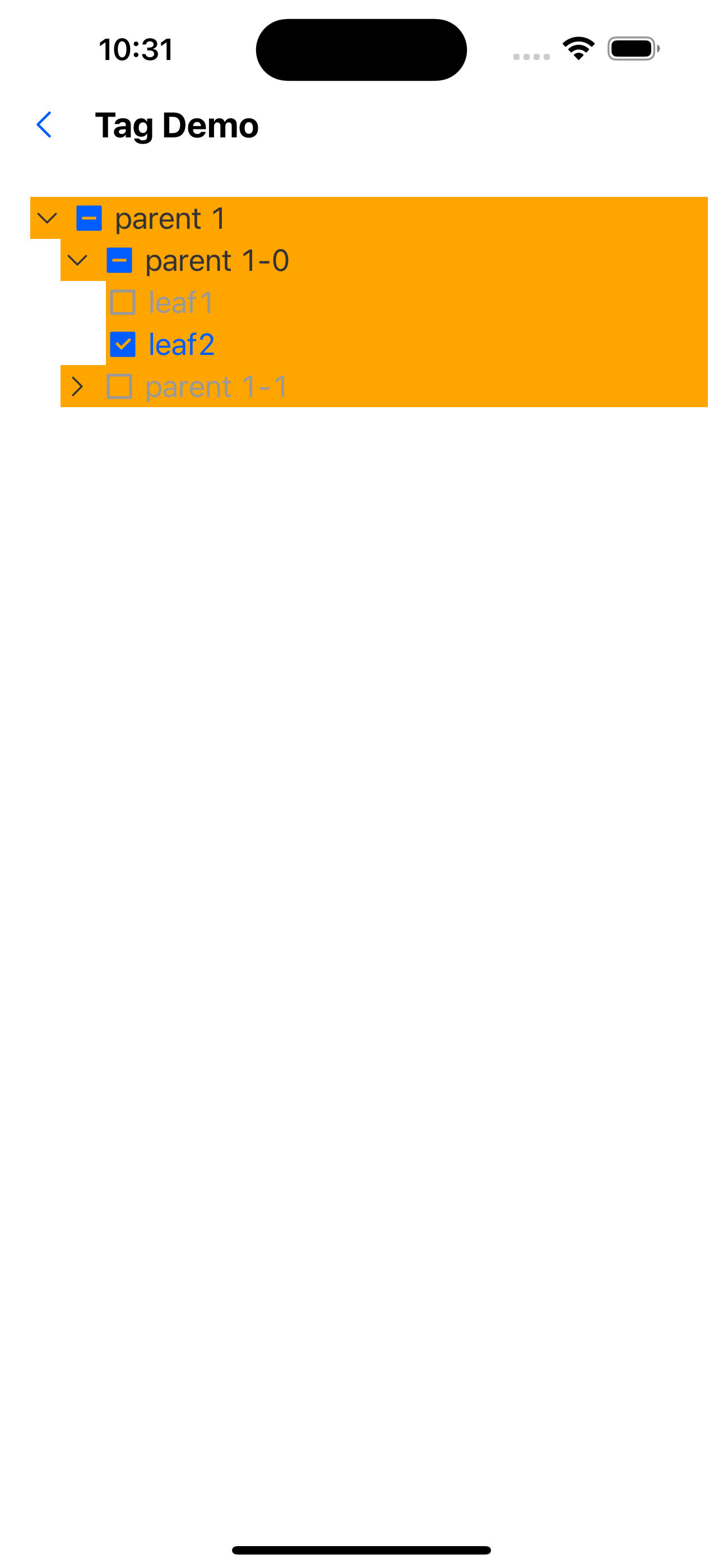
8. Custom node style
const treeData = [
  {
    text: "parent 1",
    id: "0-0",
    items: [
      {
        text: "parent 1-0",
        id: "0-0-0",
        items: [
          {
            text: "leaf1",
            id: "0-0-0-0",
            style: { backgroundColor: "red" },
            textStyle: { color: "white" },
          },
          {
            text: "leaf2",
            id: "0-0-0-1",
          },
        ],
      },
      {
        text: "parent 1-1",
        id: "0-0-1",
        items: [{ text: "sss", id: "0-0-1-0" }],
      },
    ],
  },
];
<Tree treeData={treeData} nodeStyle={{ backgroundColor: "orange" }} />;
API
TreeProps
| Properties | Required | Description | Type | Default Value |
|---|---|---|---|---|
| data | true | Tree node data | TreeItemProps[] | |
| checkable | false | Whether it can be selected | boolean | true |
| checkedKeys | false | selected node (controlled) | string[] | |
| defaultCheckedKeys | false | The key selected by default is valid when loaded for the first time | string[] | |
| expandAll | false | Expand all | boolean | false |
| defaultExpandedKeys | false | Default expanded nodes | string[] | |
| expandedKeys | false | expanded node | string[] | |
| onCheck | false | Selected event callback | (keys: string[]) => void | |
| onExpand | false | Expand event callback | (keys: string[]) => void | |
| customExpandIcon | false | Custom expansion icon | (progress: Animated.SharedValue<number>) => ReactElement | |
| activeOpacity | false | The opacity of the tree node when clicked | number | 0.6 |
| style | false | tree style | StyleProp<ViewStyle> | |
| nodeStyle | false | Tree node style | StyleProp<ViewStyle> |
TreeItemProps
| Properties | Required | Description | Type | Default Value |
|---|---|---|---|---|
| id | true | Unique identifier of the node | number | |
| text | true | node text | string | |
| items | false | child nodes | TreeItemProps[] | |
| disabled | false | Whether to disable | number | false |
| onPress | false | Callback for clicking a tree node | (id: string) => void | |
| customCheckIcon | false | Custom check icon | (checked: 'all' | 'half' | 'none') => ReactElement | |
| style | false | Node style | StyleProp<ViewStyle> | |
| textStyle | false | Node text style | StyleProp<TextStyle> |