Badge logo component
Effect demonstration
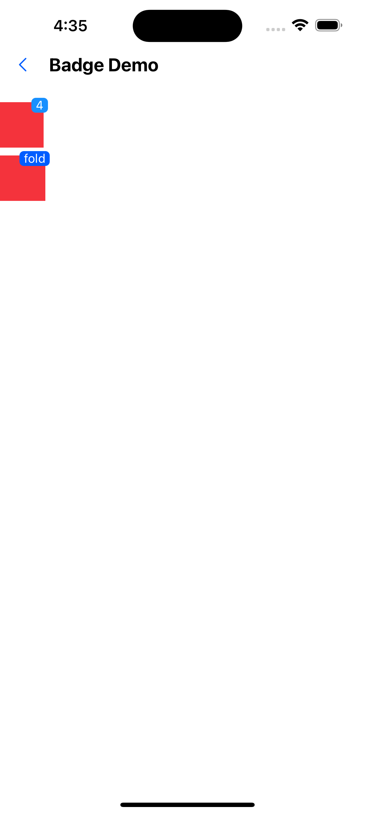
1. Type defaults to text.
<Badge text={4}>
  <Box width={50} height={52} backgroundColor="warningColor2" />
</Badge>
<WhiteSpace />
<Badge text="fold" backgroundColor="primaryTextColor">
  <Box backgroundColor="warningColor2" width={52} height={52} />
</Badge>
<WhiteSpace />
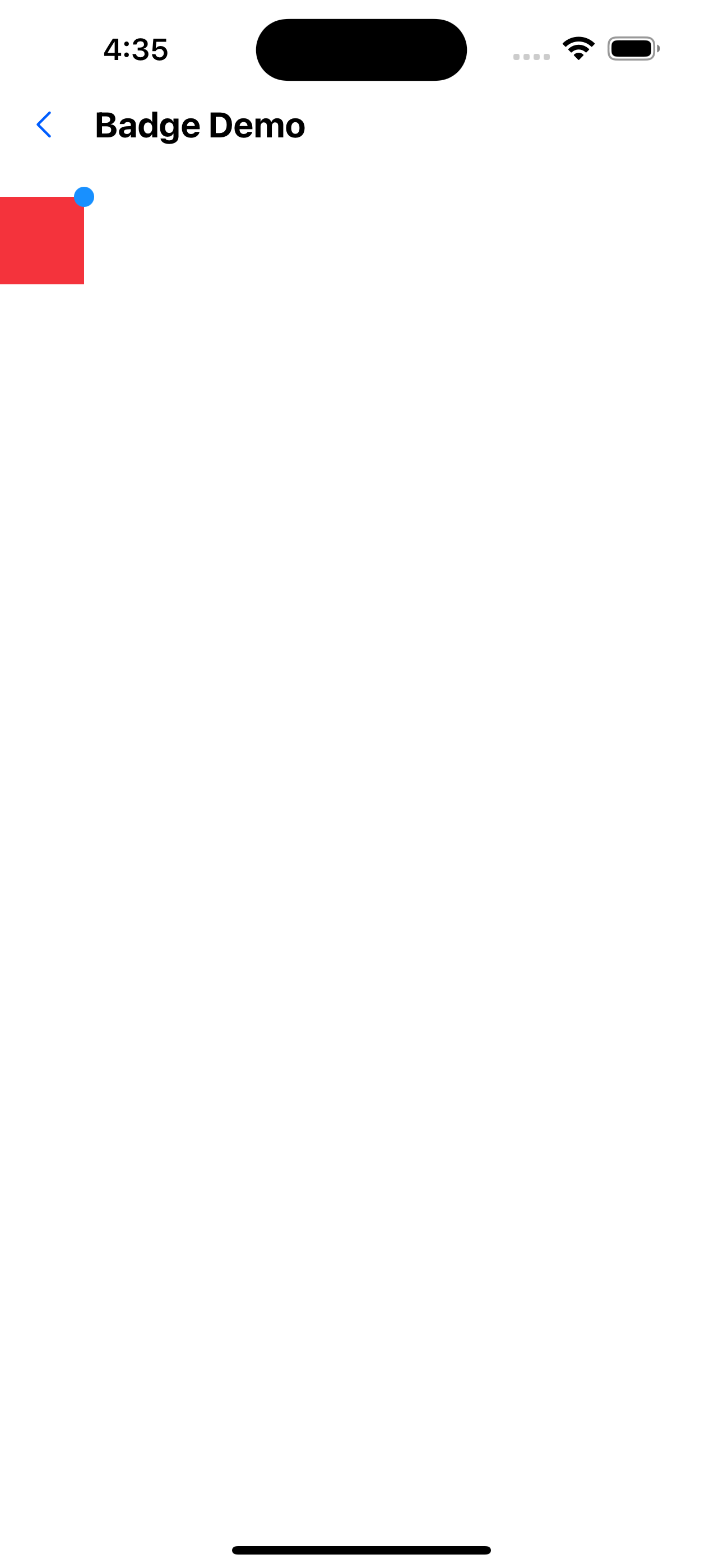
2. type for dot
<Badge text={4} type="dot">
  <Box width={50} height={52} backgroundColor="warningColor2" />
</Badge>
API
| Properties | Required | Description | Type | Default Value |
|---|---|---|---|---|
| type | false | form of badge | dot | text | text |
| text | false | content of badge | string | number | |
| max | false | Display the capped value | number | 99 |
| containerStyle | false | The style of the badge's container | ViewStyle | |
| textStyle | false | badge Chinese text style | ViewStyle |