ListItem list display item component
Effect demonstration
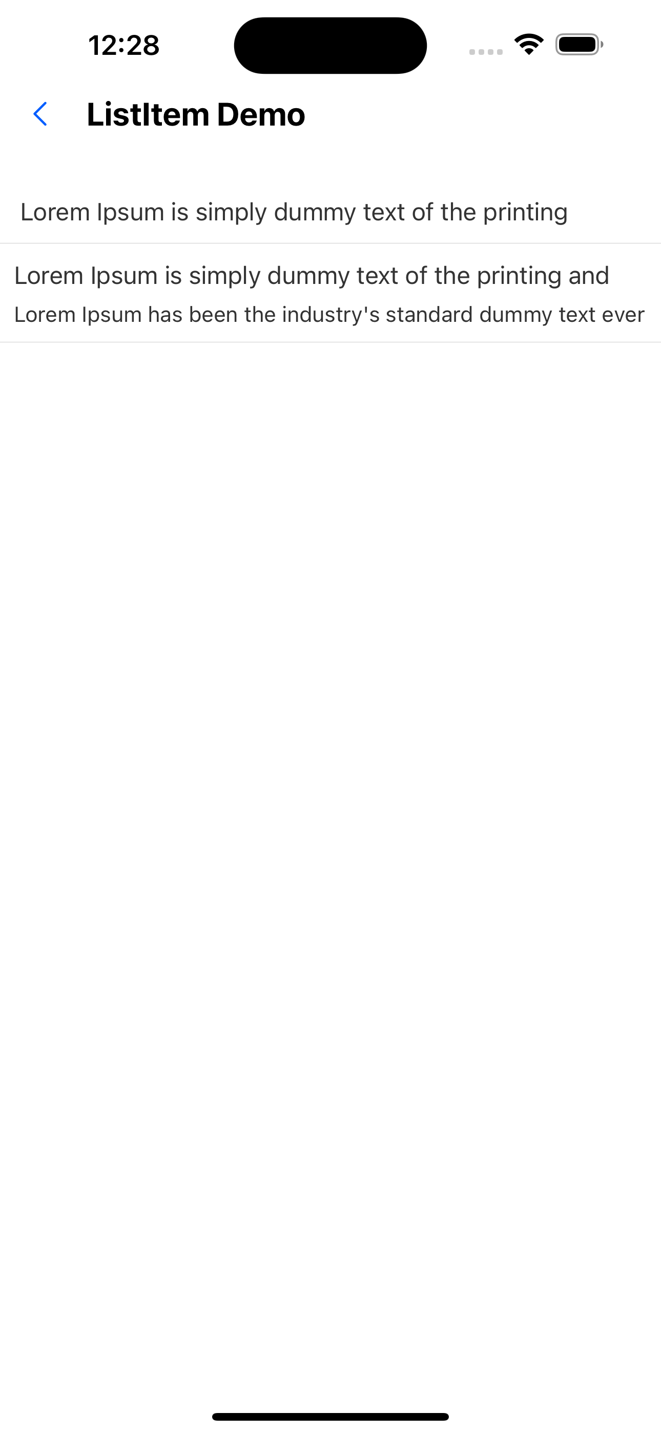
1. Default effect
<ListItem
  title=" Lorem Ipsum is simply dummy text of the printing and typesetting industry.main title main title main title main title main title main title"
  onPress={() => { console.log(111)}}
/>
<ListItem
  title="Lorem Ipsum is simply dummy text of the printing and typesetting industry."
  brief="Lorem Ipsum has been the industry's standard dummy text ever since the
    1500s, when an unknown printer took a galley of type and scrambled it to
    make a type specimen book."
/>
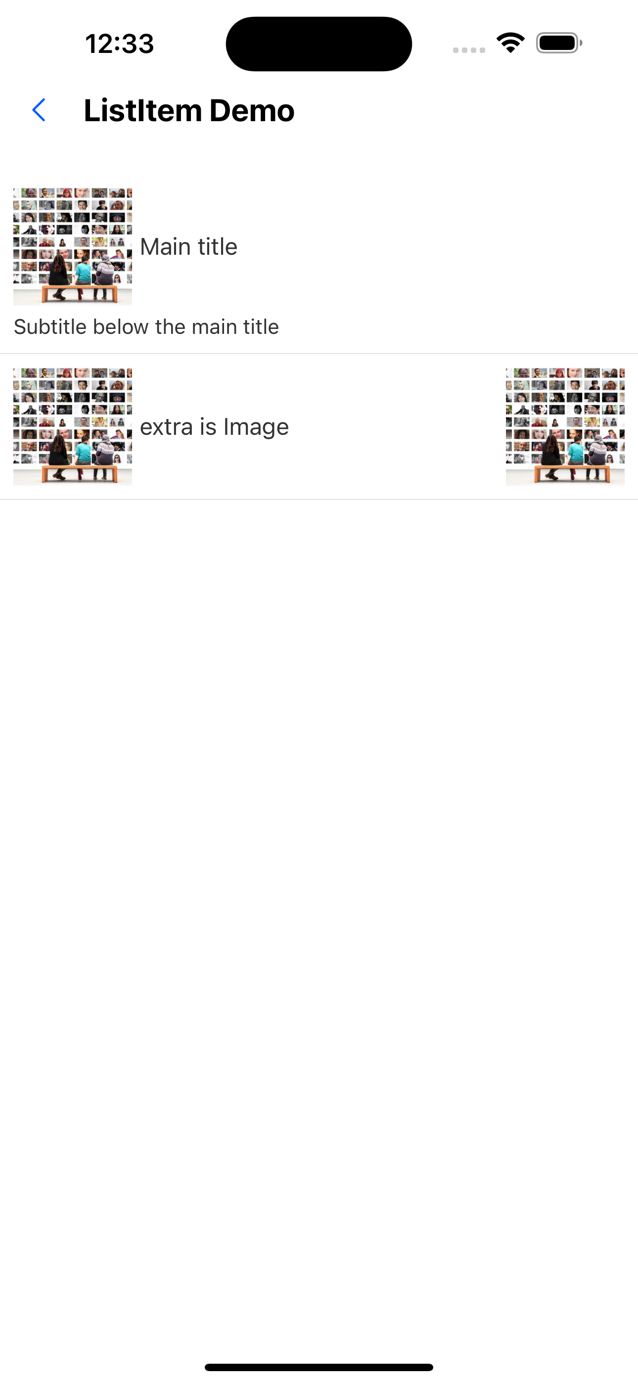
2. Add thumbnails on the left and image effects on the right
<ListItem
  title="Main title"
  brief="Subtitle below the main title"
  thumb={<Image source={imgUrl} style={{width: 80, height: 80}}/>}
/>
<ListItem
  title="extra is Image"
  thumb={<Image source={imgUrl} style={{width: 80, height: 80}}/>}
  extra={<Image source={imgUrl} style={{width: 80, height: 80}} />}
/>
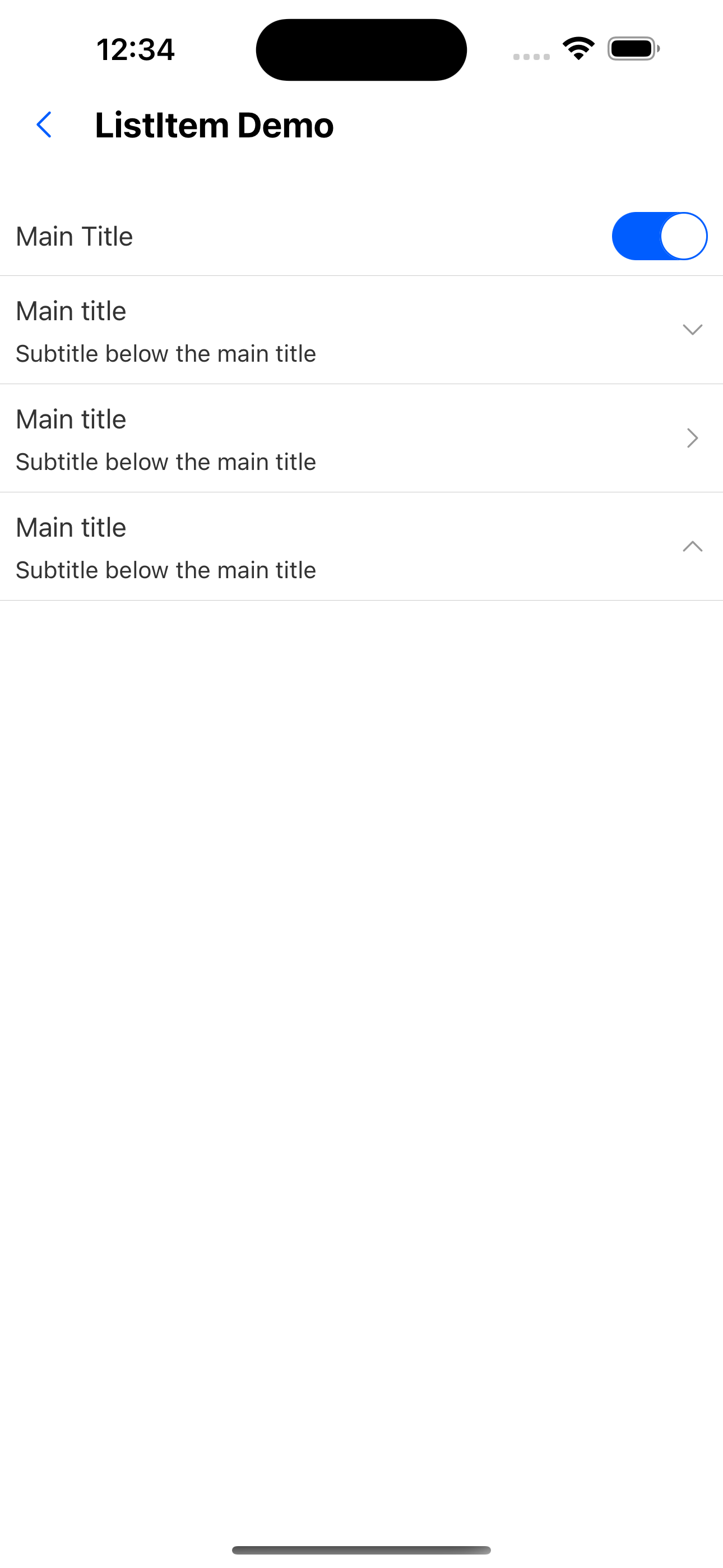
3. Customize the right component and specify the arrow direction effect
<ListItem title="Main Title" extra={<Switch />} />
<ListItem title="Main title" brief="Subtitle below the main title" arrow="down" />
<ListItem title="Main title" brief="Subtitle below the main title" arrow="horizontal" />
<ListItem title="Main title" brief="Subtitle below the main title" arrow="up" />
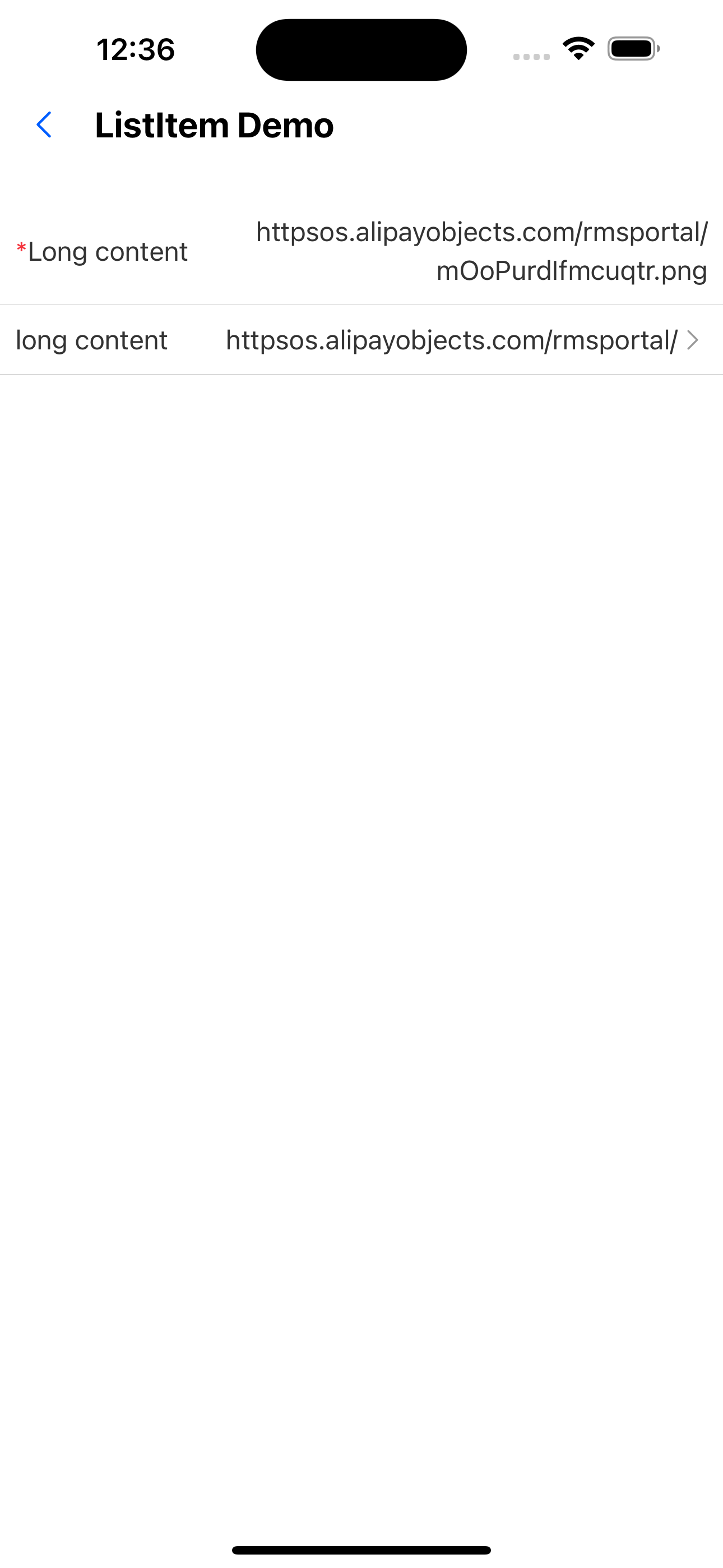
4. The effect of wrapping text on the right and omitting too long text, and adding the required effect
<ListItem title="Long content" wrap extra="httpsos.alipayobjects.com/rmsportal/mOoPurdIfmcuqtr.png" required />
<ListItem title="long content" extra="httpsos.alipayobjects.com/rmsportal/mOoPurdIfmcuqtr.png" arrow="horizontal" />
API
| Properties | Required | Description | Type | Default Value |
|---|---|---|---|---|
| title | true | Main title | ReactNode | |
| brief | false | Subtitle below the main title | ReactNode | |
| extra | false | The text or component on the right | ReactNode | |
| thumb | false | thumbnail | ReactNode | |
| onPress | false | Pressed callback function | () => void | |
| minHeight | false | Minimum height | number | |
| style | false | Custom style | ViewStyle | |
| required | false | Whether it is required, a red *sign will be displayed if required | boolean | false |
| wrap | false | Whether to wrap lines | boolean | false |
| arrow | false | The right arrow indicates the direction | horizontal | down | up | ReactNode | |
| activeOpacity | false | Opacity when pressed Ï | number | 0.6 |
| backgroundColor | false | List item background color | theme color |