Avatar
#Avatar avatar component
Effect demonstration
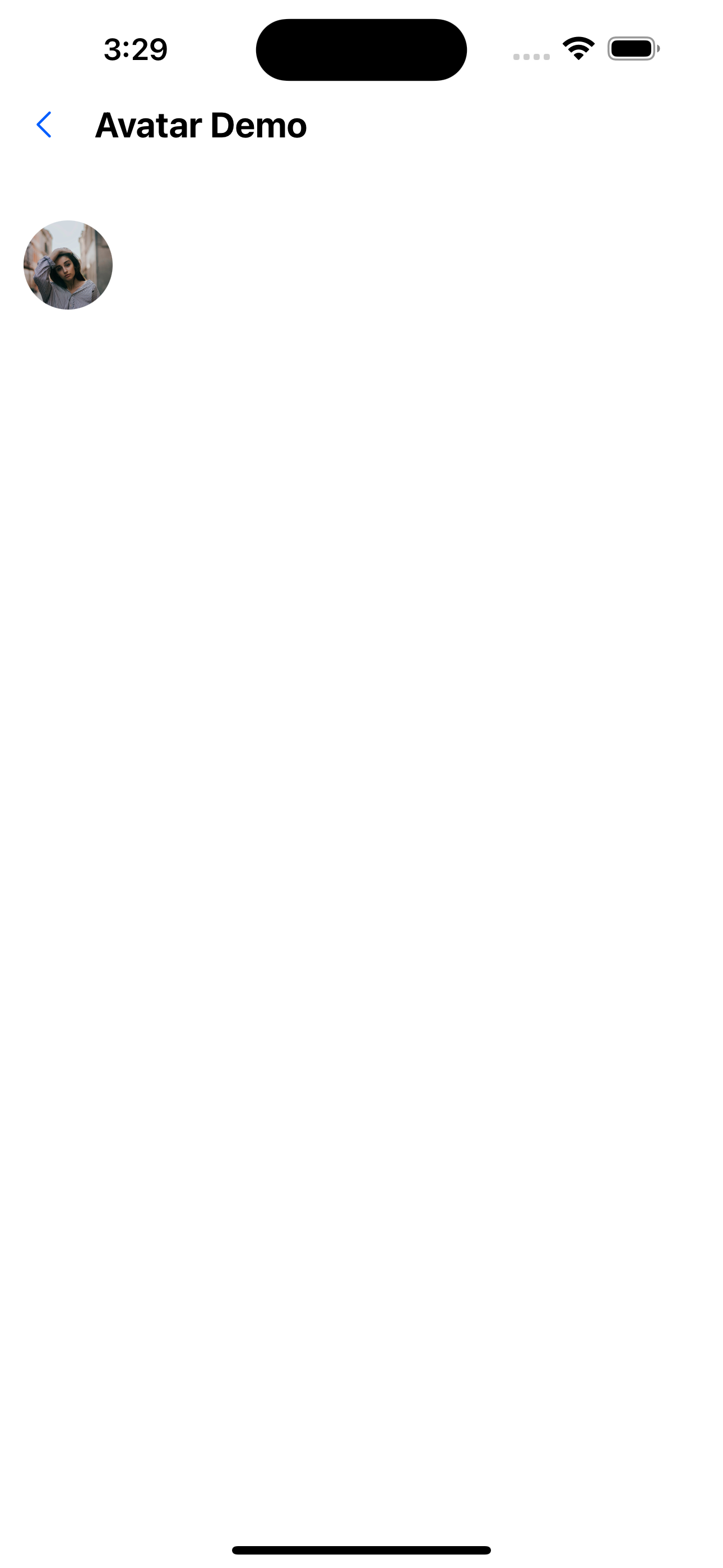
1. Default avatar
<Avatar url="https://images.pexels.com/photos/1702238/pexels-photo-1702238.jpeg?auto=compress&cs=tinysrgb&dpr=1&w=1000" />
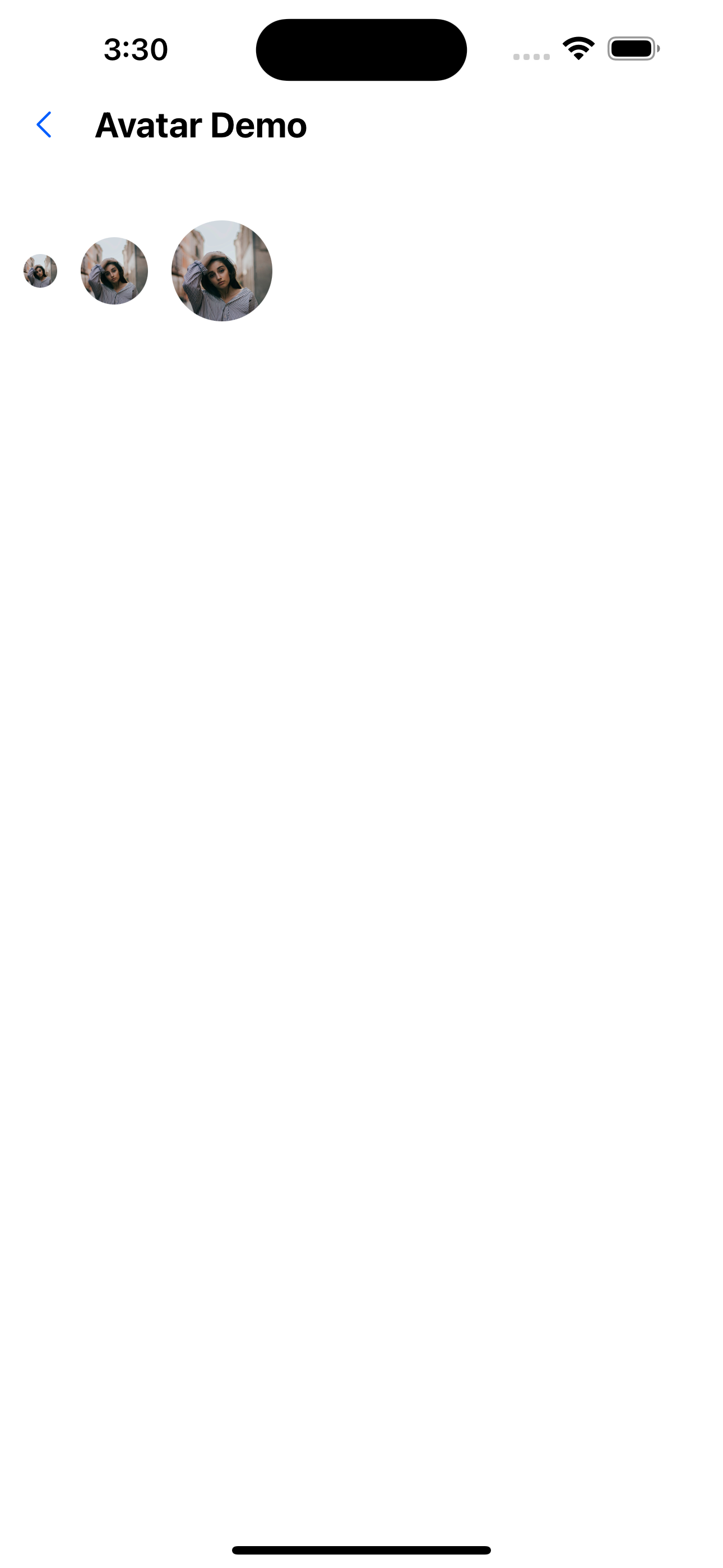
2. Avatar size
 <Avatar
    size={20}
    url="https://images.pexels.com/photos/1702238/pexels-photo-1702238.jpeg?auto=compress&cs=tinysrgb&dpr=1&w=1000"
  />
  <Avatar
    size={40}
    url="https://images.pexels.com/photos/1702238/pexels-photo-1702238.jpeg?auto=compress&cs=tinysrgb&dpr=1&w=1000"
  />
  <Avatar
    size={60}
    url="https://images.pexels.com/photos/1702238/pexels-photo-1702238.jpeg?auto=compress&cs=tinysrgb&dpr=1&w=1000"
  />
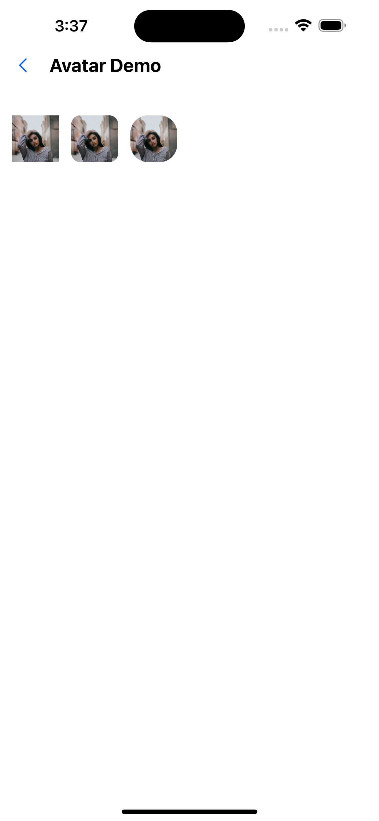
3. Avatar curvature
 <Avatar
    circular={false}
    url="https://images.pexels.com/photos/1702238/pexels-photo-1702238.jpeg?auto=compress&cs=tinysrgb&dpr=1&w=1000"
  />
  <Avatar
    borderRadius={10}
    circular={false}
url="https://images.pexels.com/photos/1702238/pexels-photo-1702238.jpeg?auto=compress&cs=tinysrgb&dpr=1&w=1000"
  />
  <Avatar
    borderRadius={20}
    circular={false}
    url="https://images.pexels.com/photos/1702238/pexels-photo-1702238.jpeg?auto=compress&cs=tinysrgb&dpr=1&w=1000"
  />
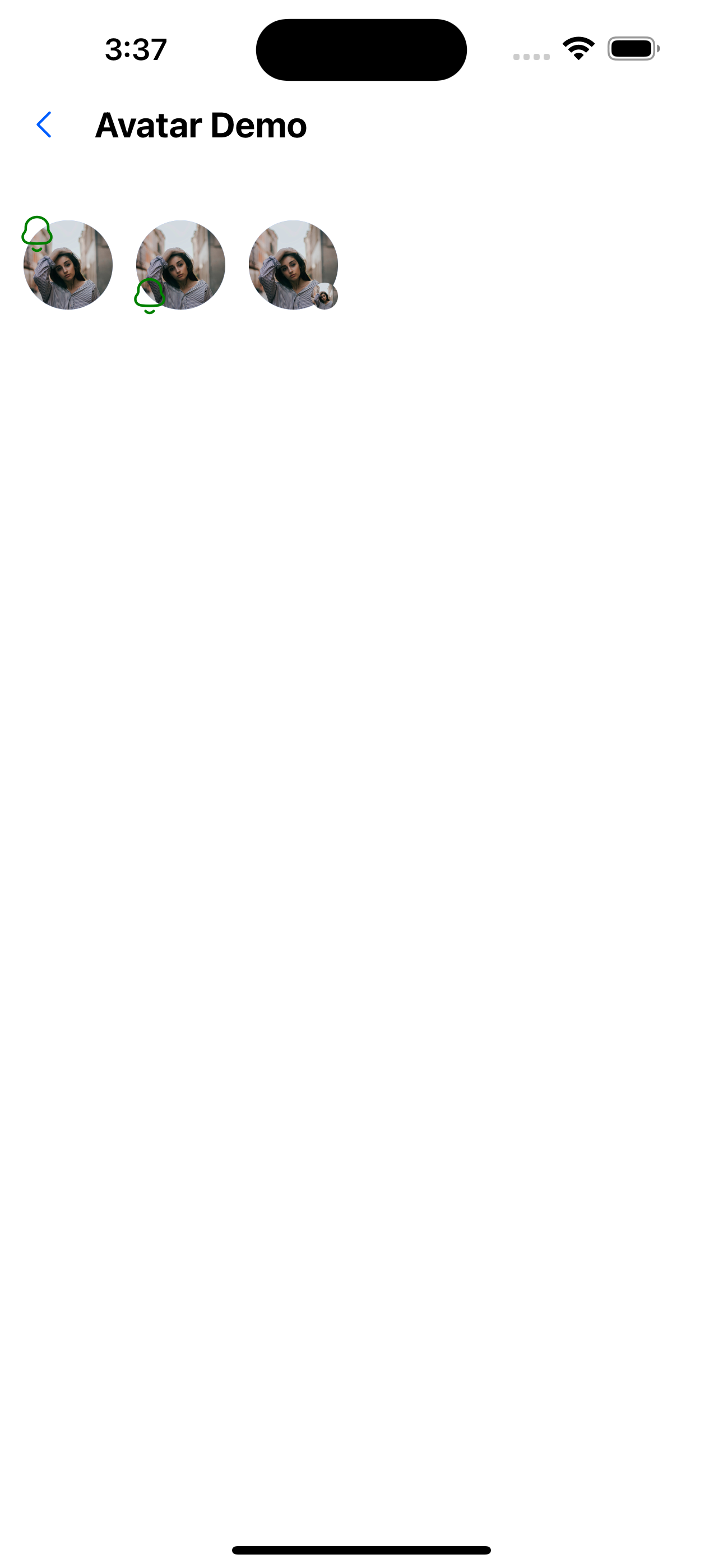
4. Avatar pendant
//Custom pendant is located at the top
<Avatar url="https://images.pexels.com/photos/1702238/pexels-photo-1702238.jpeg?auto=compress&cs=tinysrgb&dpr=1&w=1000">
  <Avatar.Accessory
    component={<SvgIcon name="bells" color="green" size={24} />}
    top={true}
    left={true}
  />
</Avatar>
//Custom pendant position is on the upper left
<Avatar url="https://images.pexels.com/photos/1702238/pexels-photo-1702238.jpeg?auto=compress& cs=tinysrgb&dpr=1&w=1000">
  <Avatar.Accessory
    component={<SvgIcon name="bells" color="green" size={24} />}
    left={true}
  />
</Avatar>
//Custom image
<Avatar url="https://images.pexels.com/photos/1702238/pexels-photo-1702238.jpeg?auto=compress&cs=tinysrgb&dpr=1&w=1000">
  <Avatar.Accessory url="https://images.pexels.com/photos/1702238/pexels-photo-1702238.jpeg?auto=compress&cs=tinysrgb&dpr=1&w=1000" />
</Avatar>
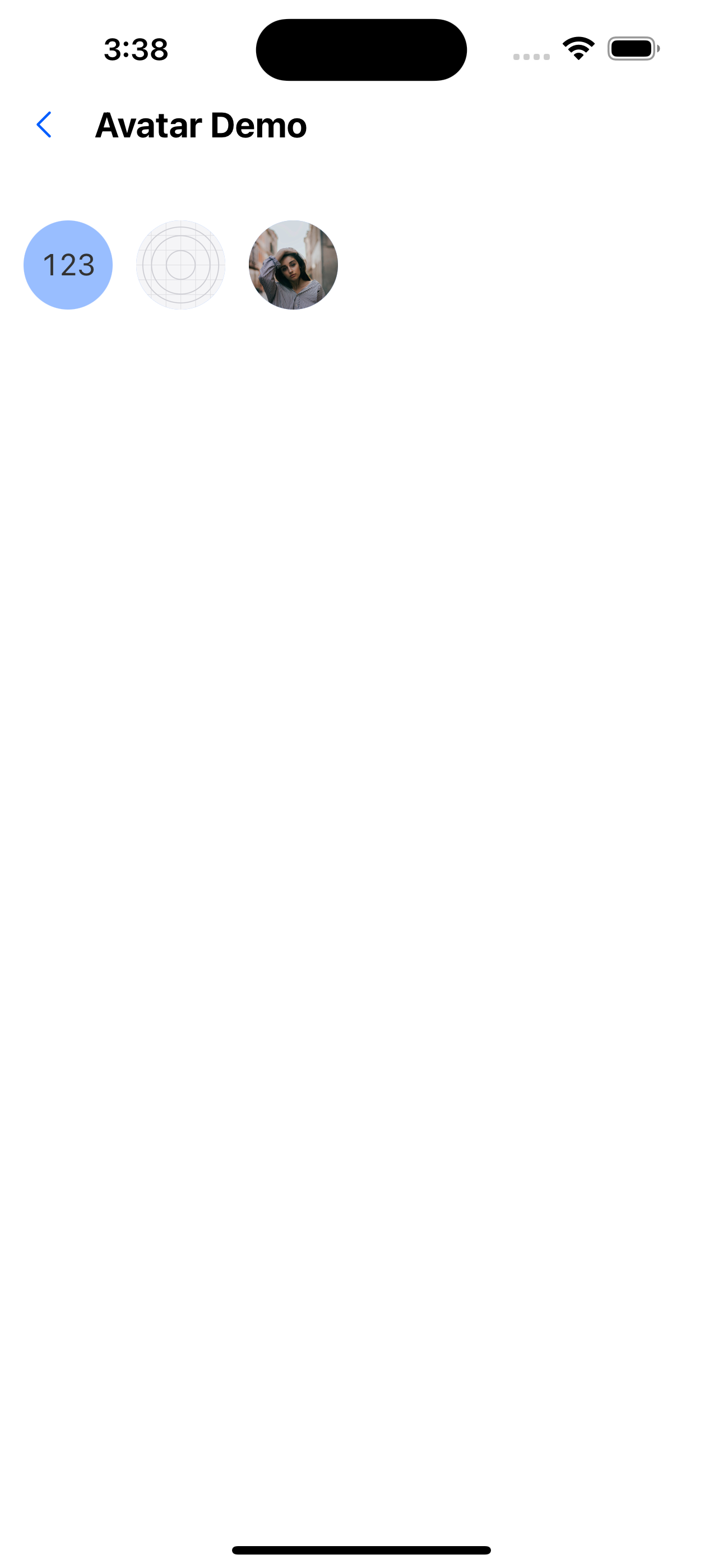
5. Avatar content
//Custom content: use text
<Avatar title="123" />
//Custom content: use images
<Avatar url={require('../../../assets/images/icon.png')} />
//Custom content: use images
<Avatar url="https://images.pexels.com/photos/1702238/pexels-photo-1702238.jpeg?auto=compress&cs=tinysrgb&dpr=1&w=1000" />
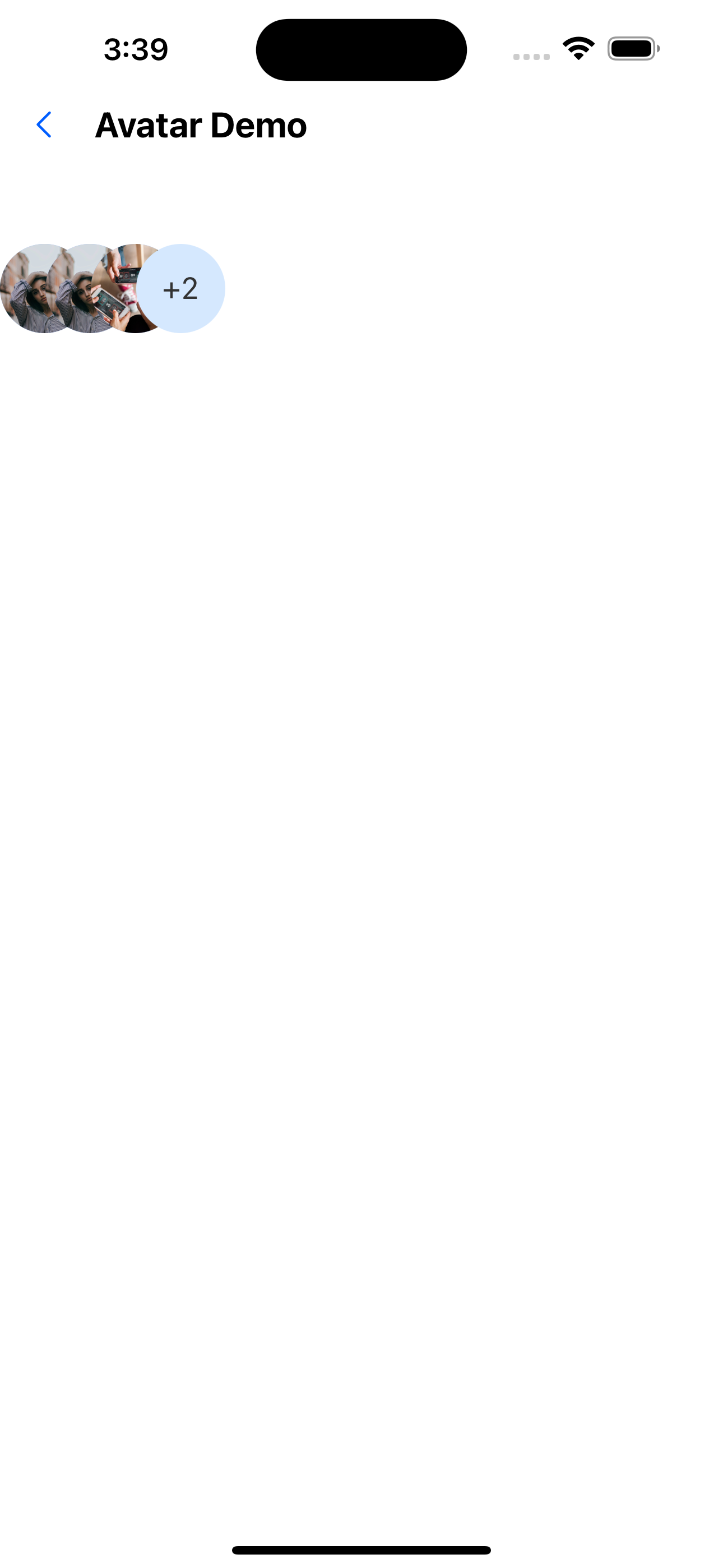
6. Avatar group
<AvatarGroup max={4}>
  <Avatar
    url="https://images.pexels.com/photos/1702238/pexels-photo-1702238.jpeg?auto=compress&cs=tinysrgb&dpr=1&w=1000"
    circular
  />
  <Avatar
    url="https://images.pexels.com/photos/1702238/pexels-photo-1702238.jpeg?auto=compress&cs=tinysrgb&dpr=1&w=1000"
    circular
  />
  <Avatar
    url="https://i0.wp.com/fancycrave.com/wp-content/uploads/2020/03/group-of-diverse-friends-playing-game-on-mobile-P5BYNJM.jpg"
    circular
  />
  <Avatar
    url="https://images.pexels.com/photos/1702238/pexels-photo-1702238.jpeg?auto=compress&cs=tinysrgb&dpr=1&w=1000"
    circular
  />
  <Avatar
    url="https://i0.wp.com/fancycrave.com/wp-content/uploads/2020/03/group-of-diverse-friends-playing-game-on-mobile-P5BYNJM.jpg"
    circular
  />
</AvatarGroup>
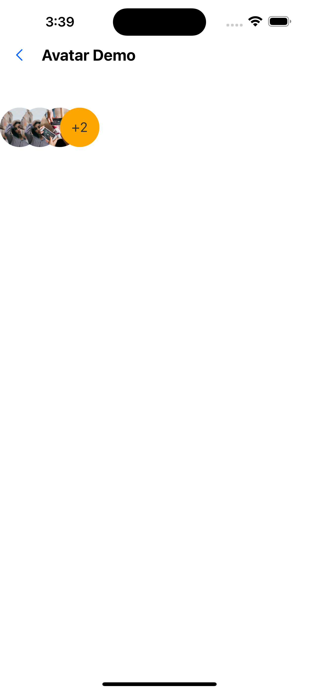
7. Avatar group background
<AvatarGroup max={4} backgroundColor="orange">
  <Avatar
    url="https://images.pexels.com/photos/1702238/pexels-photo-1702238.jpeg?auto=compress&cs=tinysrgb&dpr=1&w=1000"
    circular
  />
  <Avatar
    url="https://images.pexels.com/photos/1702238/pexels-photo-1702238.jpeg?auto=compress&cs=tinysrgb&dpr=1&w=1000"
    circular
  />
  <Avatar
    url="https://i0.wp.com/fancycrave.com/wp-content/uploads/2020/03/group-of-diverse-friends-playing-game-on-mobile-P5BYNJM.jpg"
    circular
  />
  <Avatar
    url="https://images.pexels.com/photos/1702238/pexels-photo-1702238.jpeg?auto=compress&cs=tinysrgb&dpr=1&w=1000"
    circular
  />
  <Avatar
    url="https://i0.wp.com/fancycrave.com/wp-content/uploads/2020/03/group-of-diverse-friends-playing-game-on-mobile-P5BYNJM.jpg"
    circular
  />
</AvatarGroup>
Avatar component API
| Properties | Required | Description | Type | Default Value |
|---|---|---|---|---|
| url | false | The path to the image | string | number | |
| size | false | avatar size | number | px(46) |
| borderRadius | false | Avatar curvature | number | 0 |
| title | false | Title (text displayed in the avatar, cannot be used with url) | string | |
| circular | false | Whether the avatar is circular | boolean | true |
| backgroundColor | false | Background when using title | string | #E5F1FF |
| textStyle | false | title text style | TextStyle | |
| containerStyle | false | Container style | ViewStyle | |
| activeOpacity | false | Transparency on click | number | 0.6 |
| onPress | false | Callback event for clicking the avatar | () => void |
Accessory component API
| Properties | Required | Description | Type | Default Value |
|---|---|---|---|---|
| url | false | The path to the image | string | number | |
| size | false | Icon size | number | px(14) |
| icon | false | props when using icon | IconProps | |
| component | false | Use custom components | ReactNode | |
| top | false | The vertical position of the pendant | boolean | false |
| left | false | The horizontal position of the widget | boolean | false |
AvatarGroup component API
| Properties | Required | Description | Type | Default Value |
|---|---|---|---|---|
| max | false | Maximum number to display | number | 4 |
| spacing | false | Spacing of avatar | number | px(23) |
| backgroundColor | false | The background of the number avatar | string | #E5F1FF |
| textStyle | false | Quantity avatar title text style | TextStyle |