List list component
Effect demonstration
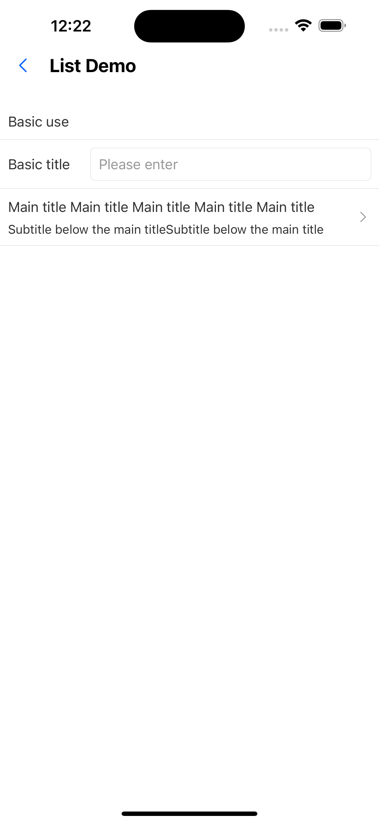
1. Only one input box
<List
  header="Basic use"
  items={[
    {
      title: "Basic title",
      extra: <Input placeholder="Please enter" style={{ height: px(32) }} />,
    },
    {
      title: `Main title Main title Main title Main title Main title Main title'< a i=3>`,
      brief: "Subtitle below the main titleSubtitle below the main title",
      arrow: "horizontal",
      onPress: () => console.log("onPress"),
    },
  ]}
/>
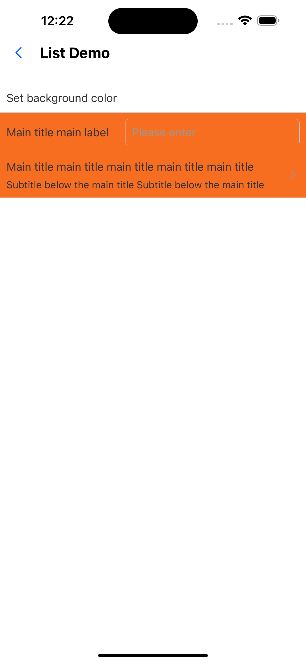
2. Set background color
<List
  header="Set background color"
  itemBackgroundColor="warningColor"
  items={[
    {
      title: "Main title main label",
      extra: <Input placeholder="Please enter" style={{ height: px(32) }} />,
    },
    {
      title:
        "Main title main title main title main title main title main title",
      brief: "Subtitle below the main title Subtitle below the main title",
      arrow: "horizontal",
      onPress: () => console.log("onPress"),
    },
  ]}
/>
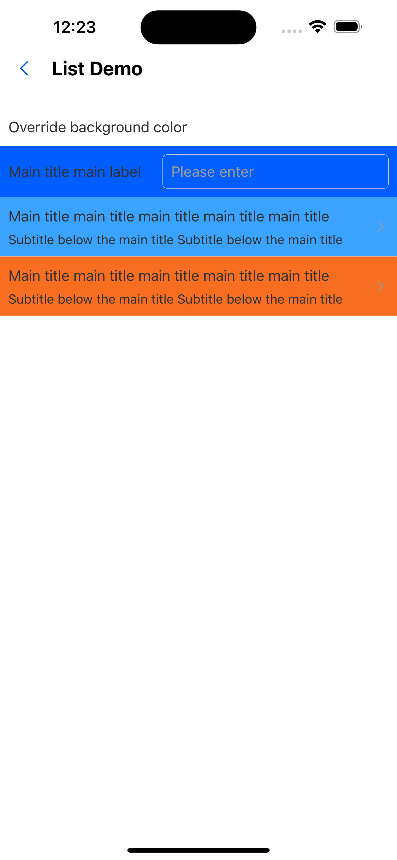
3. Override the background color
<List
  header="Override background color"
  itemBackgroundColor="primary200"
  items={[
    {
      title: "Main title main label",
      extra: <Input placeholder="Please enter" style={{ height: px(32) }} />,
    },
    {
      title:
        "Main title main title main title main title main title main title",
      brief: "Subtitle below the main title Subtitle below the main title",
      backgroundColor: "primary100",
      arrow: "horizontal",
      onPress: () => console.log("onPress"),
    },
    {
      title:
        "Main title main title main title main title main title main title",
      brief: "Subtitle below the main title Subtitle below the main title",
      backgroundColor: "warningColor",
      arrow: "horizontal",
      onPress: () => console.log("onPress"),
    },
  ]}
/>
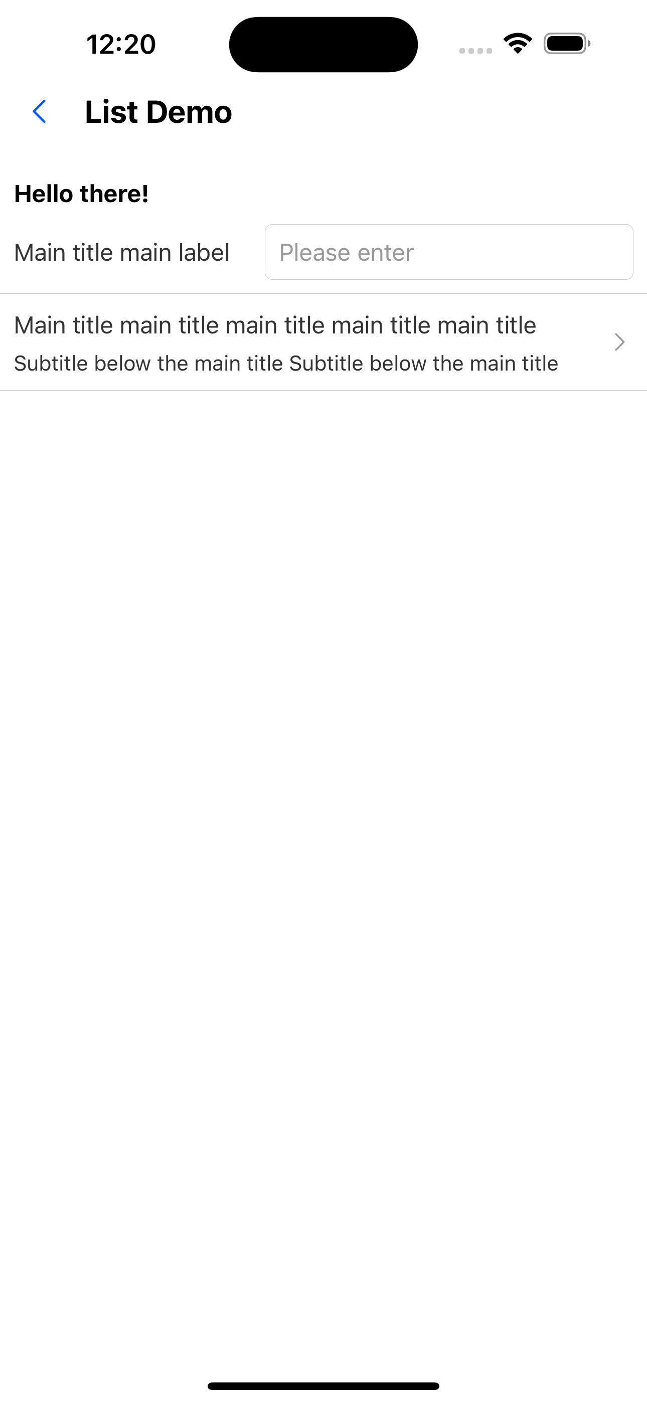
4. Custom header
const CustomHeader = () => {
  return (
    <Box paddingHorizontal={"x2"}>
      <Text variant="h3">Hello there!</Text>
    </Box>
  );
};
<List
  header={<CustomHeader />}
  items={[
    {
      title: "Main title main label",
      extra: <Input placeholder="Please enter" style={{ height: px(32) }} />,
    },
    {
      title:
        "Main title main title main title main title main title main title",
      brief: "Subtitle below the main title Subtitle below the main title",
      arrow: "horizontal",
      onPress: () => console.log("onPress"),
    },
  ]}
/>;
5. Use alone ListHeader
<ListHeader text="Only title" />
6. Customize the right side of the title
<List
  header="only header"
  extra={<SvgIcon name="left" />}
  items={[
    {
      title: "Main title main label",
      extra: <Input placeholder="Please enter" style={{ height: px(32) }} />,
    },
  ]}
/>
List API
| Properties | Required | Description | Type | Default Value |
|---|---|---|---|---|
| header | false | header | ReactNode | |
| extra | false | Content to the right of the title | ReactNode | |
| items | true | list items | ListItemProps[] | |
| itemHeight | false | List item height | number | 32Ï |
| itemBackgroundColor | false | Set the background color of list items uniformly | Theme Color |
ListHeader API
| Properties | Required | Description | Type | Default Value |
|---|---|---|---|---|
| text | true | title text | string | |
| extra | false | Content to the right of the title | ReactNode | |
| textStyle | false | Title text style | StyleProp<TextStyle> | |
| headerStyle | false | The style of the header container | StyleProp<ViewStyle> |