NoticeBar notice bar component
Below the navigation bar, it is generally used for notifications such as system reminders and event reminders. Use it when you need to attract user attention. The importance level is lower than Modal and higher than Toast.
Effect demonstration
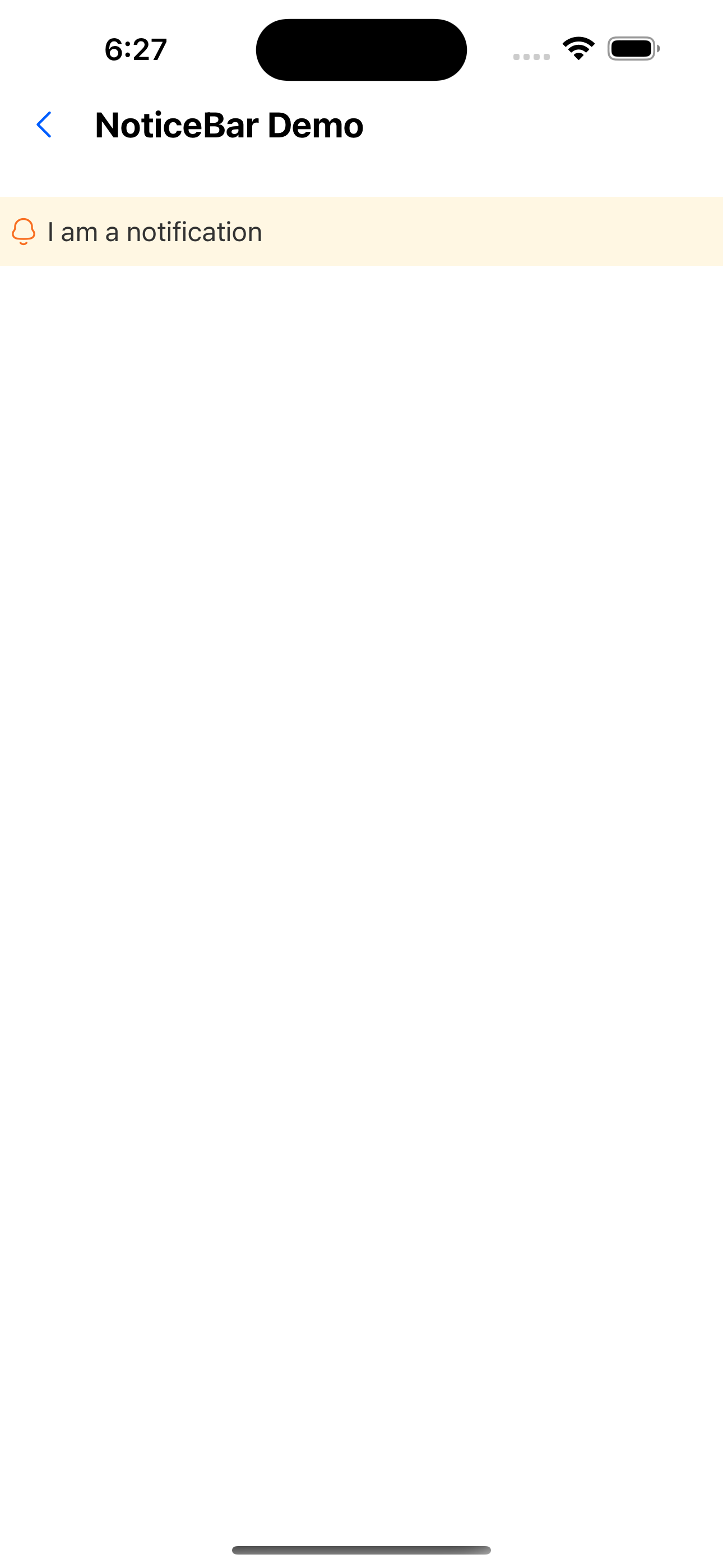
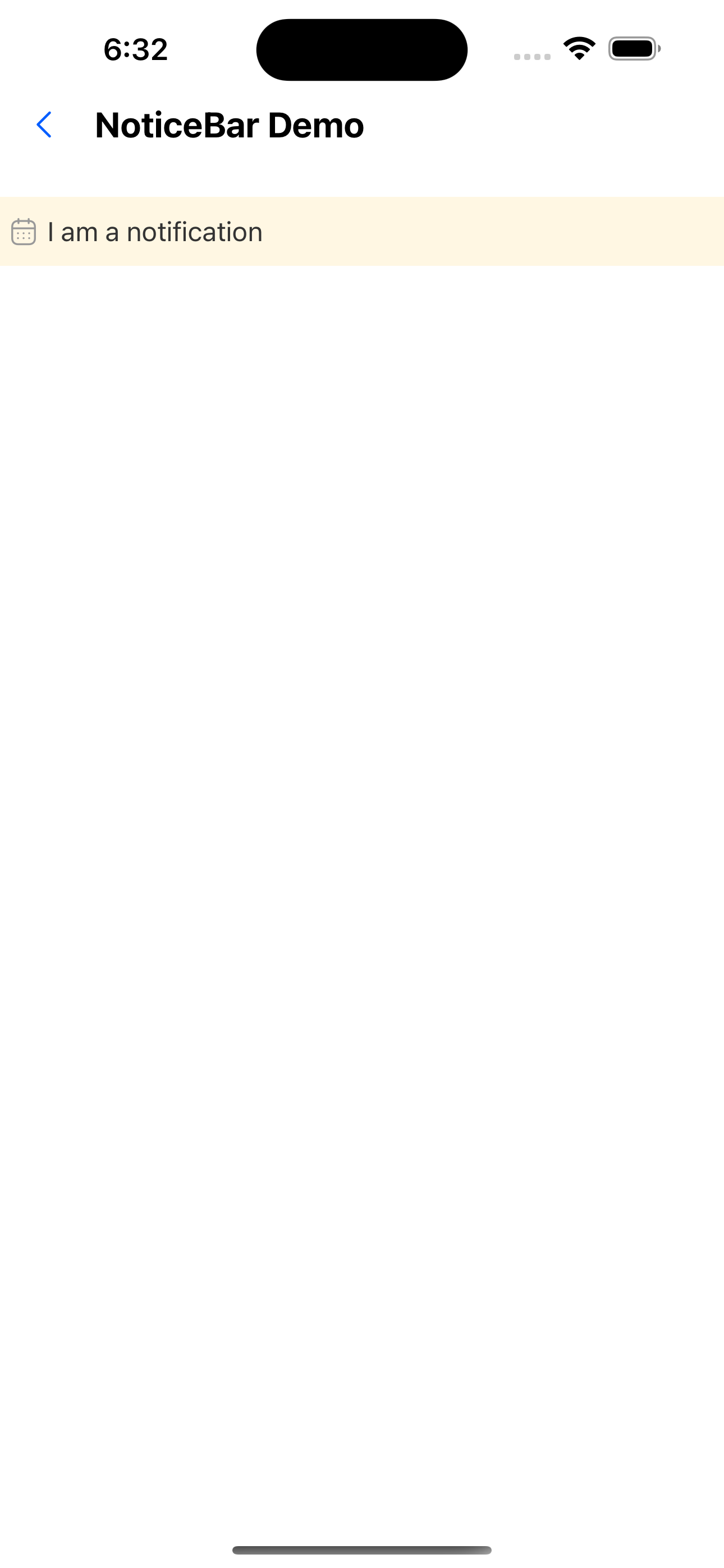
1. Default state
<NoticeBar text="I am a notification" />
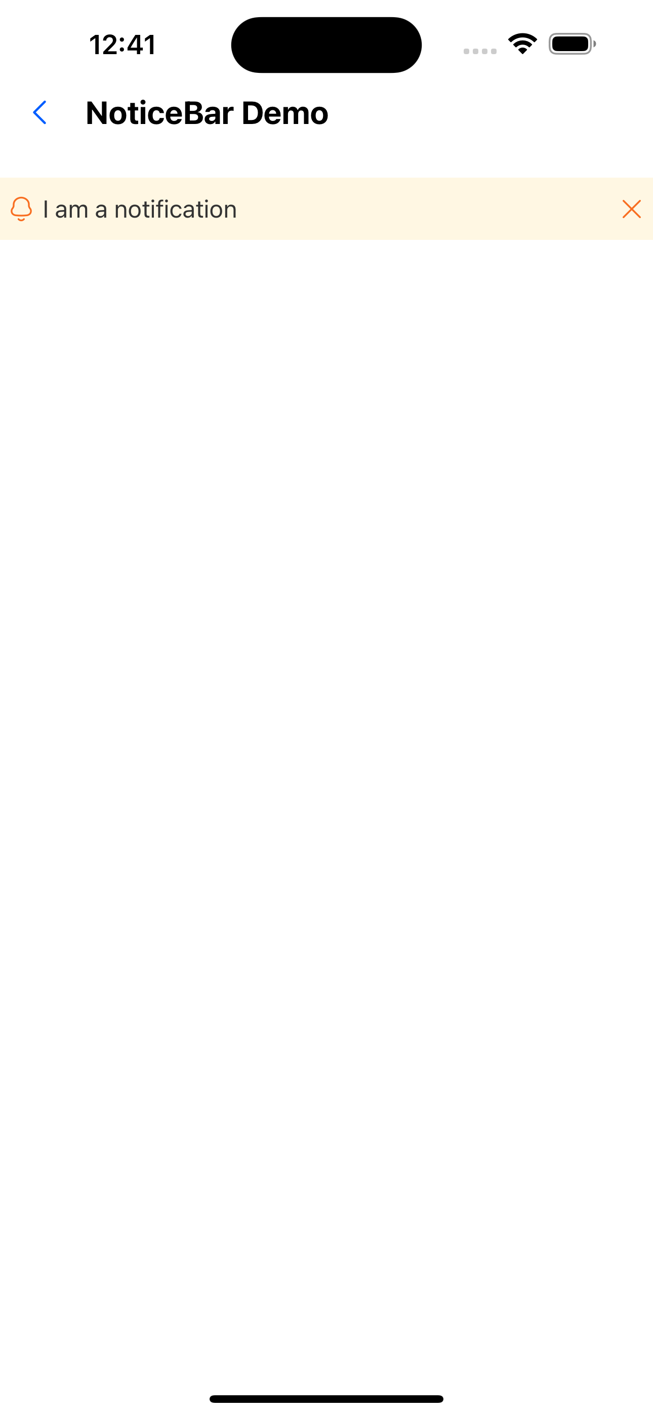
2. Can be closed
<NoticeBar text="I am a notification" mode="close" />
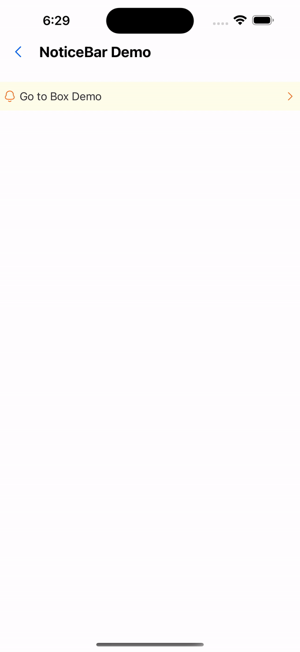
3. Click to jump
<NoticeBar
  text="Go to Box Demo"
  mode="link"
  onPress={() => navigation.navigate('BoxDemo')}
/>

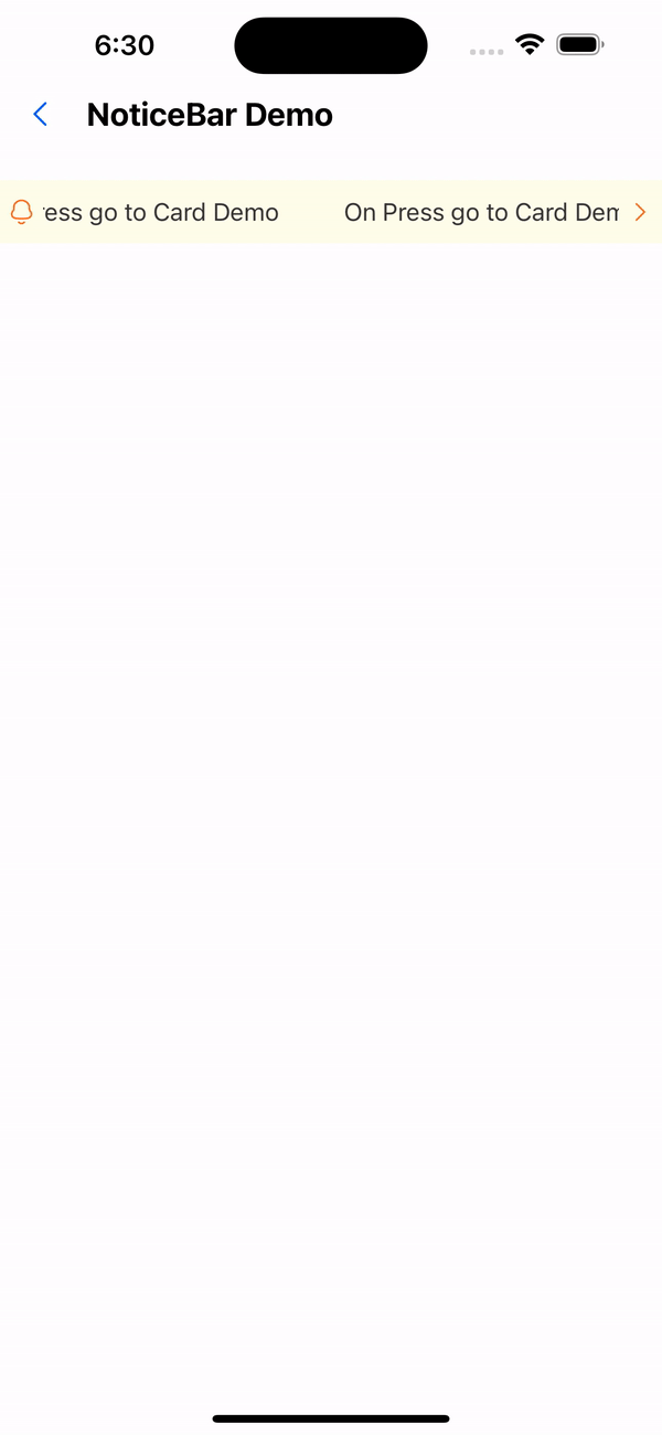
4. Horizontal scrolling + jumpable
<NoticeBar
  text="I am a notification, I am a notification"
  mode="link"
  onPress={() => navigation.navigate('BoxDemo')}
  animated
/>
5. Horizontal scroll + can be closed
<NoticeBar text="I am a notification I am a notification " mode="close" animated />
6. Custom icon
<NoticeBar icon={<Icon name="user" />} text="I am a notification " />
API
| Properties | Required | Description | Type | Default Value |
|---|---|---|---|---|
| text | true | Notice board text | string | |
| icon | false | left icon | ReactNode | |
| mode | false | Notice board type | close | link | '' | '' |
| onPress | false | Notification bar click event | () => void | |
| animated | false | Whether to enable animation | boolean | false |
| duration | false | animation playback duration | number | 5000 |
| height | false | Notice board height | number | 36 |
| activeOpacity | false | Opacity when pressed | number | 0.6 |
| style | false | Custom style | StyleProp<ViewStyle> |