Tag - label component
Effect demonstration
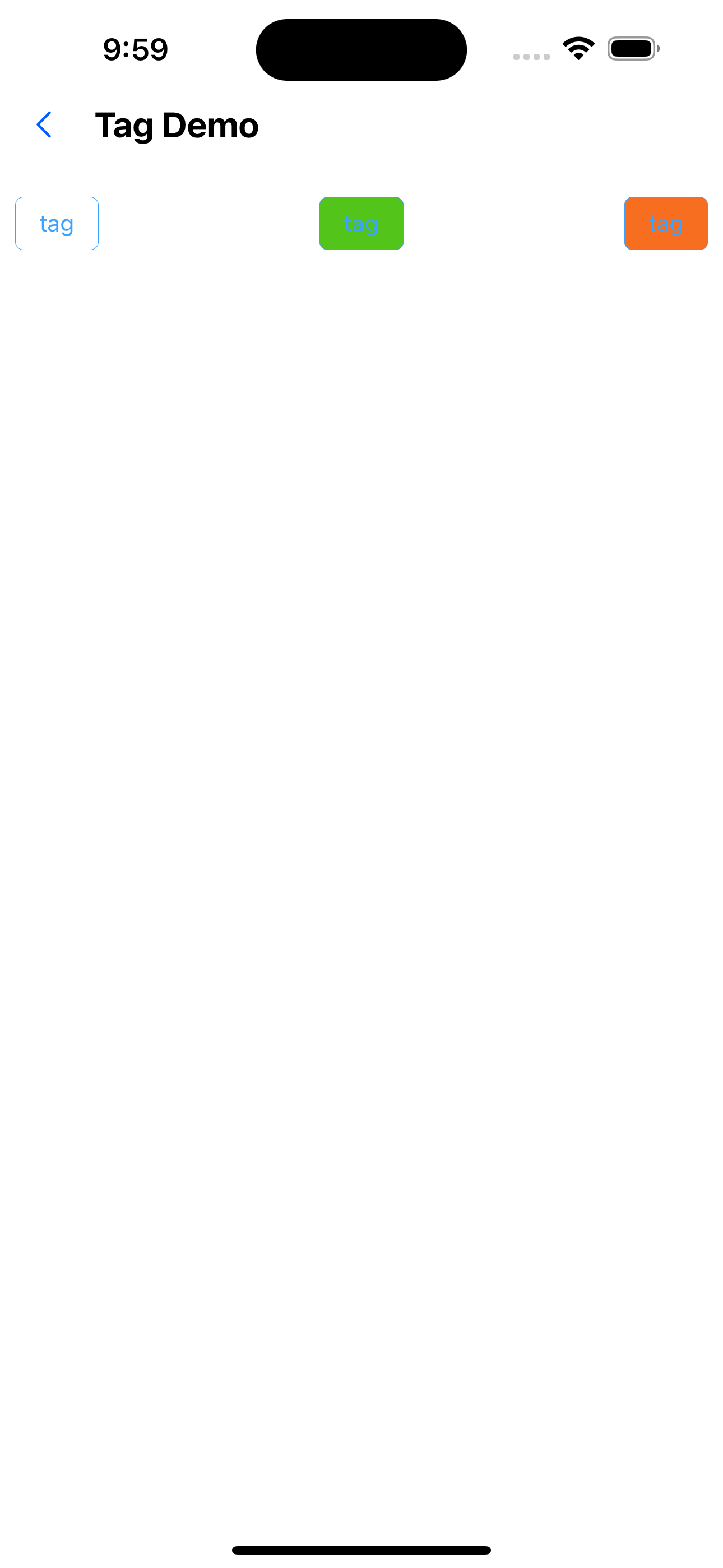
1. Default effect of large, medium and small labels
<Flex justifyContent="space-around">
  <Tag size="small">magenta</Tag>
  <Tag>magenta</Tag>
  <Tag size="large">magenta</Tag>
</Flex>
2. Customize background color
<Flex justifyContent="space-between">
  <Tag backgroundColor="func200" text="tag" />
  <Tag backgroundColor="func300" text="tag" />
  <Tag backgroundColor="func500" text="small tag tag" />
</Flex>
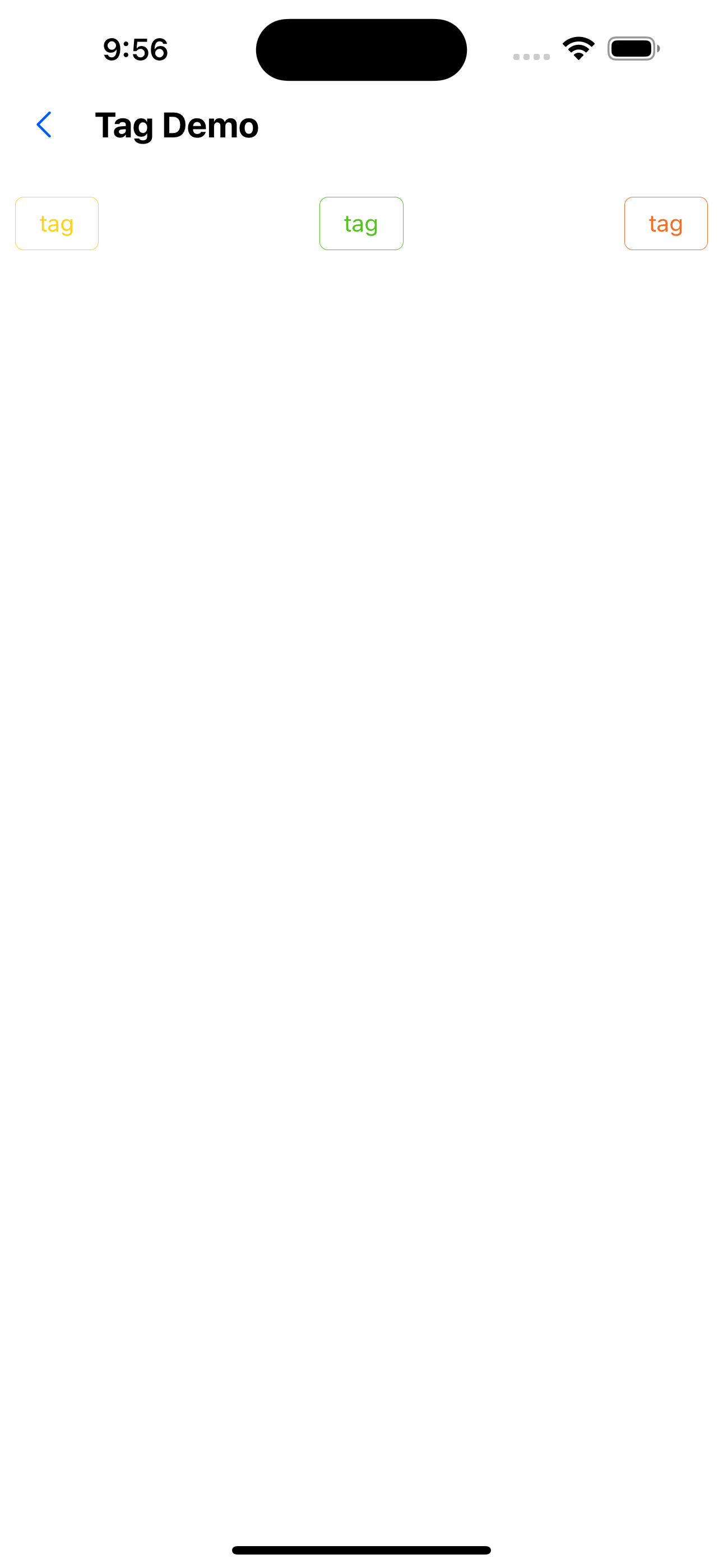
3. Customize text color
<Flex justifyContent="space-between">
  <Tag color="func200" text="tag" />
  <Tag color="func300" text="tag" />
  <Tag color="func500" text="tag" />
</Flex>
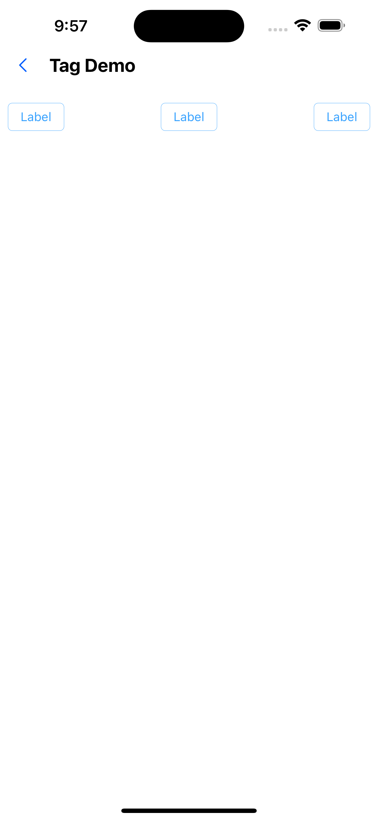
4. Hollow label
<Flex justifyContent="space-between">
  <Tag backgroundColor="func200" text="Label" />
  <Tag backgroundColor="func300" ghost text="Label" />
  <Tag backgroundColor="func500" ghost text="Label" />
</Flex>
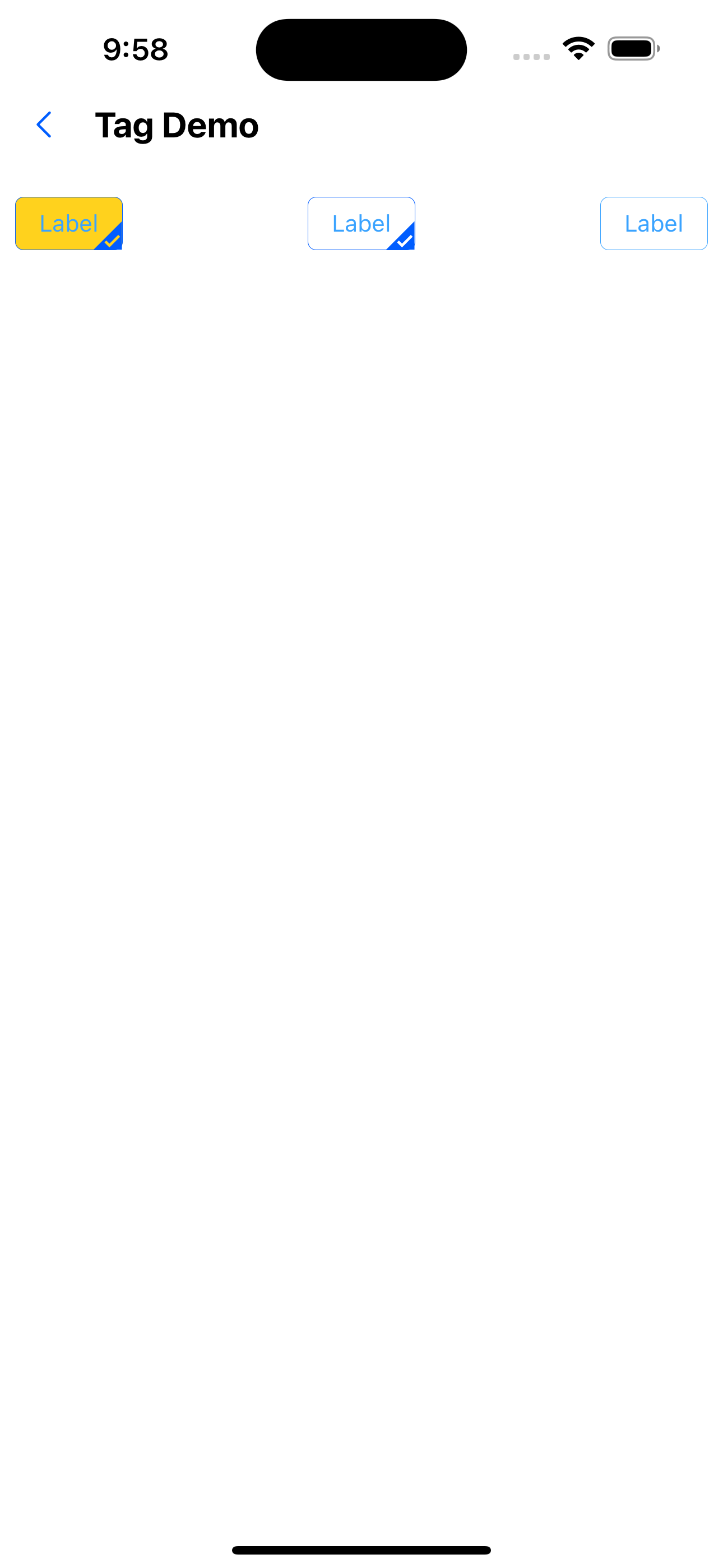
5. Disabled Effect
<Flex justifyContent="space-between">
  <Tag disabled text="Label" />
  <Tag backgroundColor="func300" disabled text="tag" />
  <Tag backgroundColor="func500" disabled text="tag" />
</Flex>
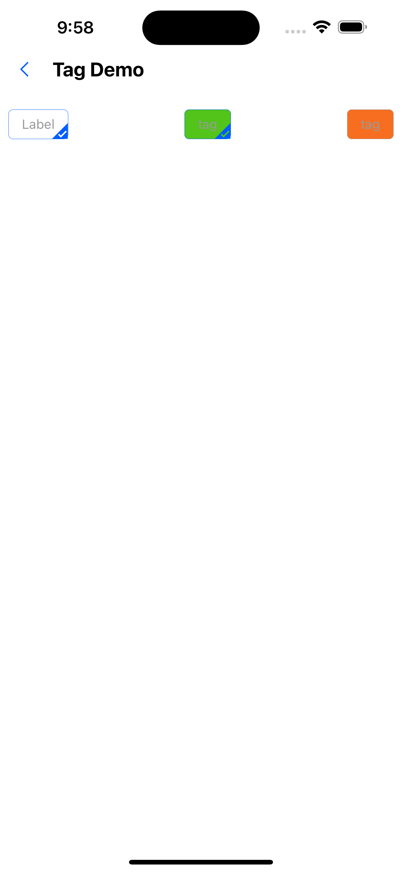
6. Select the effect
<Flex justifyContent="space-between">
  <Tag selected text="tag" />
  <Tag backgroundColor="func300" selected text="tag" />
  <Tag backgroundColor="func500" selected text="tag" />
</Flex>
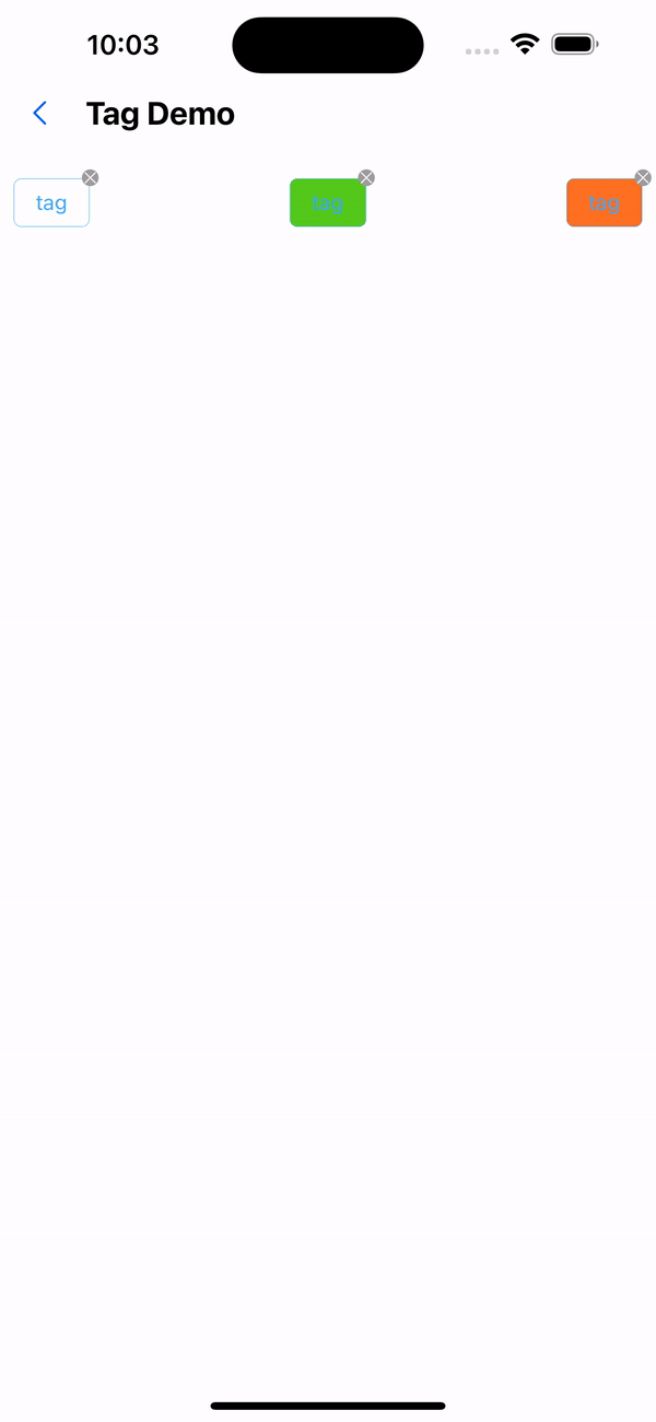
7. Deleteable effects
<Flex justifyContent="space-between">
  <Tag closable text="tag" onClose={() => Alert.alert("Close")} />
  <Tag backgroundColor="func300" closable text="tag" />
  <Tag backgroundColor="func500" closable text="tag" />
</Flex>
API
| Properties | Required | Description | Type | Default Value |
|---|---|---|---|---|
| size | false | The size of the label | large| small | middle | middle |
| text | false | Specify label text | string | |
| ghost | false | Whether the background is hollow | boolean | false |
| disabled | false | Set disabled | boolean | false |
| closable | false | Whether it can be closed | boolean | false |
| selectable | false | Whether selectable | boolean | false |
| selected | false | Set the selected status of the label | boolean | false |
| onClose | false | Click to close callback function | () => void | |
| onSelect | false | Callback function for clicking the label | (selected: boolean) => void | |
| activeOpacity | false | Opacity when pressed | number | 0.6 |