Carousel carousel component
Effect demonstration
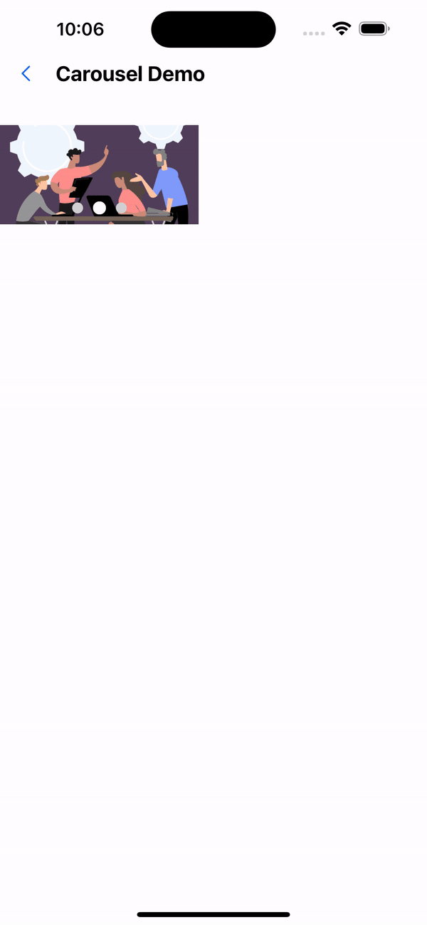
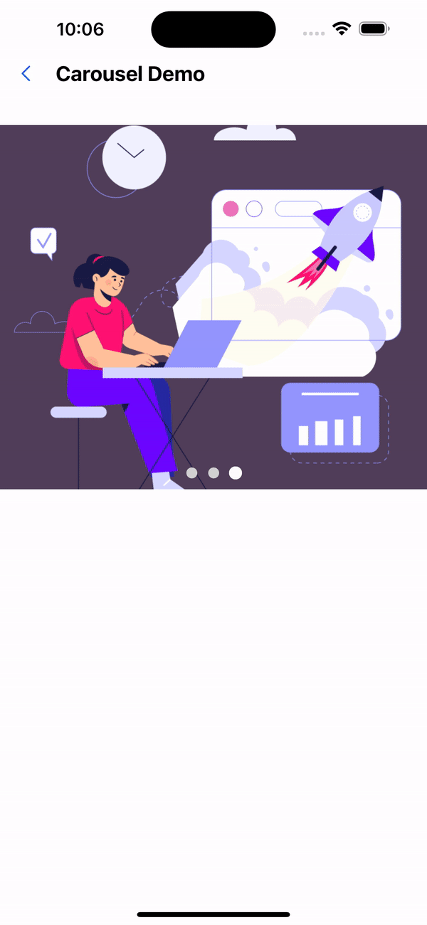
1. Default configuration
<Carousel>
  <Image source={require("../../assets/images/img-01.jpg")} />
  <Image source={require("../../assets/images/img-02.jpg")} />
  <Image source={require("../../assets/images/img-03.jpeg")} />
</Carousel>

2. width 200, height 100
<Carousel width={px(200)} height={px(100)}>
  <Image source={require("../../assets/images/img-01.jpg")} />
  <Image source={require("../../assets/images/img-02.jpg")} />
  <Image source={require("../../assets/images/img-03.jpeg")} />
</Carousel>
3. Carousel duration is 1000 milliseconds
<Carousel duration={1000}>
  <Image source={require("../../assets/images/img-01.jpg")} />
  <Image source={require("../../assets/images/img-02.jpg")} />
  <Image source={require("../../assets/images/img-03.jpeg")} />
</Carousel>
4. Modify indicator color
 <Carousel duration={1000} activeColor="red" inactiveColor="grey">
  <Image source={require('../../../assets/images/img-01.png')} />
  <Image source={require('../../../assets/images/img-02.png')} />
  <Image source={require('../../../assets/images/img-03.png')} />
</Carousel>

API
| Properties | Required | Description | Type | Default Value |
|---|---|---|---|---|
| auto | false | Whether to scroll automatically | boolean | true |
| width | false | Carousel width | number | deviceWidth |
| height | false | Carousel height | number | 320 |
| duration | false | Carousel duration (milliseconds) | number | 2000 |
| indicatorEnabled | false | Whether to display the scroll indicator | boolean | true |
| indicatorSize | false | indicator size | number | 10 |
| activeColor | false | Color when the origin is selected | string | #fff |
| inactiveColor | false | Color when origin is not selected | string | #fff |
| align | false | Indicator layout. | AlignType | center |
The types of AlignType are as follows:
type AlignType = "left" | "center" | "right";