Tooltip
#Tooltip text prompt
Effect demonstration
1. Default effect
<Tooltip content="InfoInfoInfo">
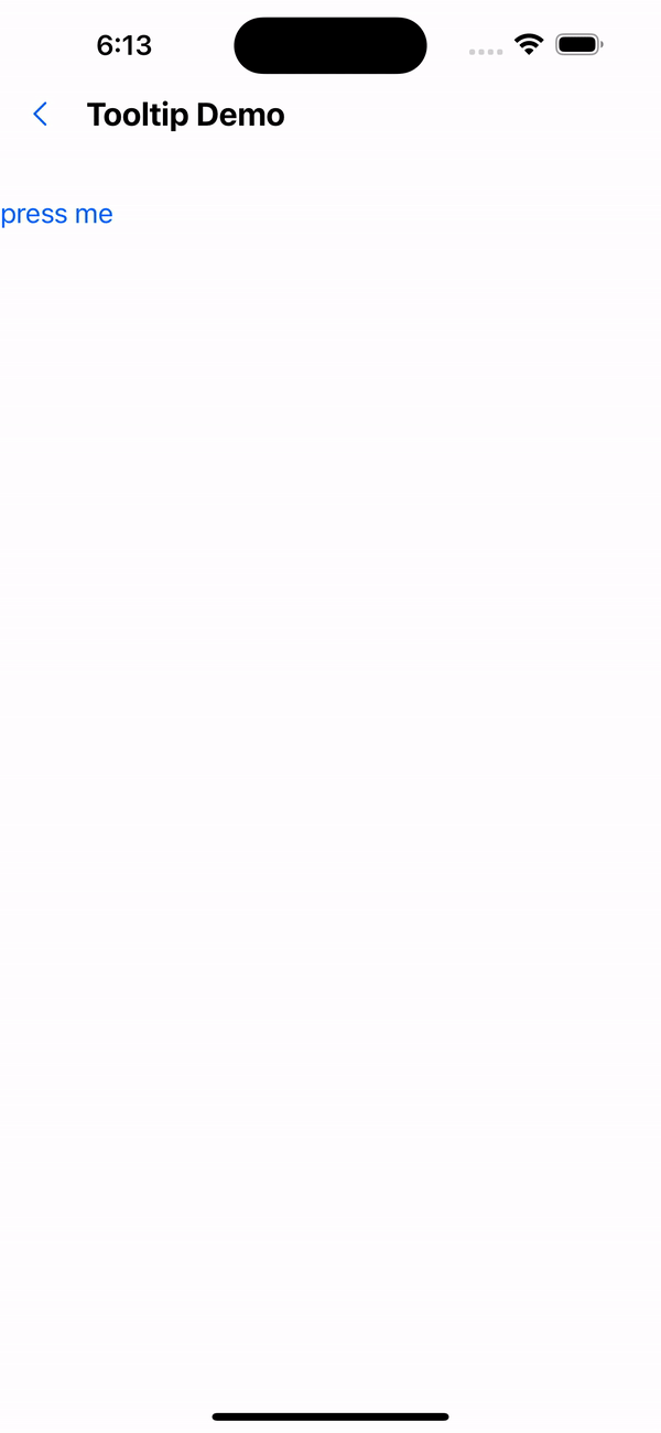
<Text variant="p0" color="primary200">
Press me
</Text>
</Tooltip>
2. Modify the background color
<Tooltip content="InfoInfoInfo" backgroundColor="red">
  <Text variant="p0" color="primary200">
    press me
  </Text>
</Tooltip>

API
| Properties | Required | Description | Type | Default Value |
|---|---|---|---|---|
| content | true | prompt text | ReactNode | |
| width | false | tooltip width | number | 40 |
| height | false | tooltip height | number | 150 |
| backgroundColor | false | tooltip background color | string | #617080 |
| containerStyle | false | tooltip container style | StyleProp<ViewStyle> | |
| withOverlay | false | Whether to display the mask layer | boolean | true |
| withCaret | false | Whether to display the small triangle | boolean | true |
| overlayColor | false | Overlay color | string | rgba(250, 250, 250, 0.70) |
| actionType | false | The click method that triggers the tooltip | onPress | onLongPress | onPress |
| onClose | false | Event triggered when tooltip is closed | () => void |