Menu menu component
Effect demonstration
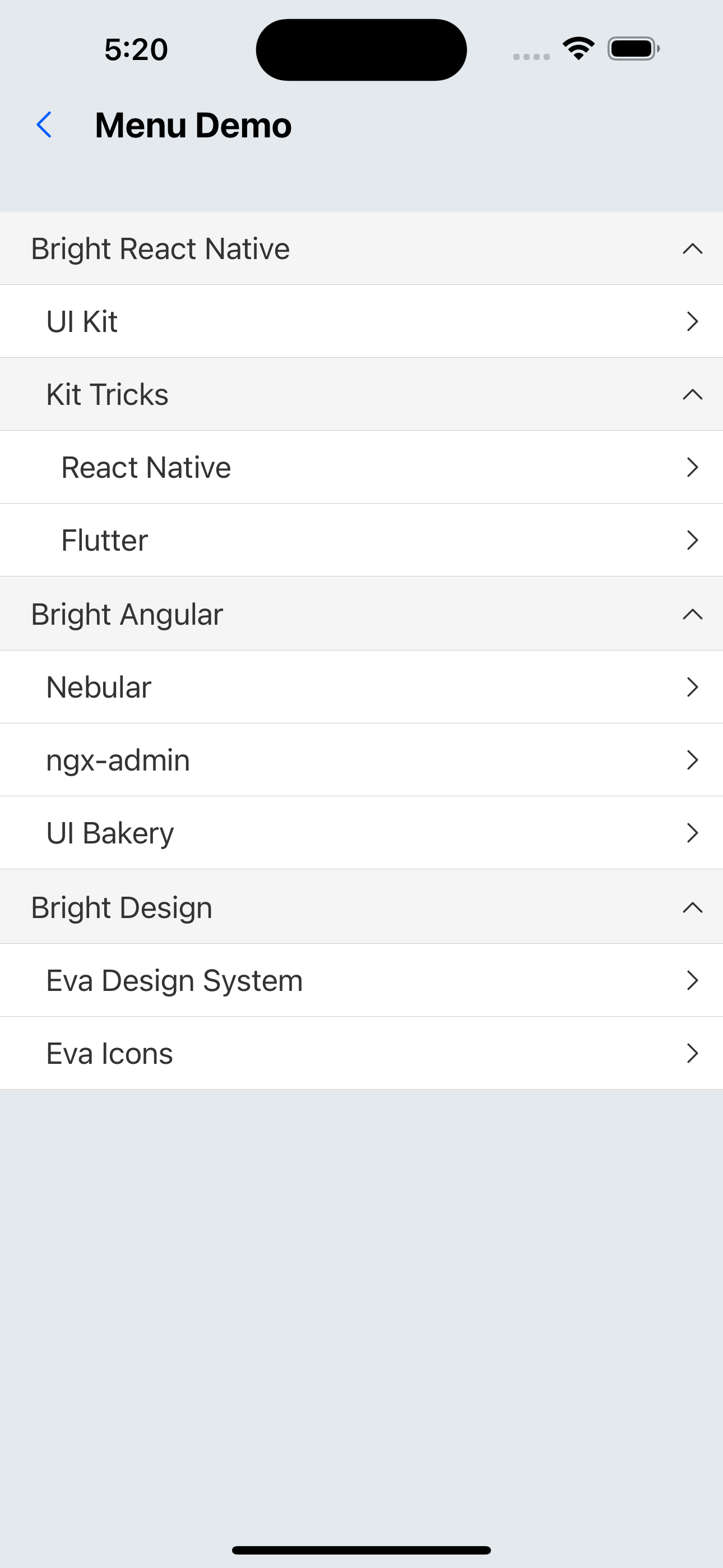
1. Default effect
<Menu
  data={[
    {
      id: "1",
      title: "Bright React Native",
      items: [
        { id: "1-1", title: "UI Kit" },
        {
          id: "1-2",
          title: "Kit Tricks",
          items: [
            { id: "1-2-1", title: "React Native " },
            { id: "1-2-2", title: "Flutter" },
          ],
        },
      ],
    },
    {
      id: "2",
      title: "Bright Angular",
      items: [
        { id: "2-1", title: "Nebular" },
        { id: "2-2", title: "ngx-admin" },
        { id: "2-3", title: "UI Bakery" },
      ],
    },
    {
      id: "3",
      title: "Bright Design",
      items: [
        { id: "3-1", title: "Eva Design System" },
        { id: "3-2", title: "Eva Icons" },
      ],
    },
  ]}
/>
2. Allow expansion of multiple menu groups
<Menu
  multiple
  data={[
    {
      id: "1",
      title: "Bright React Native",
      items: [
        { id: "1-1", title: "UI Kit" },
        {
          id: "1-2",
          title: "Kit Tricks",
          items: [
            { id: "1-2-1", title: "React Native " },
            { id: "1-2-2", title: "Flutter" },
          ],
        },
      ],
    },
    {
      id: "2",
      title: "Bright Angular",
      items: [
        { id: "2-1", title: "Nebular" },
        { id: "2-2", title: "ngx-admin" },
        { id: "2-3", title: "UI Bakery" },
      ],
    },
    {
      id: "3",
      title: "Bright Design",
      items: [
        { id: "3-1", title: "Eva Design System" },
        { id: "3-2", title: "Eva Icons" },
      ],
    },
  ]}
/>
3. Selected by default
<Menu
  defaultSelectedKey="1-2-1"
  data={[
    {
      id: "1",
      title: "Bright React Native",
      items: [
        { id: "1-1", title: "UI Kit" },
        {
          id: "1-2",
          title: "Kit Tricks",
          items: [
            { id: "1-2-1", title: "React Native " },
            { id: "1-2-2", title: "Flutter" },
          ],
        },
      ],
    },
    {
      id: "2",
      title: "Bright Angular",
      items: [
        { id: "2-1", title: "Nebular" },
        { id: "2-2", title: "ngx-admin" },
        { id: "2-3", title: "UI Bakery" },
      ],
    },
    {
      id: "3",
      title: "Bright Design",
      items: [
        { id: "3-1", title: "Eva Design System" },
        { id: "3-2", title: "Eva Icons" },
      ],
    },
  ]}
/>
4. Title left icon
<Menu
  data={[
    {
      id: "1",
      title: "Bright React Native",
      left: <IconPlus />,
      items: [
        { id: "1-1", title: "UI Kitten" },
        {
          id: "1-2",
          title: "Kitten Tricks",
          items: [
            { id: "1-2-1", title: "React Native Paper" },
            { id: "1-2-2", title: "TD Design" },
          ],
        },
      ],
    },
    {
      id: "2",
      title: "Bright Angular",
      left: <IconPlus />,
      items: [
        { id: "2-1", title: "Nebular" },
        { id: "2-2", title: "ngx-admin" },
        { id: "2-3", title: "UI Bakery" },
      ],
    },
    {
      id: "3",
      title: "Bright Design",
      left: <IconPlus />,
      items: [
        { id: "3-1", title: "Eva Design System" },
        { id: "3-2", title: "Eva Icons" },
      ],
    },
  ]}
/>

5. MenuItem right icon
<Menu
  data={[
    {
      id: "1",
      title: "Bright React Native",
      customIcon: <IconPlus />,
    },
    {
      id: "2",
      title: "Bright Angular",
      customIcon: <IconPlus />,
    },
    {
      id: "3",
      title: "Bright Design",
      customIcon: <IconPlus />,
    },
  ]}
/>
API
Menu
| Properties | Required | Description | Type | Default Value |
|---|---|---|---|---|
| data | true | menu data | MenuItemProps[] | |
| multiple | false | Whether to allow multiple menu groups to be expanded | boolean | false |
| width | false | width | number | deviceWidth |
| selectedKey | false | selected menu | string | |
| defaultSelectedKey | false | Default selected menu | string | |
| onSelect | false | Event triggered when MenuItem is selected | (key: string) => void | |
| activeColor | false | MenuItem background color when selected | string | |
| activeTextColor | false | MenuItem text color when selected | string | |
| style | false | Custom style | ViewStyle | |
| itemStyle | false | Menu item style | ViewStyle | |
| activeOpacity | false | The opacity of the menu item when clicked | number | 0.6 |
MenuItemProps
| Properties | Required | Description | Type | Default Value |
|---|---|---|---|---|
| id | true | unique identifier | string | |
| title | true | title | string | |
| left | false | Customize left content | ReactNode | |
| customIcon | false | Custom icon | ReactNode | |
| disabled | false | Whether to disable menu items | boolean | false |
| items | false | Submenu | MenuItemProps[] |