CollapseText -Text folding component
Effect demonstration
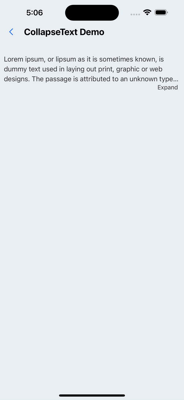
1. Default effect
const text = `Lorem ipsum, or lipsum as it is sometimes known, is dummy text used in laying out print, graphic or web designs. The passage is attributed to an unknown typesetter in the 15th century who is thought to have scrambled parts of Cicero's De Finibus Bonorum et Malorum for use in a type specimen book. It usually begins with:
  “Lorem ipsum dolor sit amet, consectetur adipiscing elit, sed do eiusmod tempor incididunt ut labore et dolore magna aliqua.”`;

<CollapseText text={text} defaultNumberOfLines={3} lineHeight={px(20)} />;
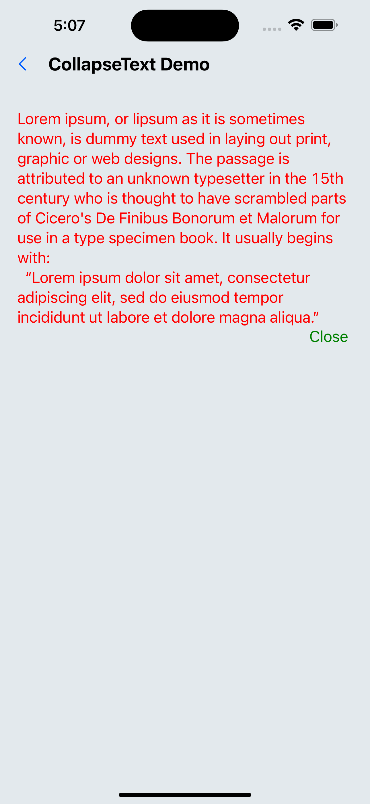
2. Custom style
const text = `Lorem ipsum, or lipsum as it is sometimes known, is dummy text used in laying out print, graphic or web designs. The passage is attributed to an unknown typesetter in the 15th century who is thought to have scrambled parts of Cicero's De Finibus Bonorum et Malorum for use in a type specimen book. It usually begins with:
  “Lorem ipsum dolor sit amet, consectetur adipiscing elit, sed do eiusmod tempor incididunt ut labore et dolore magna aliqua.”`;

<CollapseText
  text={text}
  defaultNumberOfLines={3}
  lineHeight={px(20)}
  textStyle={{ color: 'red', fontSize: px(16) }}
  textContainerStyle={{ marginHorizontal: px(10) }}
  expandStyle={{ color: 'green', fontSize: px(16) }}
/>;
API
| Properties | Required | Description | Type | Default Value |
|---|---|---|---|---|
| text | true | text | string | |
| defaultNumberOfLines | false | Default number of displayed lines | number | 2 |
| lineHeight | false | The height of each line of text | number | 18 |
| textStyle | false | text style | TextStyle | |
| textContainerStyle | false | Text container style | ViewStyle | |
| expandText | false | Text when expanded | string | expand |
| unExpandText | false | Text when collapsed | string | Collapse |
| expandStyle | false | Expand/collapse text style | TextStyle | |
| activeOpacity | false | Opacity when pressed | number | 0.6 |