Pressable -clickable component
Based on React Native Pressable package.
Note: Pressable is a new feature introduced by react-native in version 0.63, which also means that if your project is lower than version 0.63, the Pressable component cannot be used
Effect demonstration
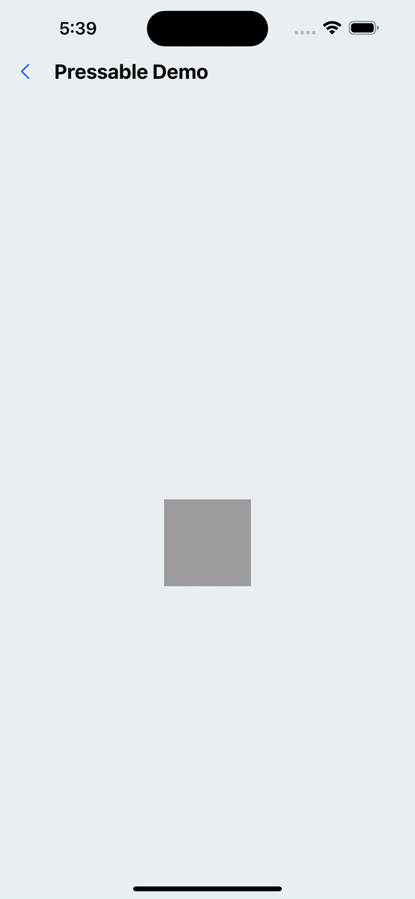
1. Default effect
<Pressable onPress={handlePress} onLongPress={handleLongPress}>
  <Box width={90} height={90} backgroundColor="gray300" />
</Pressable>
API
| Properties | Required | Description | Type | Default Value |
|---|---|---|---|---|
| onPress | false | Click event | (event: GestureResponderEvent) => void | |
| onPressIn | false | Before the click event is executed | (event: GestureResponderEvent) => void | |
| onPressOut | false | After the click event is executed | (event: GestureResponderEvent) => void | |
| onLongPress | false | Long press event | (event: GestureResponderEvent) => void | |
| disabled | false | Whether to disable | boolean | |
| delayLongPress | false | Delay time from click state to long press state | number | 1000 |
| activeOpacity | false | Opacity on click | number | 0.5 |
| pressOffset | false | The distance the finger moves out of the component but holds the clicked state | number | 20 |
| hitOffset | false | The distance from the component to trigger onPressIn | number | 20 |
| style | false | Custom style | ViewStyle |