Button button component
Effect demonstration
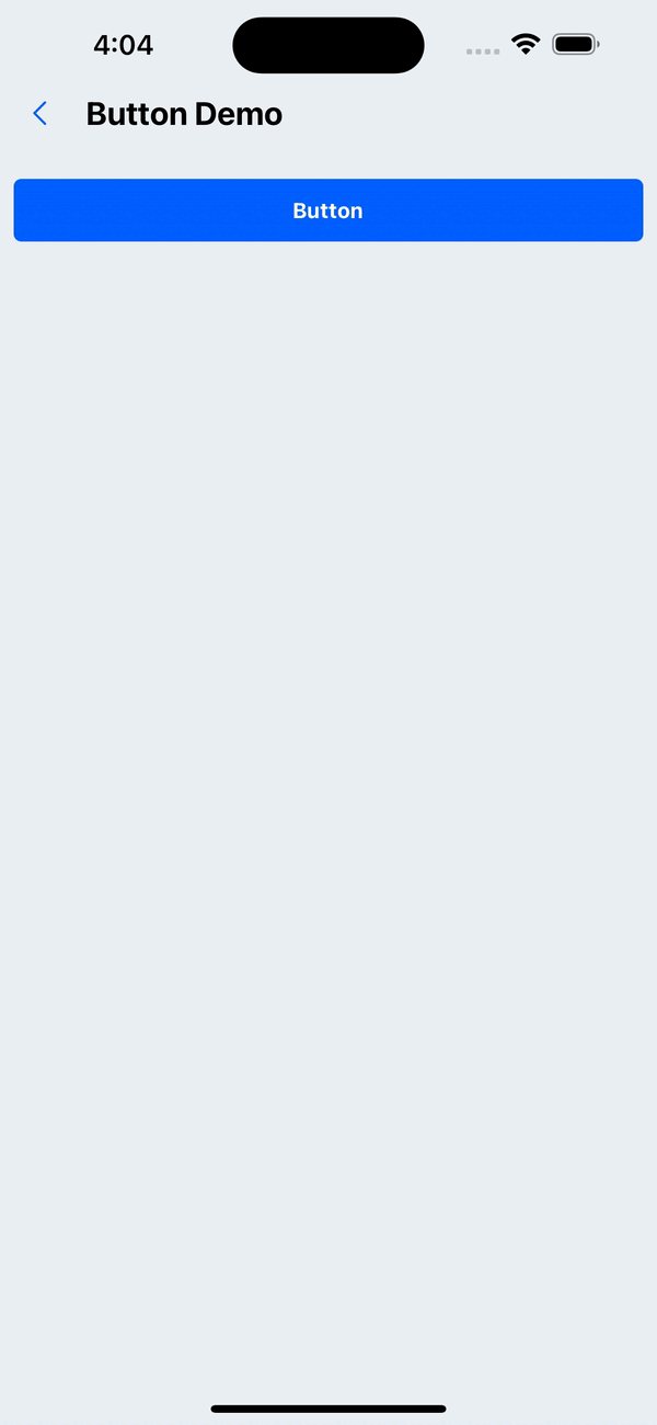
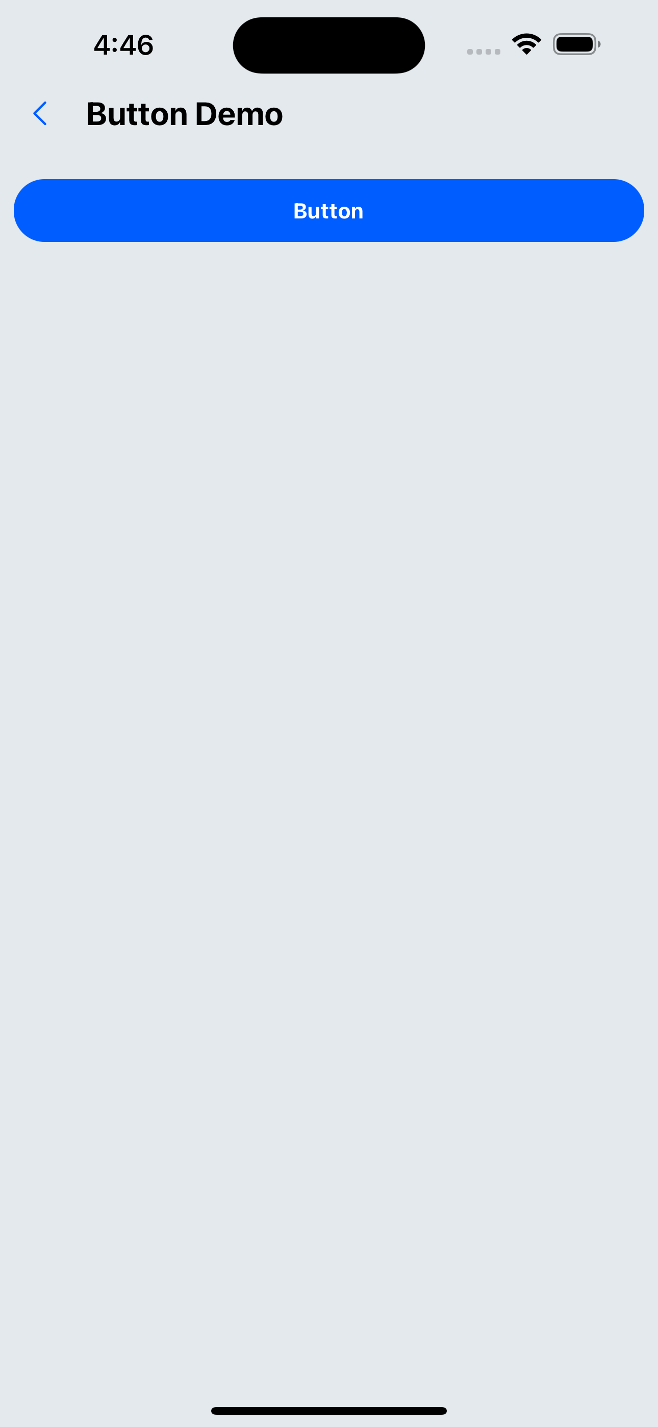
1. Default effect
<Button title="Button" onPress={() => Alert.alert('hello, Button')} />
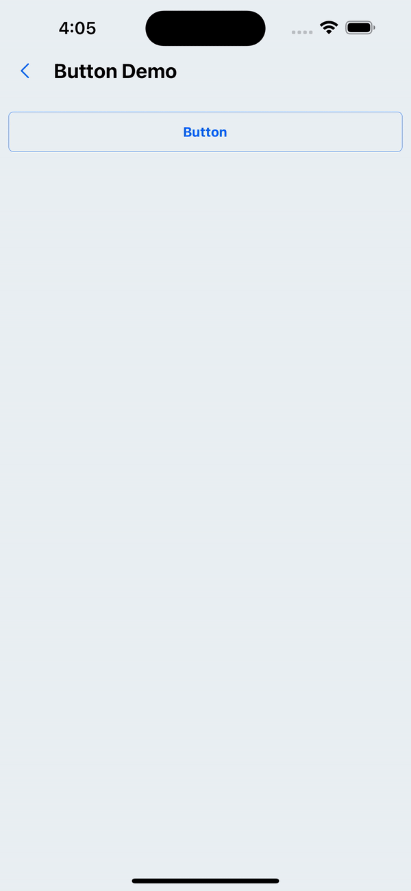
2. type='secondary'
<Button title="Button" type="secondary" onPress={() => Alert.alert('hello, Button')} />
3. Loading state (does not respond to click events)
<Button title="Button" loading onPress={() => Alert.alert('hello, Button')} />
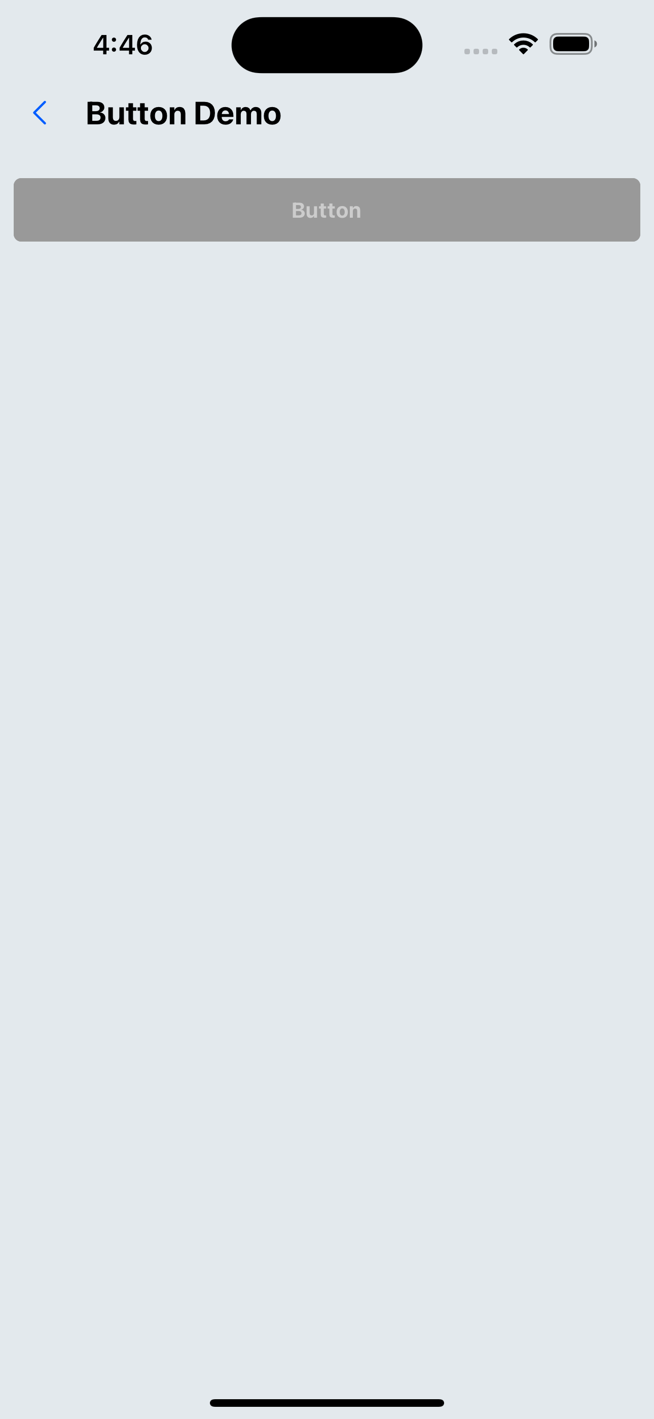
4. Disable button
<Button title="button" disabled onPress={() => Alert.alert('hello, Button')} />
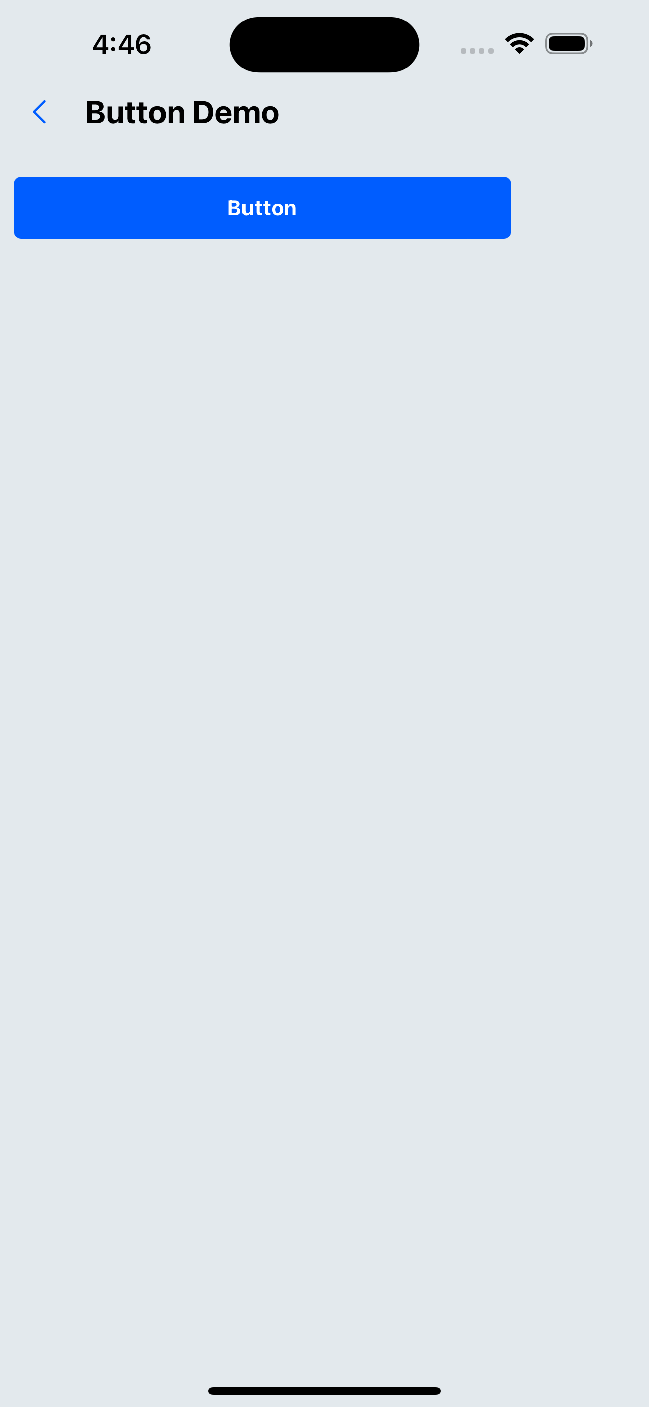
5. Set button width
<Button title="Button" width="80%" onPress={() => Alert.alert('hello, Button')} />
6. Set the button fillet size�
<Button title="Button" borderRadius={20} onPress={() => Alert.alert('hello, Button')} />
API
Component properties inherit SpacingProps, and the remaining properties are as follows:
| Properties | Required | Description | Type | Default Value |
|---|---|---|---|---|
| title | true | Button text content | ReactNode | |
| type | false | Button display type | primary | secondary | primary |
| disabled | false | Whether it is disabled | boolean | false |
| loading | false | Whether loading | boolean | |
| onPress | true | Button click event | () => void | |
| width | false | button width | number | string | 100% |
| borderRadius | false | Corner size | number | px(4) |
| borderless | false | Do not show borders | boolean | false |
| size | false | button size | default | small | large | default |
| style | false | Custom style | ViewStyle |