ButtonGroup
Effect demonstration
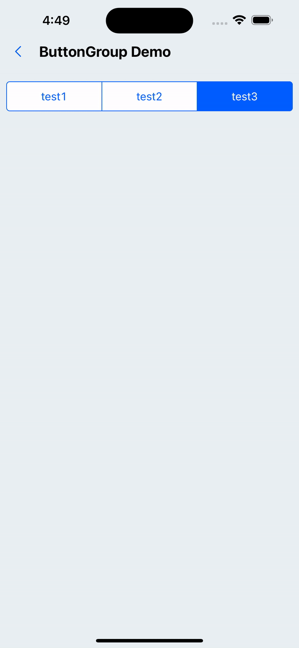
1. Default effect
<ButtonGroup
  options={[
    {
      label: "test1",
      onPress: () => {
        console.log(111);
      },
    },
    { label: "test2" },
    { label: "test3" },
  ]}
/>
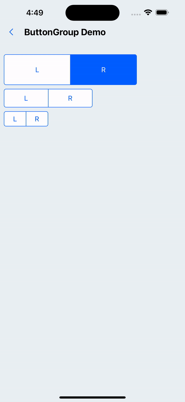
2. Set button groups of different sizes
<WhiteSpace />
<ButtonGroup
  options={[{ label: 'L' }, { label: 'R' }]}
  size='x5'
  containerStyle={{ width: '75%' }}
/>
<WhiteSpace />
<ButtonGroup
  options={[{ label: 'L' }, { label: 'R' }]}
  containerStyle={{ width: '50%' }}
/>
<WhiteSpace />
<ButtonGroup
  options={[{ label: 'L' }, { label: 'R' }]}
  size='x1'
  containerStyle={{ width: '25%' }}
/>
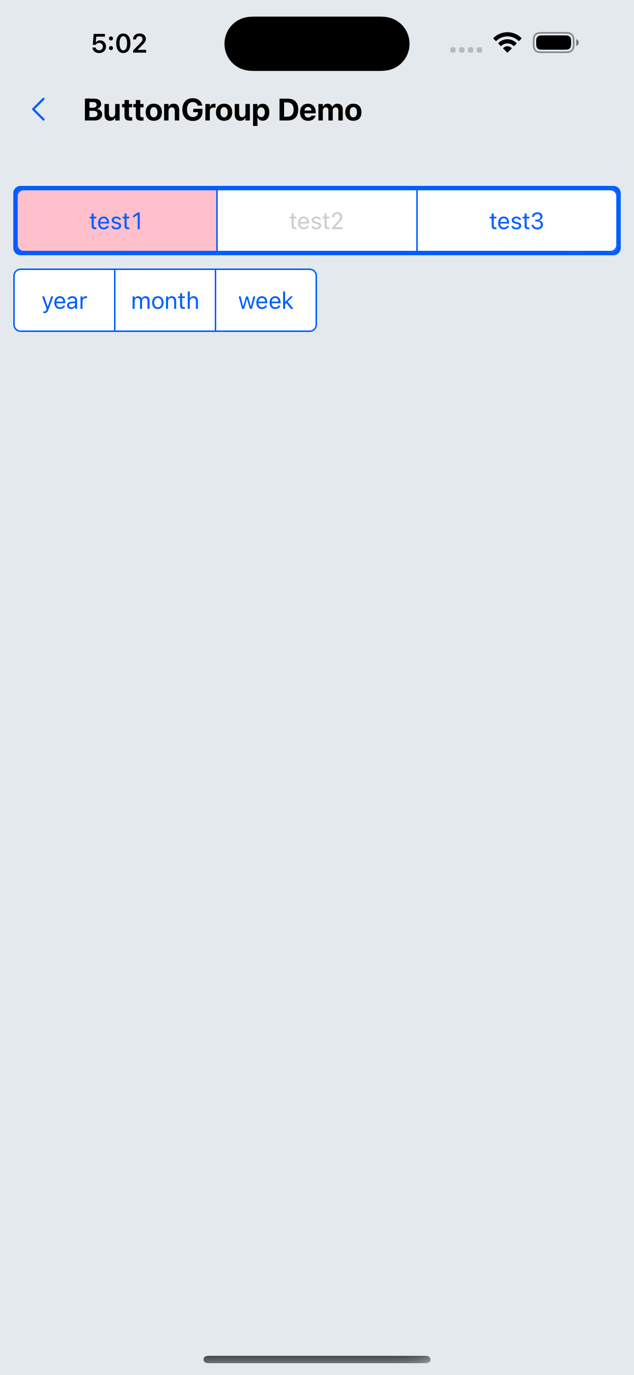
3. Custom style
<ButtonGroup
  options={[{ label: 'test1', style: { backgroundColor: 'pink' } }, { label: 'test2' }, { label: 'test3' }]}
  disabledItems={[1]}
containerStyle={{ padding: px(2), backgroundColor: '#005DFF', borderRadius: px(4) }}
/>
<WhiteSpace />
<ButtonGroup
options={[{ label: 'year' }, { label: 'month' }, { label: 'week' }]}
  size='x2'
  containerStyle={{ width: '50%' }}
/>
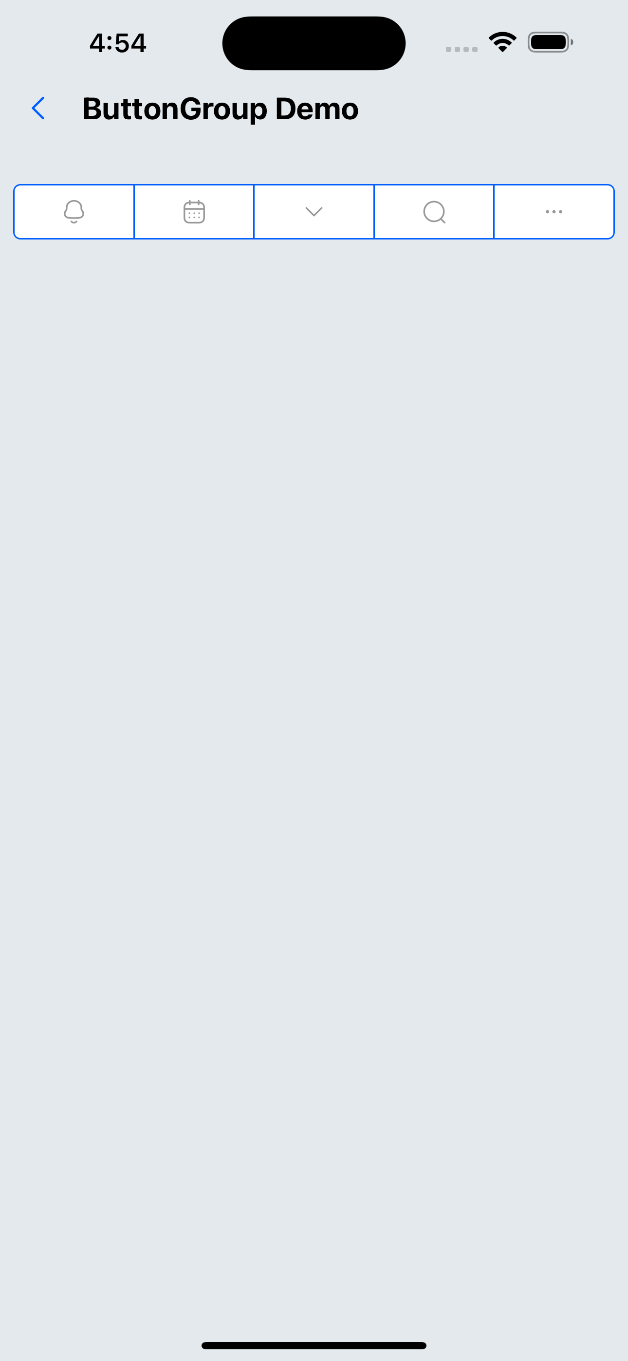
4. The content is a custom icon (component)
<ButtonGroup
  options={[
    {
      label: <SvgIcon name="bells" />,
    },
    {
      label: <SvgIcon name="date" />,
    },
    {
      label: <SvgIcon name="down" />,
    },
    {
      label: <SvgIcon name="search" />,
    },
    {
      label: <SvgIcon name="ellipsis" />,
    },
  ]}
/>
API
ButtonGroup API
| Properties | Required | Description | Type | Default Value |
|---|---|---|---|---|
| options | true | Specify optional options | Option[] | |
| size | false | Size | xxs | xs | s | m | l | xl | xxl | m |
| disabledItems | false | Set disabled items, the value is the array index of options | number[] | |
| activeIndex | false | Item in the clicked state by default, the value is the array index of options | number | |
| activeOpacity | false | Opacity when not disabled | number | 0.6 |
| itemStyle | false | Custom Item style | ViewStyle | |
| containerStyle | false | Custom container style | ViewStyle |
Option type
| Properties | Required | Description | Type | Default Value |
|---|---|---|---|---|
| label | true | text or component | ReactNode | |
| onPress | false | Pressed callback function | () => void | |
| style | false | Custom style | StyleProp<ViewStyle> |