SearchBar
Effect demonstration
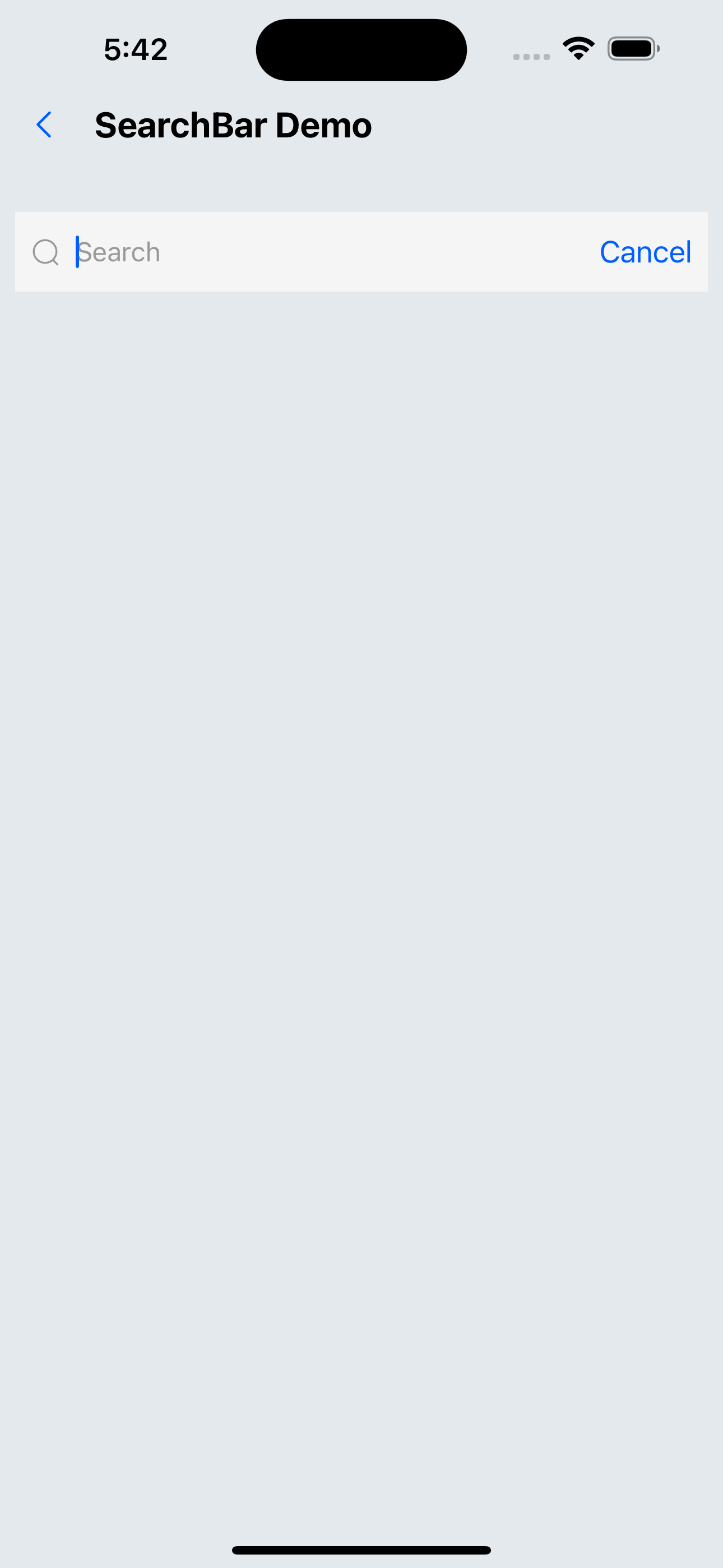
1. Default allocation
<SearchBar
  onChange={(value) => console.log(value)}
  onSearch={(value) => console.log(value)}
/>
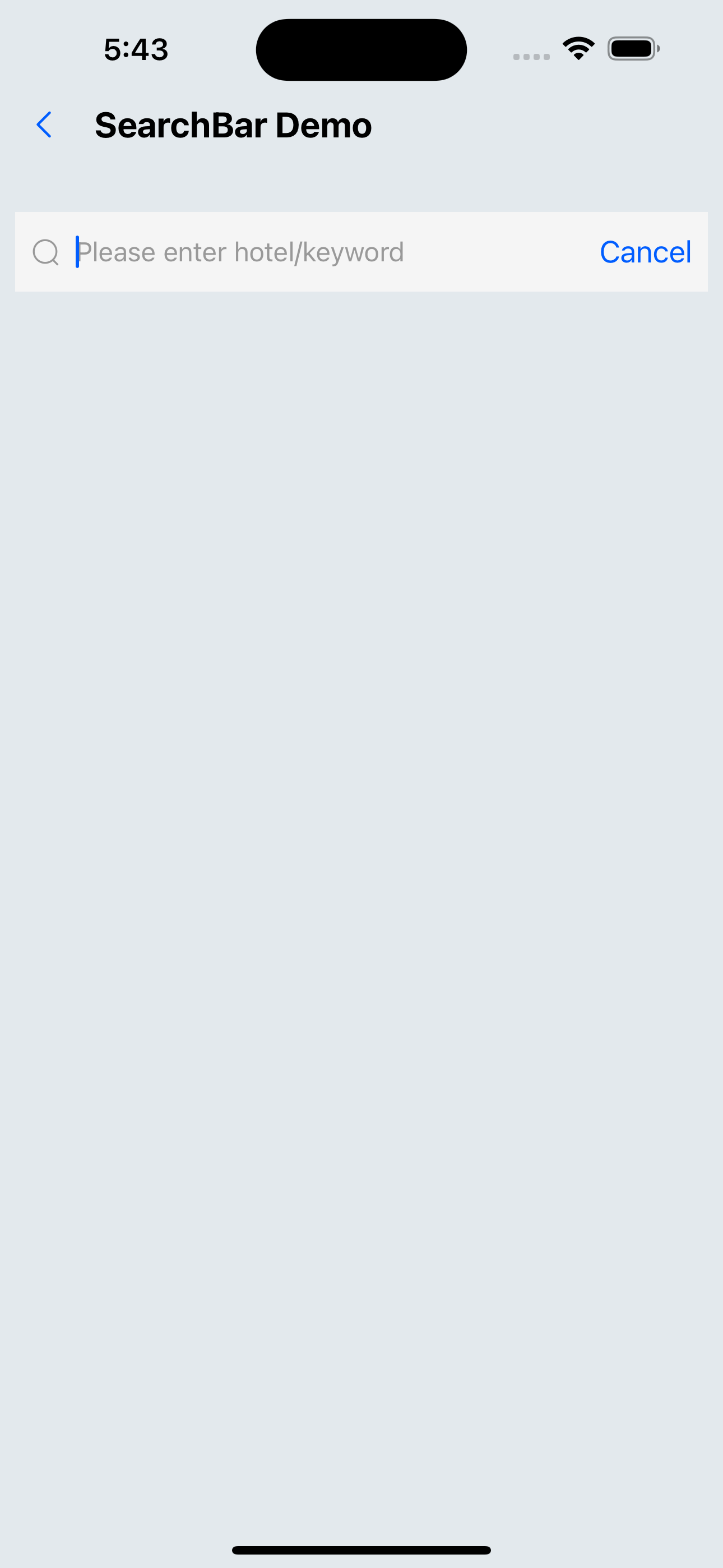
2. Configuration placeholder、cancelTitle
<SearchBar placeholder="Please enter hotel/keyword" cancelText="cancel" />
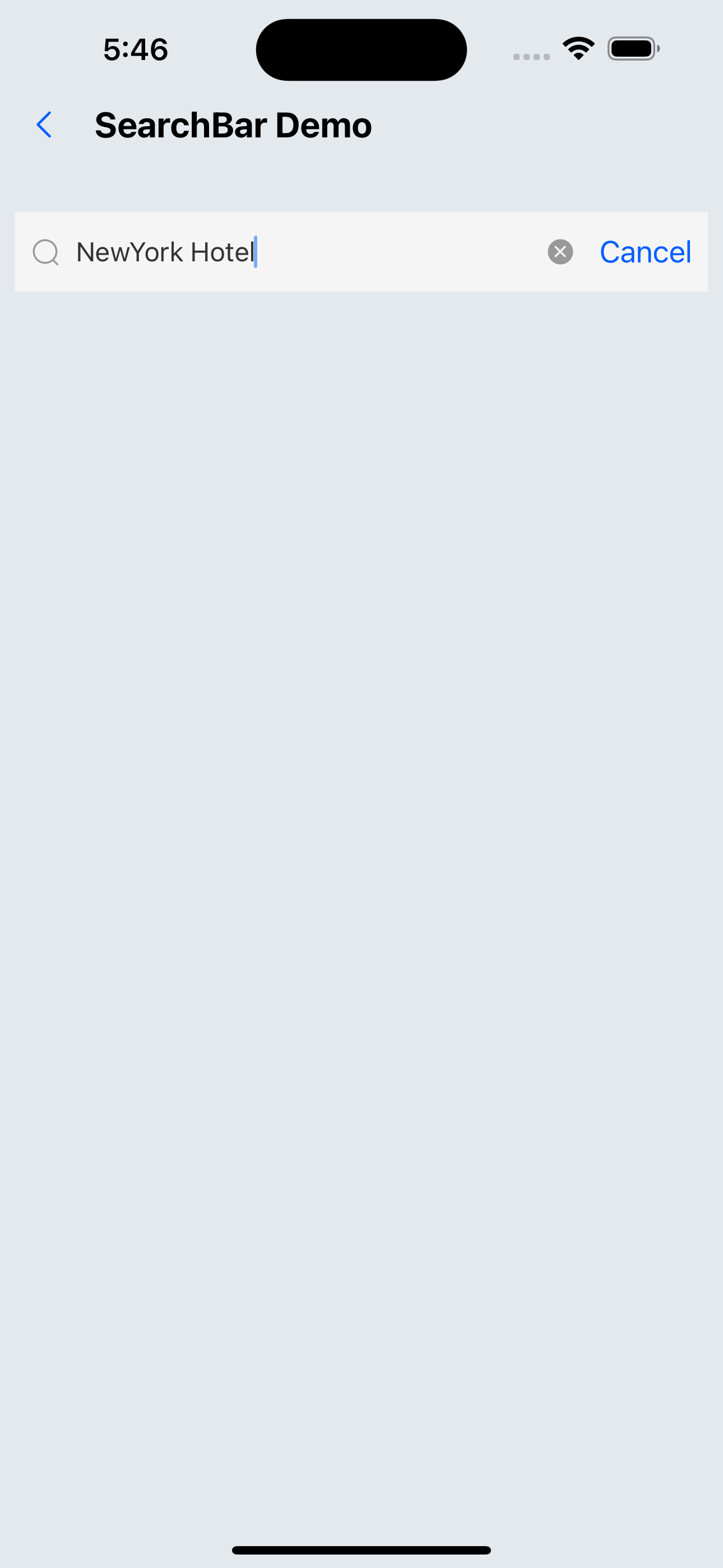
3. Configuration defaultValue、autoFocus
<SearchBar defaultValue="NewYork Hotel" autoFocus />
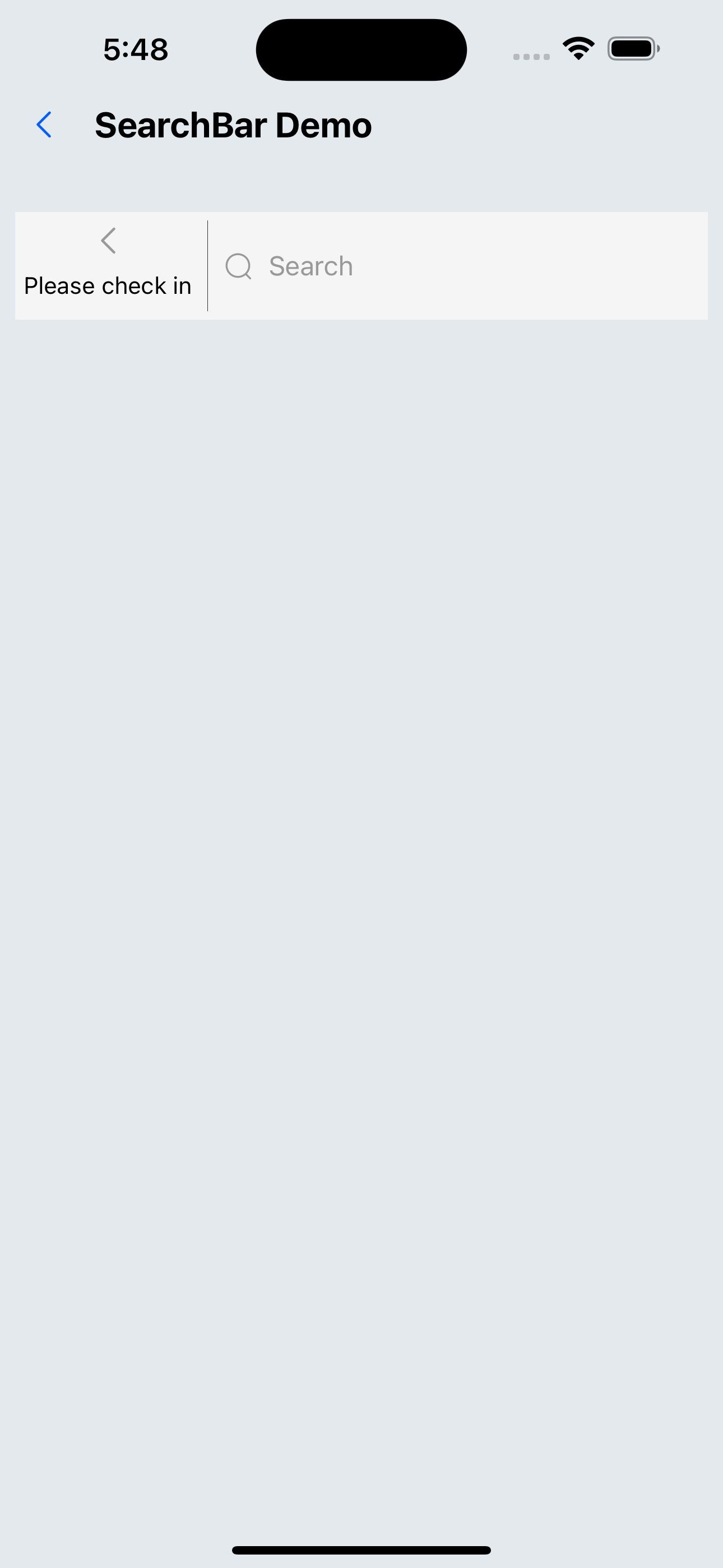
4. Configuration children
<SearchBar inputStyle={{ flex: 6 }} style={{ height: px(56) }}>
  <>
    <Flex flex={1}>
      <SvgIcon name="left" size={24} />
    </Flex>
    <Flex flex={2} height={px(40)} justifyContent="center">
      <Text>Please check in</Text>
    </Flex>
  </>
</SearchBar>
API
| Properties | Required | Description | Type | Default Value |
|---|---|---|---|---|
| placeholder | false | placeholder for the search box | string | search |
| showCancelButton | false | Whether to display the cancel button | boolean | true |
| allowClear | false | Whether to allow clearing | boolean | true |
| disabled | false | Whether the search box is disabled | boolean | false |
| defaultValue | false | The default value of the search box | string | |
| autoFocus | false | Whether to automatically focus | boolean | false |
| cancelText | false | Cancel text | string | Cancel |
| returnKeyType | false | The button type below the keyboard | ReturnKeyTypeOptions | search |
| keyboardType | false | Popup keyboard type | KeyboardTypeOptions | default |
| style | false | The style of the outermost view | ViewStyle | |
| inputStyle | false | input style | TextStyle | |
| onChange | false | Callback when input changes | (text: string) => void | |
| onSearch | false | Search on submission | (text: string) => void | |
| activeOpacity | false | The opacity of the cancel button when pressed | number | 0.6 |