FloatButton floating button component
Effect demonstration
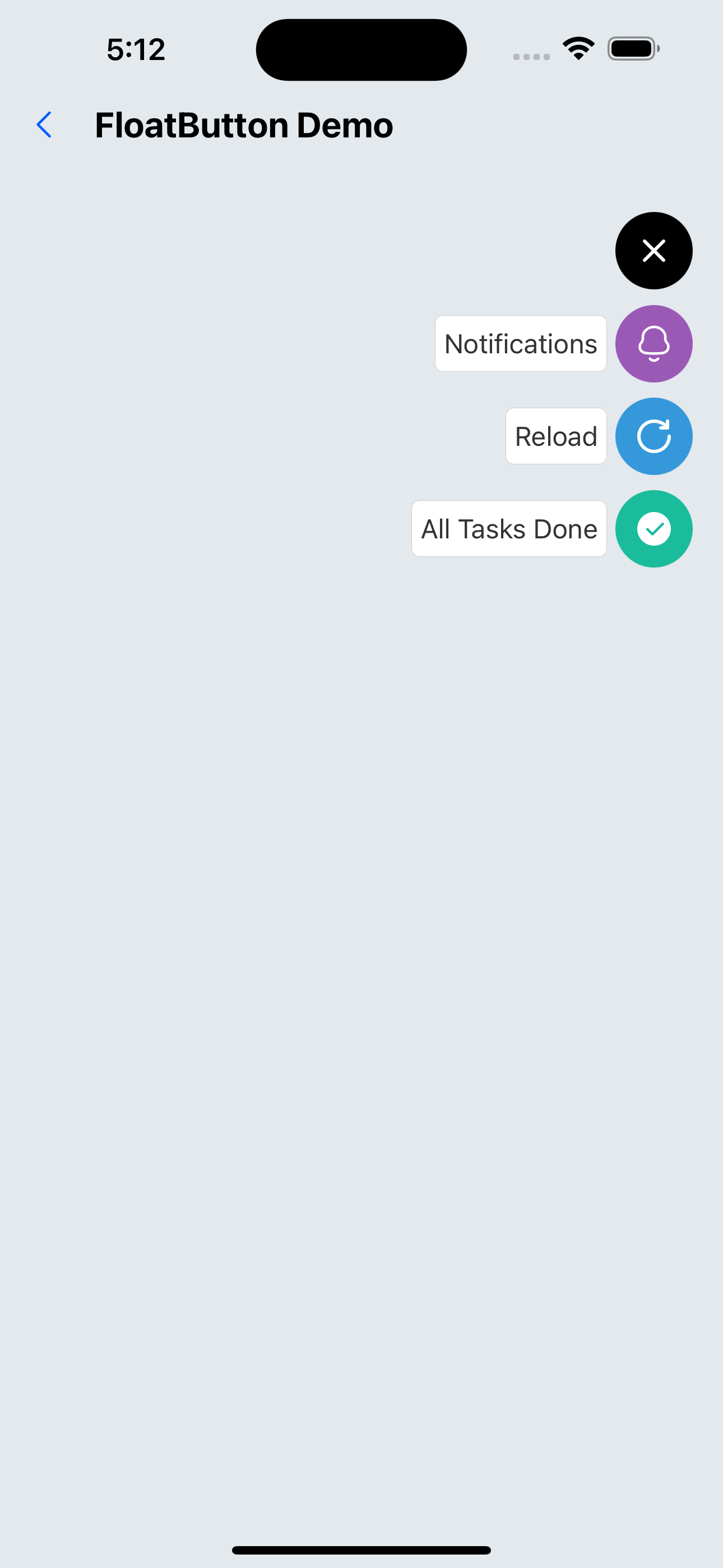
1. The floating button is in the upper right corner of the page
<FloatButton
  verticalOrientation="down"
  items={[
    {
      backgroundColor: "#9b59b6",
      title: "Notifications",
      icon: <SvgIcon name="bells" size={24} color={"white"} />,
    },
    {
      backgroundColor: "#3498db",
      title: "Reload",
      icon: <SvgIcon name="reload" size={24} color={"white"} />,
    },
    {
      backgroundColor: "#1abc9c",
      title: "All Tasks Done",
      icon: <SvgIcon name="checkcircle" size={24} color={"white"} />,
    },
  ]}
/>
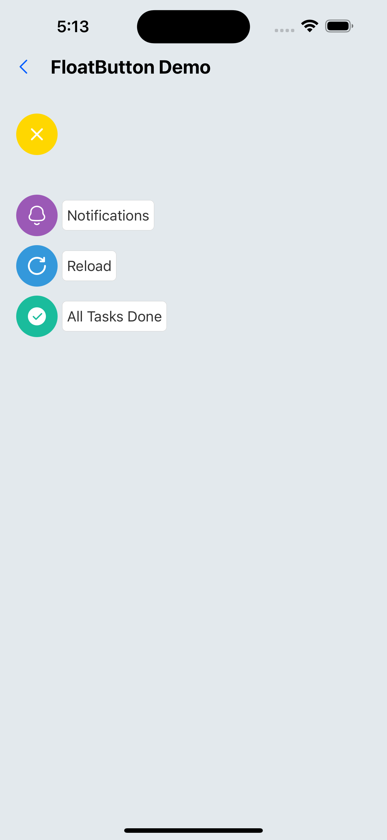
2. Custom style
<FloatButton
  buttonColor="rgba(231,76,60,1)"
  btnOutRange="gold"
  position="left"
  verticalOrientation="down"
  spacing={10}
  items={[
    {
      backgroundColor: "#9b59b6",
      title: "Notifications",
      icon: <SvgIcon name="bells" size={24} color={"white"} />,
    },
    {
      backgroundColor: "#3498db",
      title: "Reload",
      icon: <SvgIcon name="reload" size={24} color={"white"} />,
    },
    {
      backgroundColor: "#1abc9c",
      title: "All Tasks Done",
      icon: <SvgIcon name="checkcircle" size={24} color={"white"} />,
    },
  ]}
/>
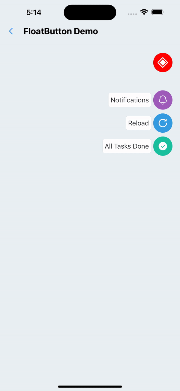
3. Custom floating button
<FloatButton
  buttonColor="gold"
  btnOutRange="red"
  position="right"
  verticalOrientation="down"
  customIcon={<SvgIcon name="checkboxHalfchecked" color="white" size={25} />}
  items={[
    {
      backgroundColor: "#9b59b6",
      title: "Notifications",
      icon: <SvgIcon name="bells" size={24} color={"white"} />,
    },
    {
      backgroundColor: "#3498db",
      title: "Reload",
      icon: <SvgIcon name="reload" size={24} color={"white"} />,
    },
    {
      backgroundColor: "#1abc9c",
      title: "All Tasks Done",
      icon: <SvgIcon name="checkcircle" size={24} color={"white"} />,
    },
  ]}
/>
API
FloatButton
| Properties | Required | Description | Type | Default Value |
|---|---|---|---|---|
| items | true | Expand button group | ActionButtonItemProps[] | |
| size | false | The size of the main button | number | 40 |
| verticalOrientation | false | Expand direction | up | down | up |
| buttonColor | false | The color of the button | string | black |
| btnOutRange | false | The color of the button after clicking | string | black |
| outRangeScale | false | The scaling ratio of the main button during animation | number | 1 |
| customIcon | false | Customize the icon of the main button | ReactNode | |
| position | false | The position of the main button | left | center | right | right |
| spacing | false | Spacing between expand buttons | number | 8 |
| style | false | The style of the entire container | ViewStyle | |
| activeOpacity | false | Opacity when pressed | number | 0.6 |
ActionButtonItemProps
| Properties | Required | Description | Type | Default Value |
|---|---|---|---|---|
| icon | true | button icon | ReactElement | |
| backgroundColor | true | The color of the button | string | |
| onPress | false | Button click event | () => void | |
| textStyle | false | The text style of the button | TextStyle | |
| textContainerStyle | false | The text container style of the button | ViewStyle | |
| title | false | The text title of the button | string | |
| spaceBetween | false | Spacing between buttons and icons | number | 4 |