Swipe Row
#SwipeRow -Slide operation
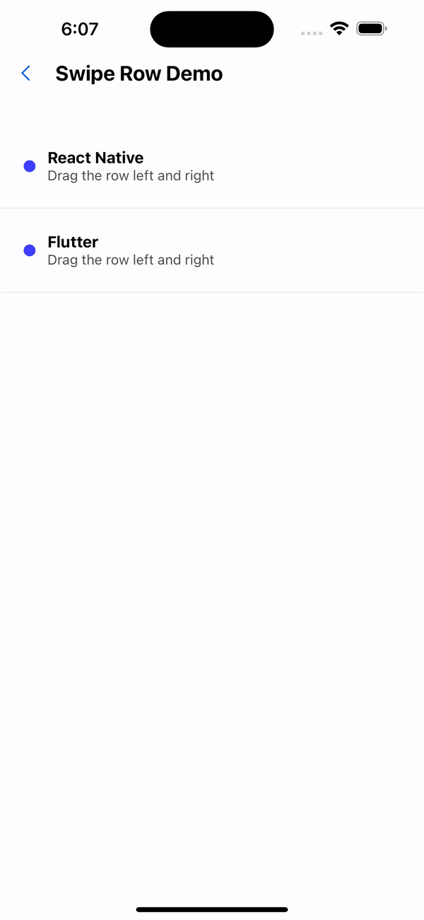
Effect demonstration
1. Default effect (default with delete action item)
<SwipeRowContextProvider>
  <FlatList
    data={[
      { id: 1, name: "React Native" },
      { id: 2, name: "Flutter" },
    ]}
    keyExtractor={(item) => item.id.toString()}
    renderItem={({ item, index }) => (
      <SwipeRow actionWidth={80} anchor={item.id}>
        <View style={styles.rowContent}>
          <View style={styles.rowIcon} />
          <View>
            <Text style={styles.rowTitle}>{item.name}</Text>
            <Text style={styles.rowSubtitle}>Drag the row left and right</Text>
          </View>
        </View>
      </SwipeRow>
    )}
  />
</SwipeRowContextProvider>
...
const styles = StyleSheet.create({
  rowContent: {
    backgroundColor: '#FFF',
    padding: 24,
    borderBottomWidth: 1,
    borderBottomColor: '#E3E9ED',
    flexDirection: 'row',
    alignItems: 'center',
  },
  rowIcon: {
    width: 12,
    height: 12,
    borderRadius: 99,
    backgroundColor: '#3f3efe',
    marginRight: 12,
  },
  rowTitle: {
    fontSize: 16,
    fontWeight: 'bold',
  },
  rowSubtitle: {
    fontSize: 14,
    fontWeight: '400',
    opacity: 0.7,
  },
});

2. Right slide action item
<SwipeRowContextProvider>
  <FlatList
    data={[
      { id: 1, name: "React Native" },
      { id: 2, name: "Flutter" },
    ]}
    keyExtractor={(item) => item.id.toString()}
    renderItem={({ item, index }) => (
      <SwipeRow
        anchor={item.id}
        actions={[
          {
            label: "warn",
            onPress: () => console.log("warn"),
            backgroundColor: "#4f7db0",
          },
        ]}
        actionWidth={80}
      >
        <View style={styles.rowContent}>
          <View style={styles.rowIcon} />
          <View>
            <Text style={styles.rowTitle}>{item.name}</Text>
            <Text style={styles.rowSubtitle}>Drag the row left and right</Text>
          </View>
        </View>
      </SwipeRow>
    )}
  />
</SwipeRowContextProvider>
...
const styles = StyleSheet.create({
  rowContent: {
    backgroundColor: '#FFF',
    padding: 24,
    borderBottomWidth: 1,
    borderBottomColor: '#E3E9ED',
    flexDirection: 'row',
    alignItems: 'center',
  },
  rowIcon: {
    width: 12,
    height: 12,
    borderRadius: 99,
    backgroundColor: '#3f3efe',
    marginRight: 12,
  },
  rowTitle: {
    fontSize: 16,
    fontWeight: 'bold',
  },
  rowSubtitle: {
    fontSize: 14,
    fontWeight: '400',
    opacity: 0.7,
  },
});
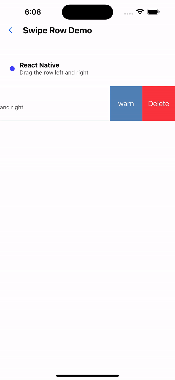
3. Override default action items
<SwipeRowContextProvider>
  <FlatList
    data={[
      { id: 1, name: "React Native" },
      { id: 2, name: "Flutter" },
    ]}
    keyExtractor={(item) => item.id.toString()}
    renderItem={({ item, index }) => (
      <SwipeRow
        anchor={item.id}
        actions={[
          {
            label: "warning",
            onPress: () => Alert.alert("Warning"),
            backgroundColor: "#4f7db0",
          },
        ]}
        actionWidth={80}
        overwriteDefaultActions
      >
        <View style={styles.rowContent}>
          <View style={styles.rowIcon} />
          <View>
            <Text style={styles.rowTitle}>{item.name}</Text>
            <Text style={styles.rowSubtitle}>Drag the row left and right</Text>
          </View>
        </View>
      </SwipeRow>
    )}
  />
</SwipeRowContextProvider>
API
SwipeRow
| Properties | Required | Description | Type | Default Value |
|---|---|---|---|---|
| anchor | true | As a basis for judging mutual exclusion of sliding operations | ReactText | |
| actions | false | Action items that slide out on the right side | SwipeAction[] | [] |
| height | false | row height | number | 60 |
| actionWidth | false | The width of each action item | number | height |
| onRemove | false | Delete event | () => void | |
| overwriteDefaultActions | false | Whether to overwrite the default action items | boolean | false |
| containerStyle | false | Slider style | ViewStyle | |
| contentContainerStyle | false | Slider subcomponent style | ViewStyle |
SwipeAction
| Properties | Required | Description | Type | Default Value |
|---|---|---|---|---|
| label | true | action text | string | |
| textStyle | false | Action item text style | TextStyle | |
| onPress | true | Action item click event | () => void | |
| backgroundColor | true | background color | string |