WingBlank Two wing blank components
**Tips: When the WingBlank component is used with the ScrollView component, be sure to use the WingBlank component as a subcomponent of the ScrollView component. **
Effect demonstration
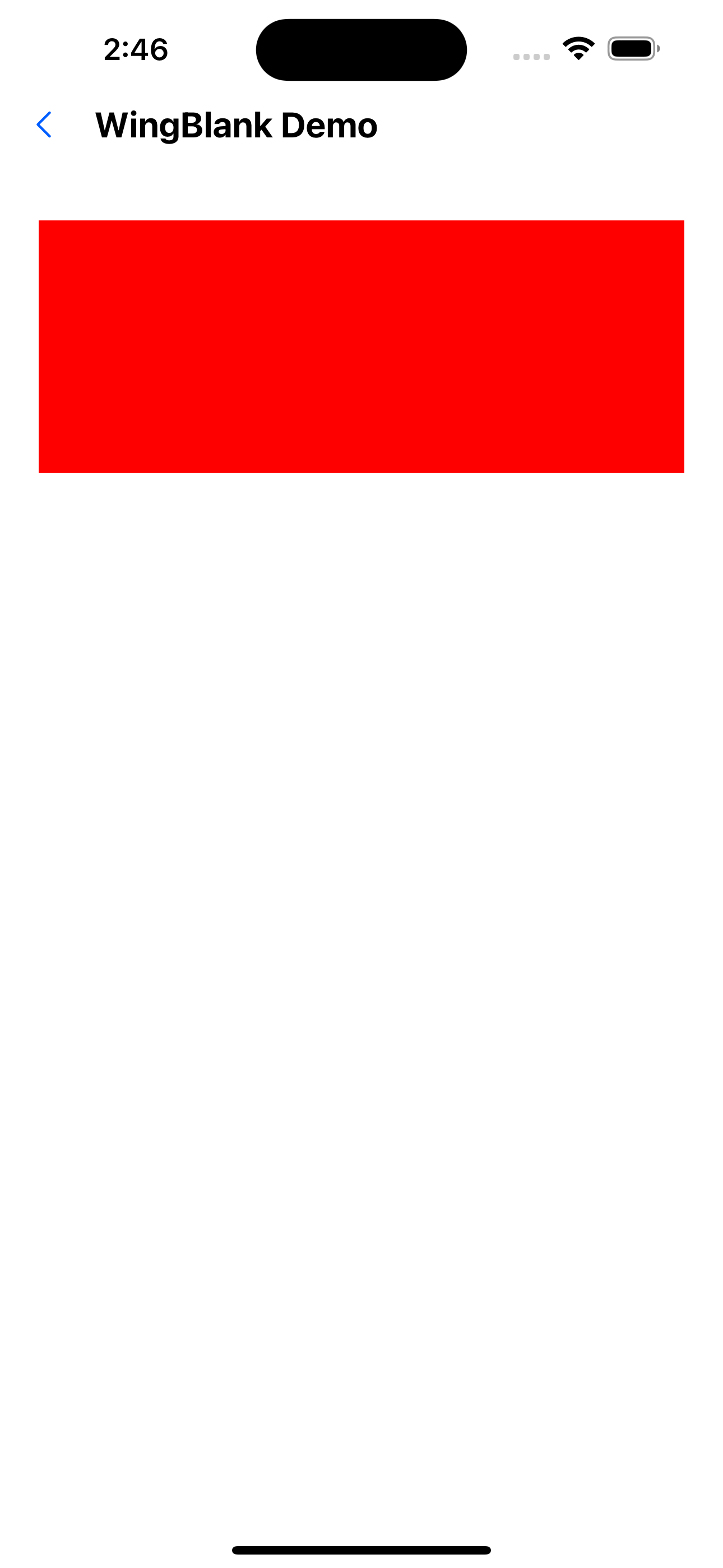
1. Default effect
<WingBlank>
  <View style={{ height: 150, backgroundColor: 'red' }} />
</WingBlank>
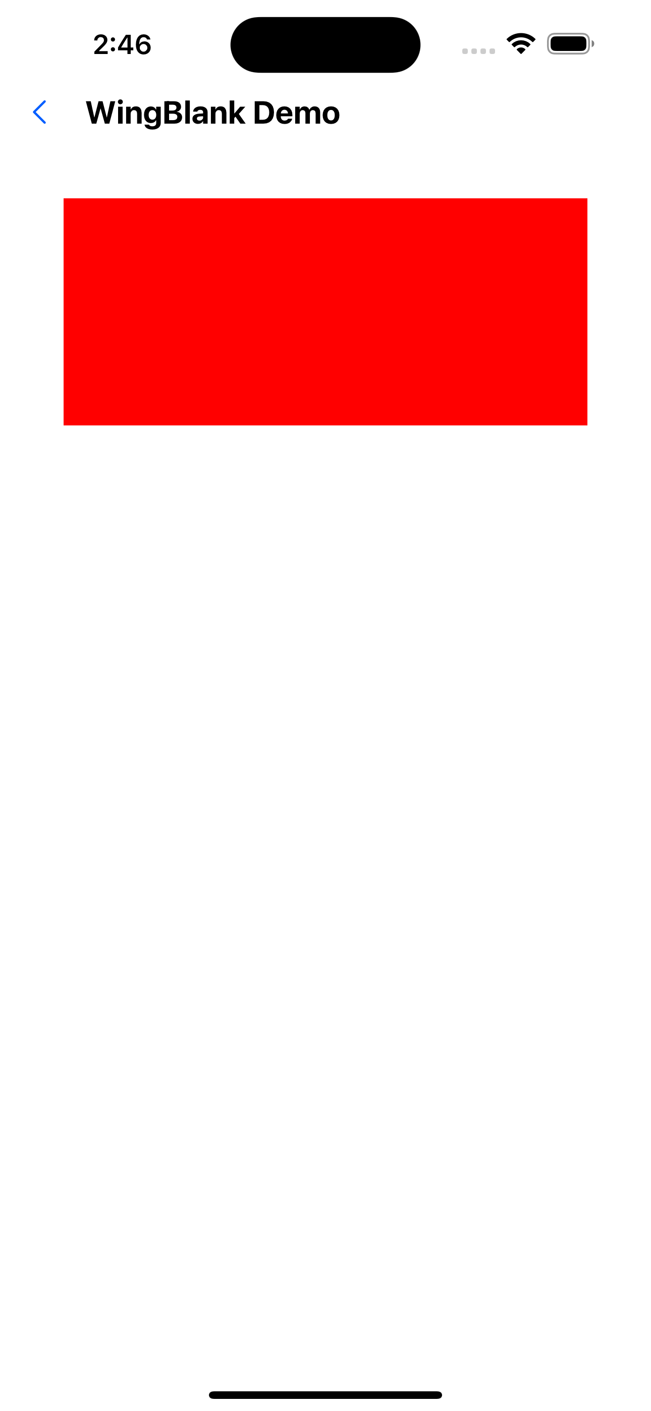
2. Revise size
<WingBlank size="x6">
  <View style={{ height: 150, backgroundColor: 'red' }} />
</WingBlank>
API
| Properties | Required | Description | Type | Default Value |
|---|---|---|---|---|
| size | false | The size of the two wings | xxs | xs | s | m | l | xl | xxl | m |
| children | true | wrapped child component | ReactNode |
The specific size corresponding to the value of _size is defined in spacing of the theme file. _