Flex layout component
Flex is a wrapper for CSS flex layout.
Effect demonstration
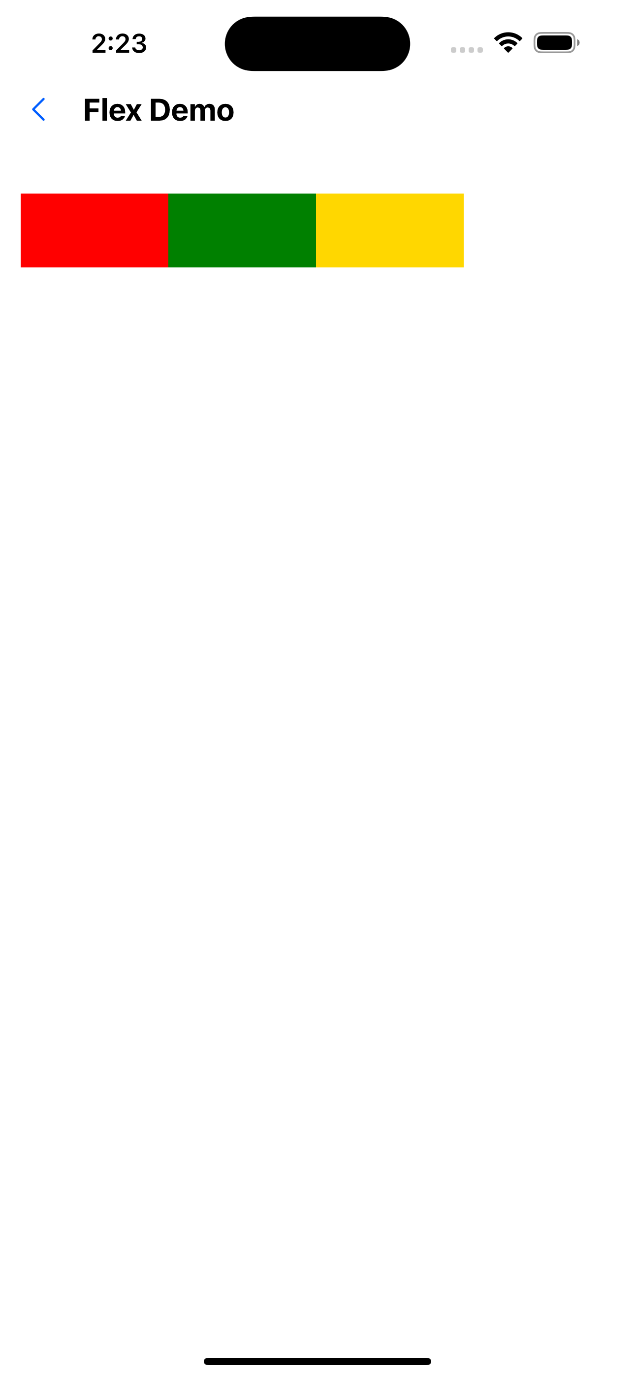
1. Horizontal direction
<Flex>
  <View style={{ width: 100, height: 50, backgroundColor: 'red' }} />
  <View style={{ width: 100, height: 50, backgroundColor: 'green' }} />
  <View style={{ width: 100, height: 50, backgroundColor: 'gold' }} />
</Flex>
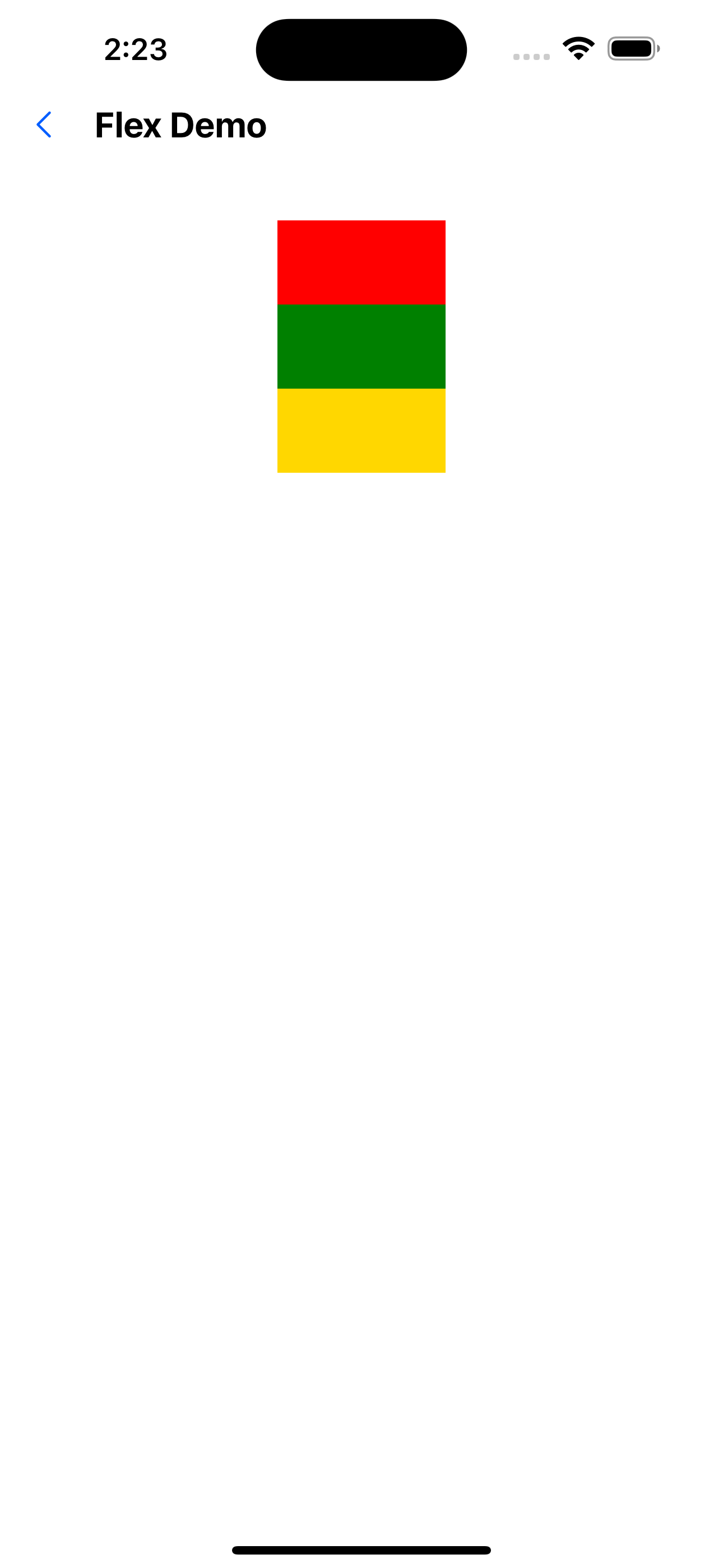
2. Vertical direction
<Flex flexDirection="column">
  <View style={{ width: 100, height: 50, backgroundColor: 'red' }} />
  <View style={{ width: 100, height: 50, backgroundColor: 'green' }} />
  <View style={{ width: 100, height: 50, backgroundColor: 'gold' }} />
</Flex>
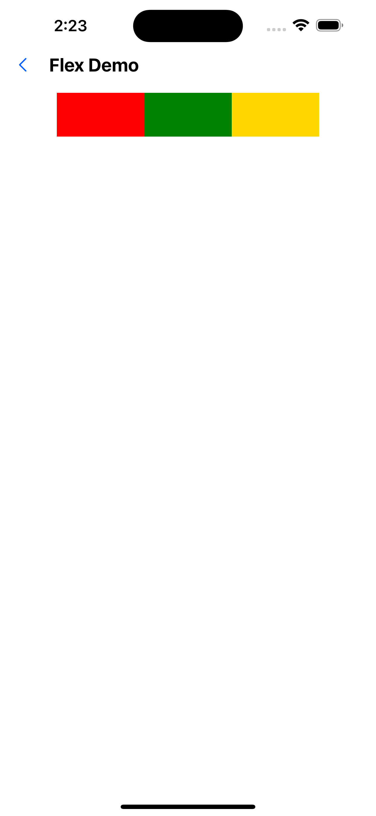
3. Center content
<Flex flex={1} justifyContent="center" alignItems="center">
  <View style={{ width: 100, height: 50, backgroundColor: 'red' }} />
  <View style={{ width: 100, height: 50, backgroundColor: 'green' }} />
<View style={{ width: 100, height: 50, backgroundColor: 'gold' }} />
</Flex>
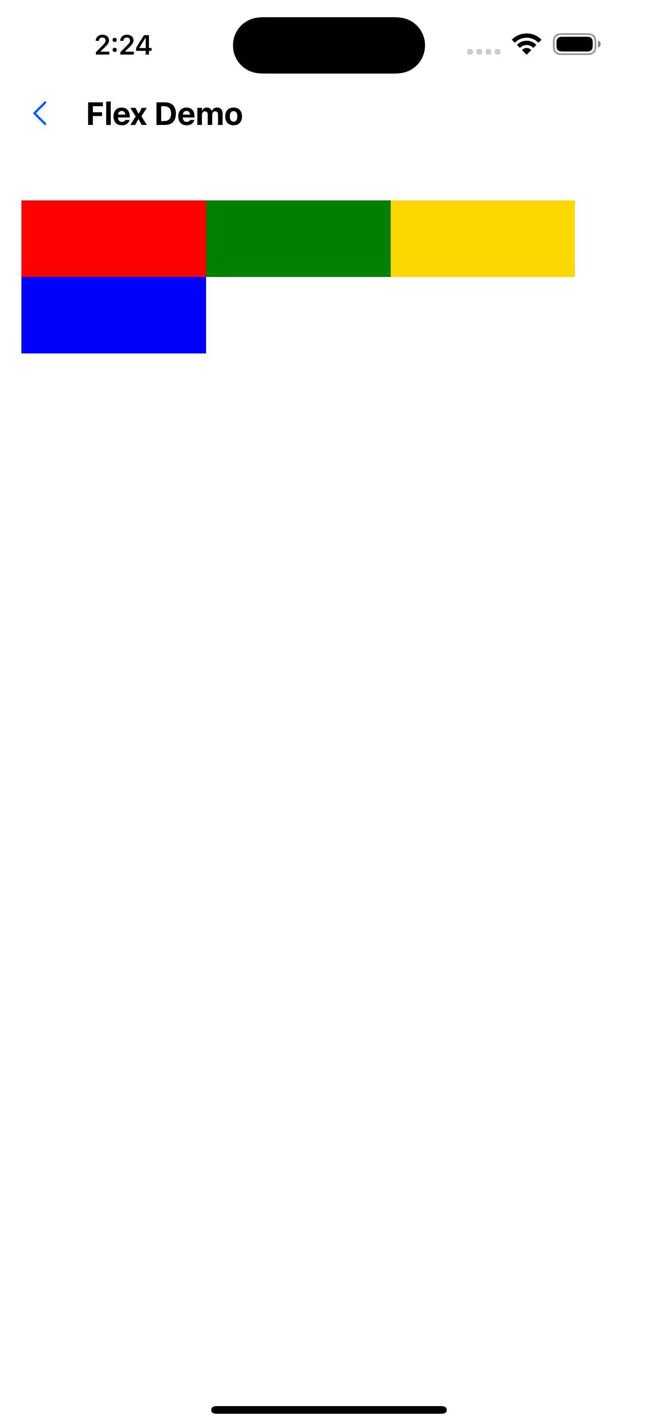
4. Automatic line wrapping
<Flex flexWrap="wrap">
  <View style={{ width: '30%', height: 50, backgroundColor: 'red' }} />
<View style={{ width: '30%', height: 50, backgroundColor: 'green' }} />
  <View style={{ width: '30%', height: 50, backgroundColor: 'gold' }} />
  <View style={{ width: '30%', height: 50, backgroundColor: 'blue' }} />
</Flex>
API
Basic attributes
| Properties | Required | Description | Type | Default Value |
|---|---|---|---|---|
| backgroundColor | false | Background color. The value is colors in Theme | string | |
| style | false | style | ViewStyle |
Width and height layout related attributes
For definition, see: https://reactnative.dev/docs/layout-props
| Properties | Required | Description | Type | Default Value |
|---|---|---|---|---|
| width | false | |||
| minWidth | false | |||
| maxWidth | false | |||
| height | false | |||
| maxHeight | false | |||
| minHeight | false | |||
| flex | false | |||
| flexDirection | false | |||
| flexBasis | false | |||
| flexGrow | false | |||
| flexShrink | false | |||
| flexWrap | false | |||
| alignContent | false | |||
| alignItems | false | |||
| alignSelf | false | |||
| justifyContent | false | |||
| aspectRatio | false | |||
| overflow | false |
Padding and margin related properties
The value is spacing in Theme.
For definition, see: https://reactnative.dev/docs/layout-props
| Properties | Required | Description | Type | Default Value |
|---|---|---|---|---|
| margin | false | |||
| marginStart | false | |||
| marginEnd | false | |||
| marginHorizontal | false | |||
| marginVertical | false | |||
| marginLeft | false | |||
| marginRight | false | |||
| marginBottom | false | |||
| marginTop | false | |||
| padding | false | |||
| paddingStart | false | |||
| paddingEnd | false | |||
| paddingHorizontal | false | |||
| paddingVertical | false | |||
| paddingLeft | false | |||
| paddingRight | false | |||
| paddingBottom | false | |||
| paddingTop | false |
Border related properties
For the definition, see: https://reactnative.dev/docs/view-style-props
| Properties | Required | Description | Type | Default Value |
|---|---|---|---|---|
| borderWidth | false | |||
| borderLeftWidth | false | |||
| borderRightWidth | false | |||
| borderBottomWidth | false | |||
| borderTopWidth | false | |||
| borderStartWidth | false | |||
| borderEndWidth | false | |||
| borderStyle | false | |||
| borderColor | false | |||
| borderStartColor | false | |||
| borderEndColor | false | |||
| borderLeftColor | false | |||
| borderRightColor | false | |||
| borderBottomColor | false | |||
| borderTopColor | false | |||
| borderRadius | false | |||
| borderBottomStartRadius | false | |||
| borderBottomEndRadius | false | |||
| borderBottomLeftRadius | false | |||
| borderBottomRightRadius | false | |||
| borderTopStartRadius | false | |||
| borderTopEndRadius | false | |||
| borderTopLeftRadius | false | |||
| borderTopRightRadius | false |
Flex.Item
The Flex.Item component is added with the style flex:1 by default to ensure that all items share the width equally. The children of the Flex container are not necessarily Flex.Item.