Text component
The text component is mainly based on the restyle package, replacing the react-native default Text component.
**Note: The Text component has removed the properties onLongPress/onPress/onPressIn/onPressOut (Why) . Therefore, you cannot use click events directly on the Text component. If necessary, please use components such as Pressable or Touchable* to wrap the Text component to achieve the same effect. **
Effect demonstration
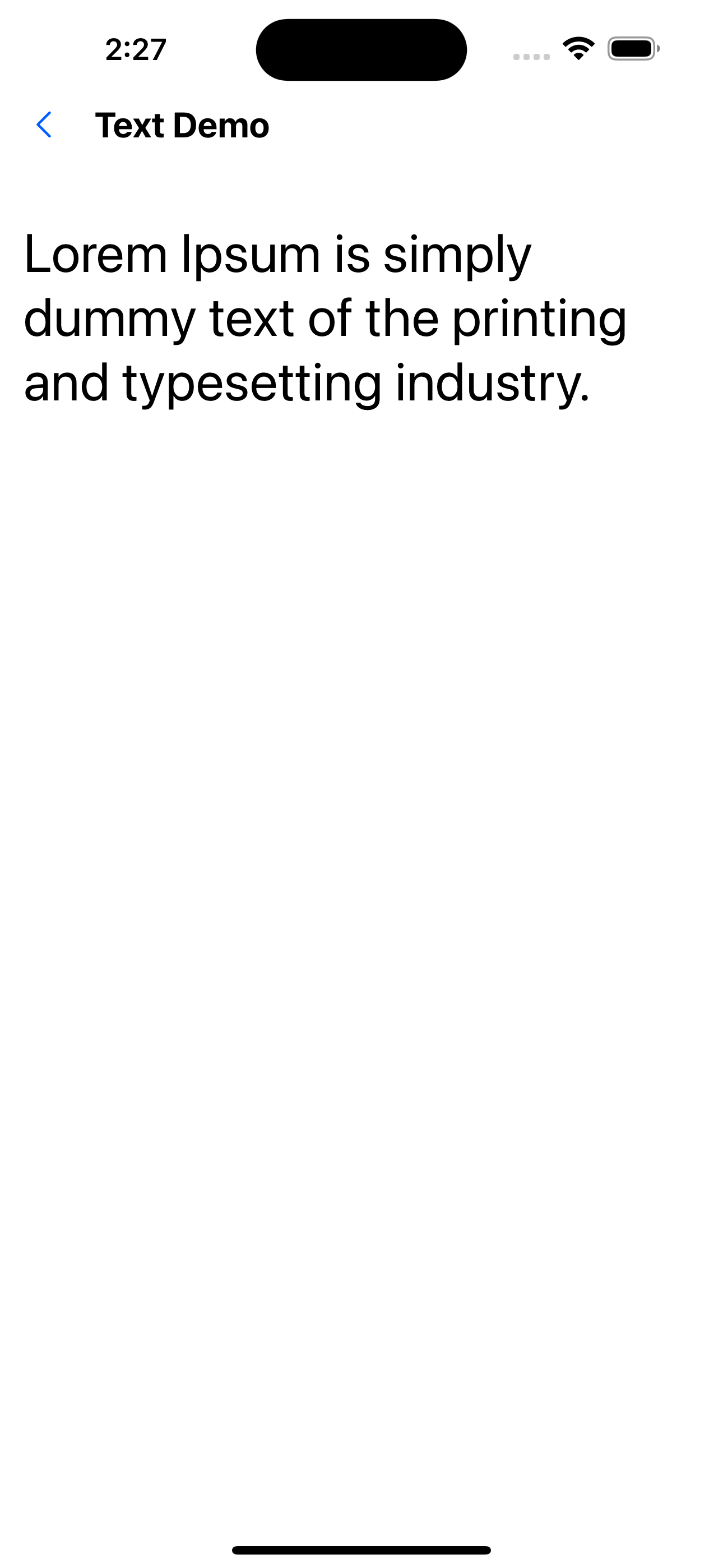
1. Font size 32
<Text fontSize={32}>
  Lorem Ipsum is simply dummy text of the printing and typesetting industry.
</Text>
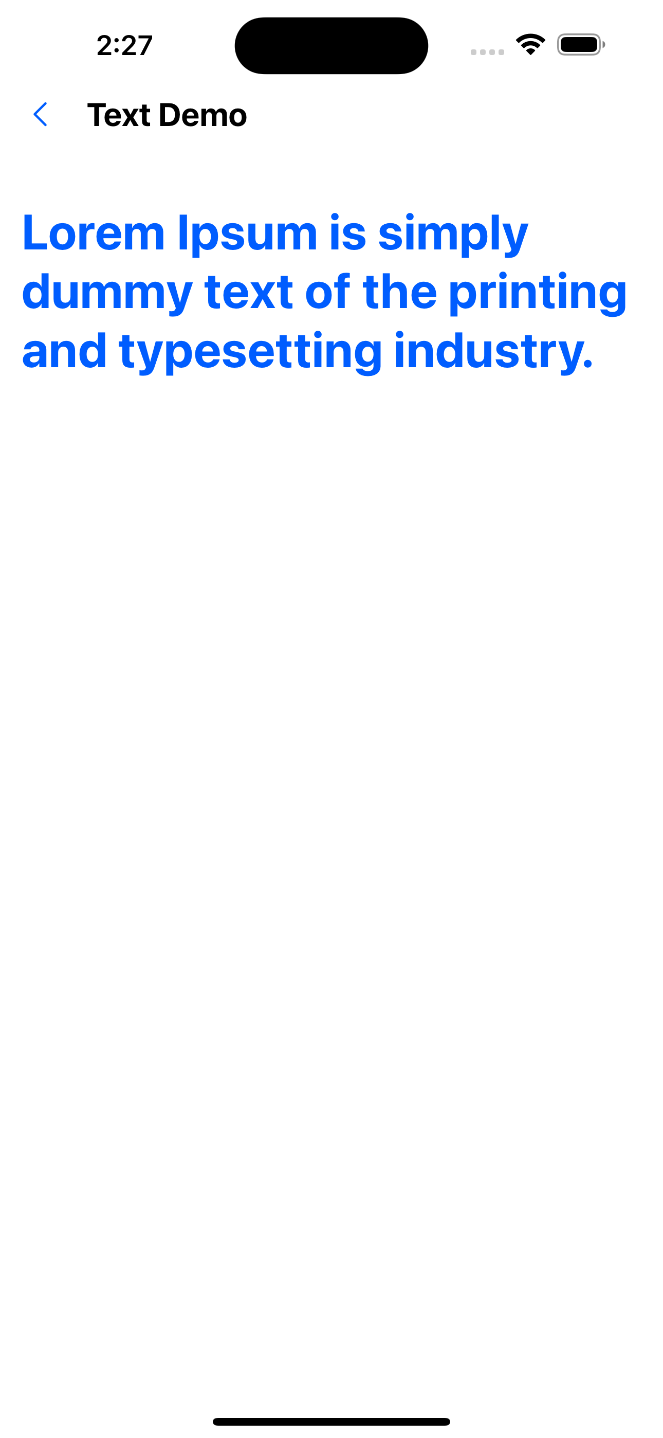
2. The color is blue and the font is bold.
<Text fontSize={32} color="primaryColor" fontWeight="bold">
  Lorem Ipsum is simply dummy text of the printing and typesetting industry.
</Text>
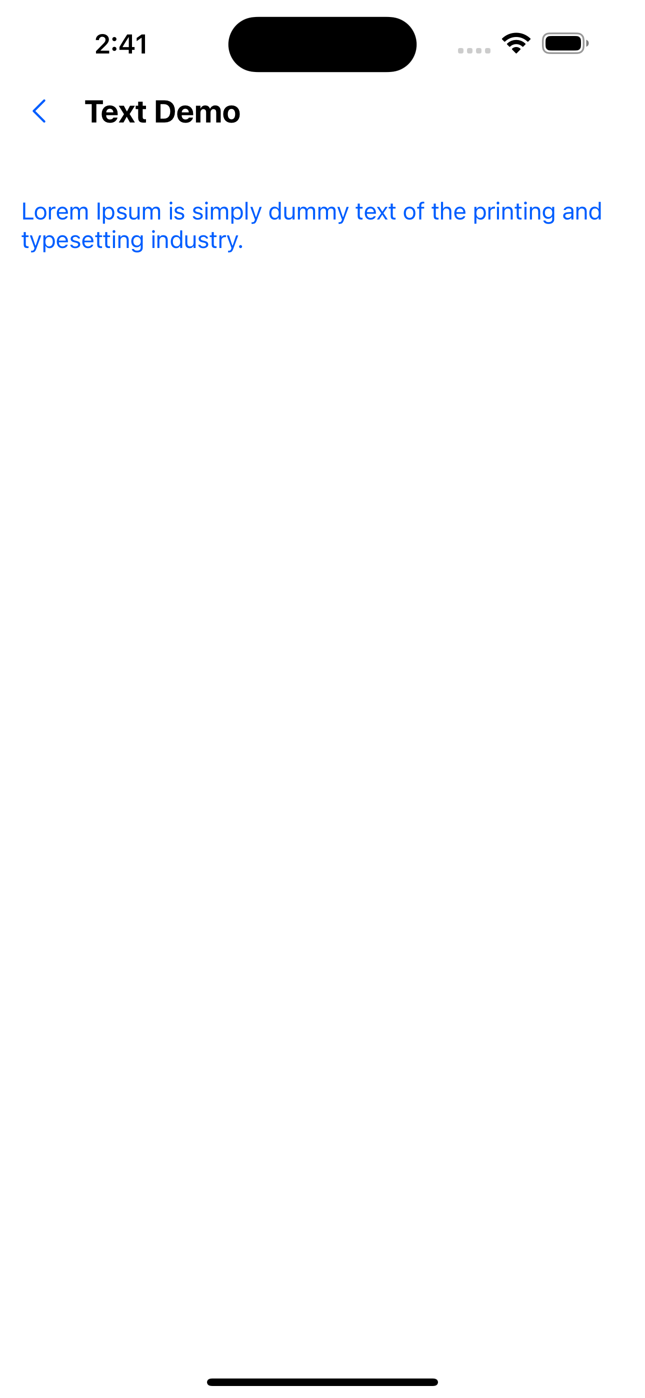
3. Variant usage example
<Text variant="primaryBody">Hello, I am text</Text>
primaryBody is defined in src/themes as:
const extraVariants = {
  ...
  primaryBody: {
    fontSize: 16,
    color: 'primaryTextColor',
  }
}
export const lightTheme = {
  ...theme.lightTheme,
  colors: {
    ...theme.lightTheme.colors,
    ...
    primaryTextColor: theme.lightTheme.colors.primary200,
  },
  ...
};
export const darkTheme: AppTheme = {
  ...theme.darkTheme,
  colors: {
    ...theme.darkTheme.colors,
    ...
    primaryTextColor: theme.lightTheme.colors.primary100,
  },
  ...
};
API
Except for the style attributes, other attributes are consistent with TextProps. Style attributes are based on restyle, which flattens the properties originally wrapped in style and adopts the constraints defined in Theme.
Unique properties
| Properties | Required | Description | Type | Default Value |
|---|---|---|---|---|
| variant | false | The value is the key value in the textVariants object defined in Theme | string |
Text attributes
For the definition, see: https://reactnative.dev/docs/text-style-props
| Properties | Required | Description | Type | Default Value |
|---|---|---|---|---|
| color | false | Text color. The value is colors | string | |
| opacity | false | Transparency. Value 0 -1 | number | 1 |
| visible | false | Whether it is visible | boolean | true |
| fontFamily | false | |||
| fontSize | false | |||
| fontStyle | false | |||
| fontWeight | false | |||
| letterSpacing | false | |||
| lineHeight | false | |||
| textAlign | false | |||
| textDecorationLine | false | |||
| textDecorationStyle | false | |||
| textTransform | false | |||
| textShadowOffset | false | |||
| textShadowRadius | false | |||
| textShadowColor | false | Text shadow color. The value is colors in Theme |
Padding and margin related properties
The value is spacing in Theme.
For definition, see: https://reactnative.dev/docs/layout-props
| Properties | Required | Description | Type | Default Value |
|---|---|---|---|---|
| margin | false | |||
| marginStart | false | |||
| marginEnd | false | |||
| marginHorizontal | false | |||
| marginVertical | false | |||
| marginLeft | false | |||
| marginRight | false | |||
| marginBottom | false | |||
| marginTop | false | |||
| padding | false | |||
| paddingStart | false | |||
| paddingEnd | false | |||
| paddingHorizontal | false | |||
| paddingVertical | false | |||
| paddingLeft | false | |||
| paddingRight | false | |||
| paddingBottom | false | |||
| paddingTop | false |