Divider dividing line component
A divider is a thin line that groups content in lists and layouts.
Effect demonstration
1. Default effect
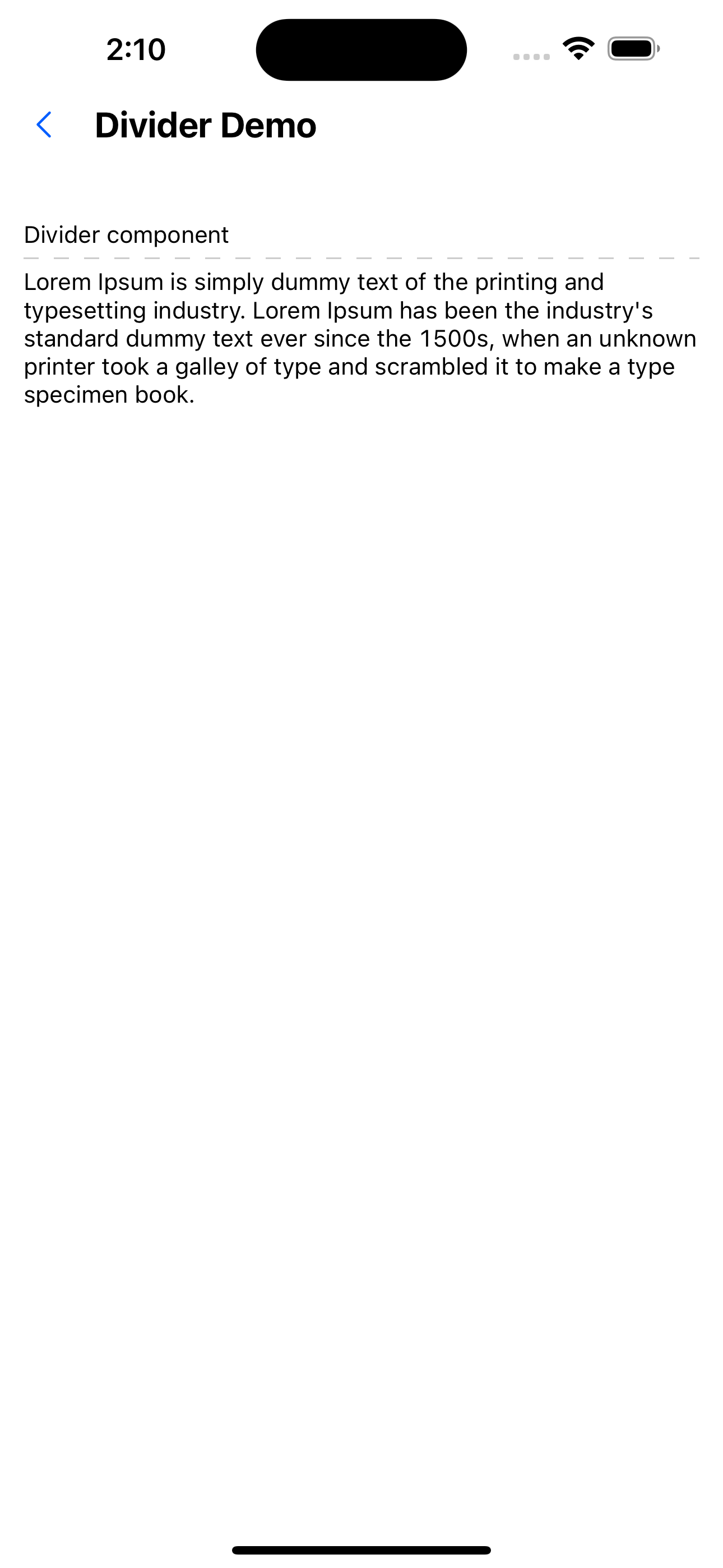
<Text>Divider component</Text>
<Divider />
<Text>
  Lorem Ipsum is simply dummy text of the printing and typesetting
  industry. Lorem Ipsum has been the industry's standard dummy text ever
  since the 1500s, when an unknown printer took a galley of type and
  scrambled it to make a type specimen book.
</Text>

2. The dividing line is a dotted line
<Text>Divider component</Text>
<Divider type="dashed" />
<Text>Divider component</Text>
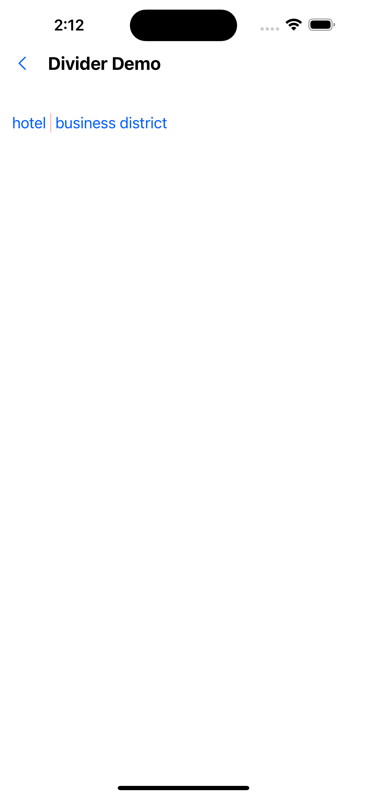
3. Vertical divider
<Flex>
  <Text variant="p0" color="primary200">
    hotel
  </Text>
  <Divider color="red" axis="vertical" height={px(20)} />
  <Text variant="p0" color="primary200">
    business district
  </Text>
</Flex>
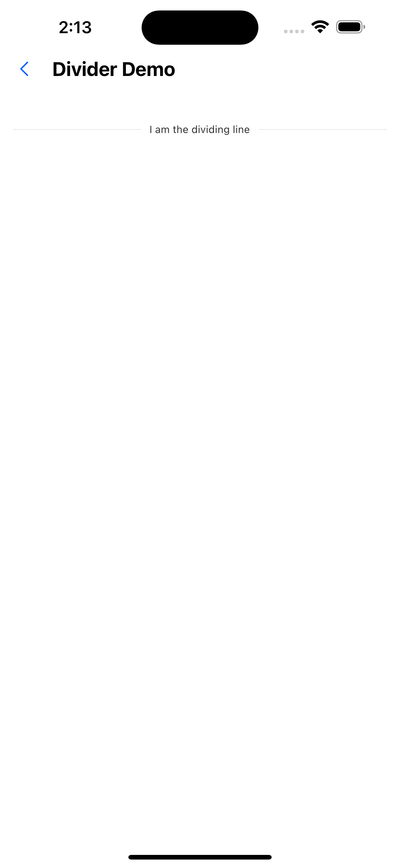
4. Separator with text
<Divider text="I am the dividing line" />
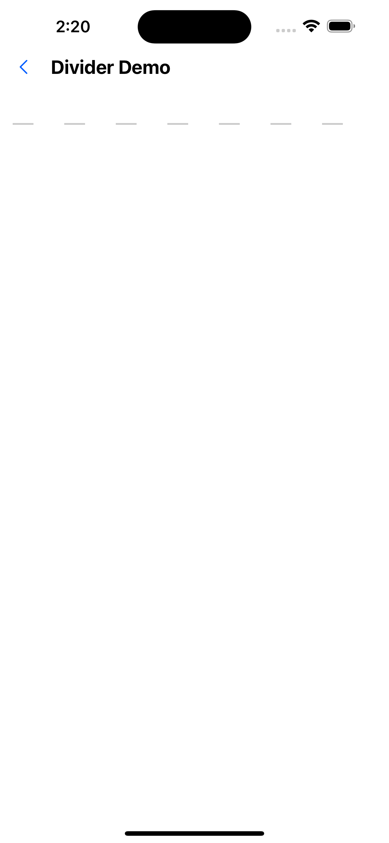
5. Custom dotted line separator
<Divider
  type="dashed"
  dashGap={px(30)}
  dashLength={px(20)}
  dashThickness={px(2)}
/>
API
| Properties | Required | Description | Type | Default Value |
|---|---|---|---|---|
| type | false | Splitting line type | solid | dashed | solid |
| axis | false | Splitting line direction | horizontal | vertical | horizontal |
| height | false | The height of the dividing line when vertical | number | 12 |
| color | false | dividing line color | string | #bbbbbb |
| margin | false | Horizontal top and bottom margins, vertical left and right margins | xxs | xs | s | m | l | xl \ | xxl |
| text | false | Split line text (only supports horizontal split lines) | string | |
| textAlign | false | Split line text position | left | center | right | center |
| dashGap | false | Dash gap width | number | |
| dashLength | false | Single dash line width | number | |
| dashThickness | false | dash thickness | number |