Card card component
Cards contain content and actions about a single subject.
Effect demonstration
1. Standard Card
<Card
  icon={<SvgIcon name="bells" size={24} color={theme.colors.primary200} />}
  title={"I am the title"}
  extra="Description text"
  footer={
    <Box>
      <Text variant="h4">Bottom text</Text>
    </Box>
  }
>
  <Text variant="d3">
    Lorem Ipsum is simply dummy text of the printing and typesetting industry.
    Lorem Ipsum has been the industry's standard dummy text ever since the
    1500s, when an unknown printer took a galley of type and scrambled it to
    make a type specimen book.
  </Text>
</Card>

2. Card without footer
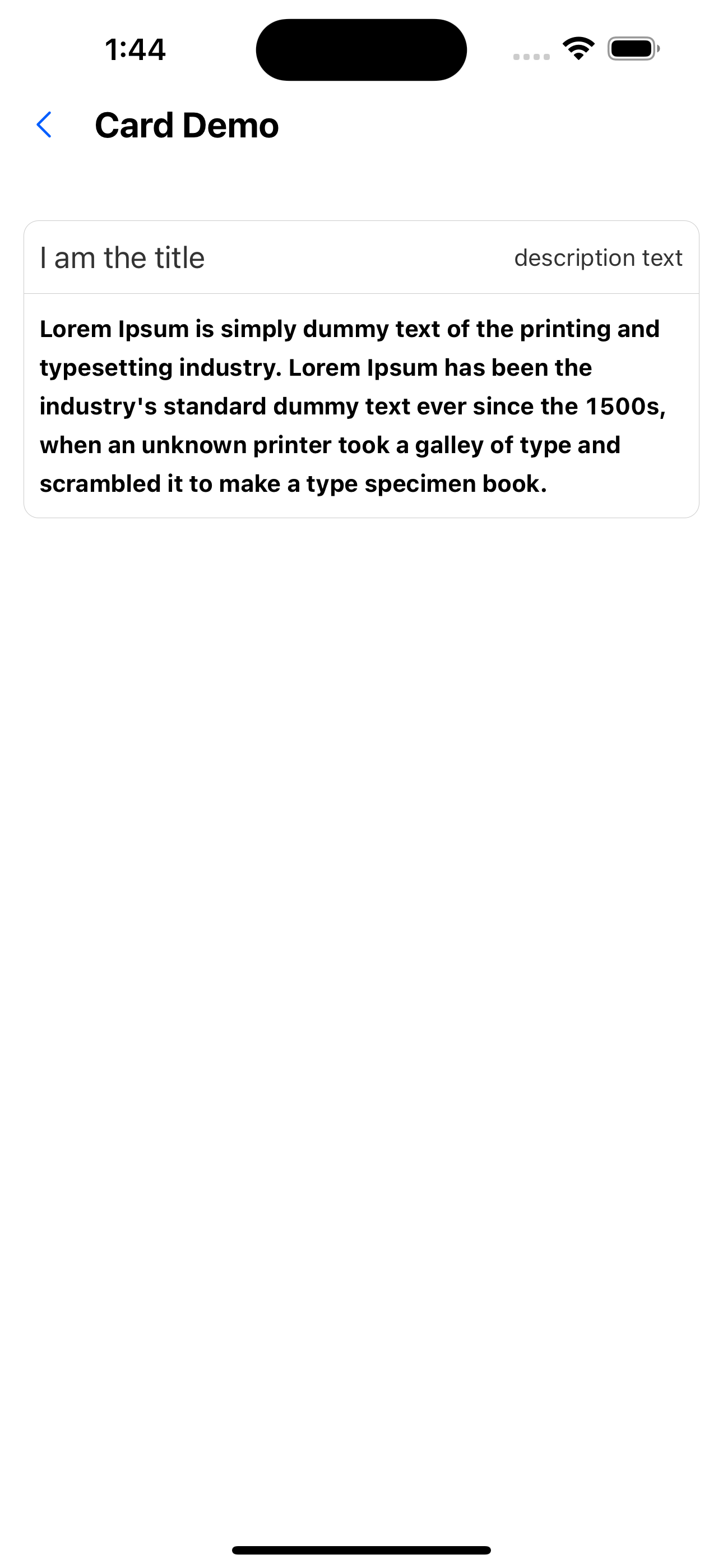
<Card title="I am the title" extra="description text">
  <Text variant="h4">
    Lorem Ipsum is simply dummy text of the printing and typesetting industry.
    Lorem Ipsum has been the industry's standard dummy text ever since the
    1500s, when an unknown printer took a galley of type and scrambled it to
    make a type specimen book.
  </Text>
</Card>
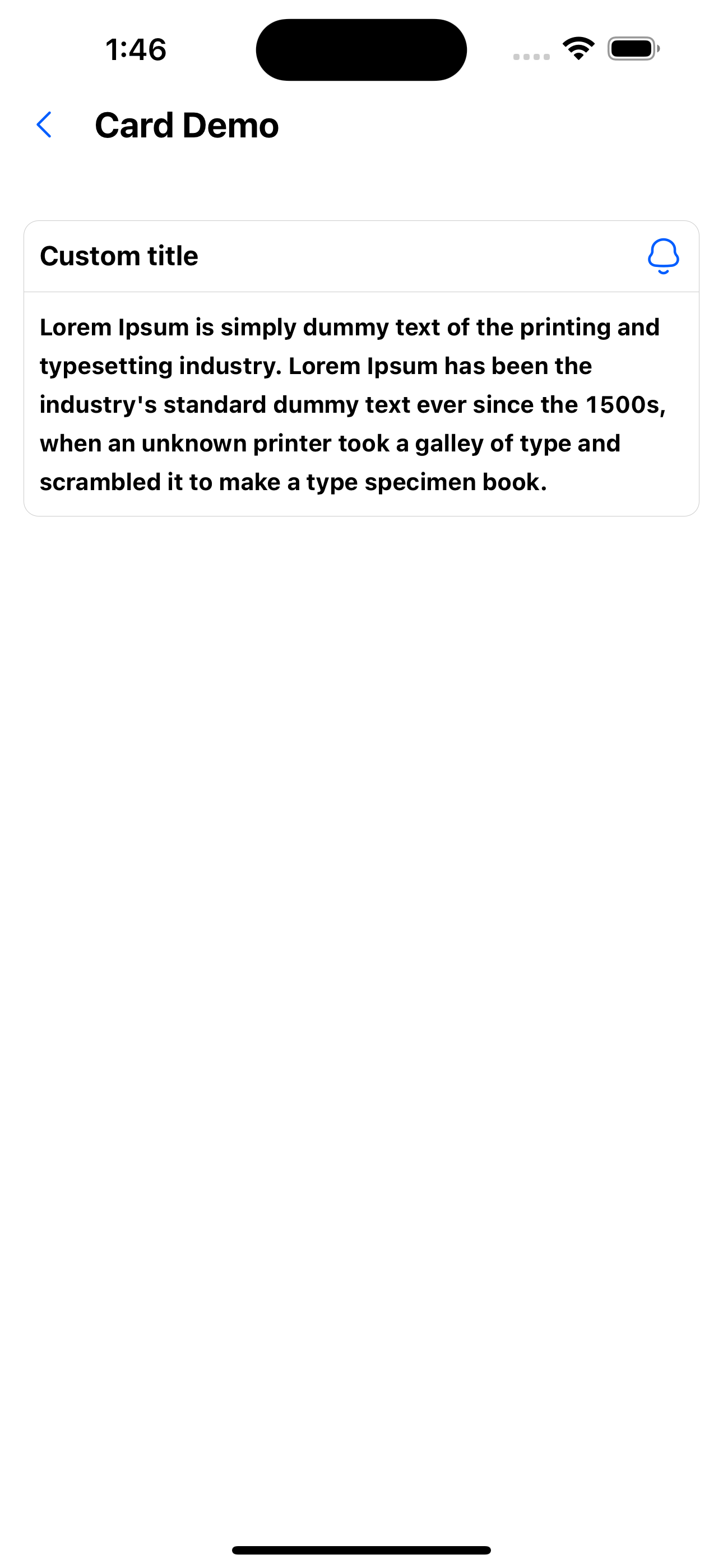
3. Customize Header Card
<Card
  renderHeader={() => (
    <Box flexDirection={"row"} justifyContent={"space-between"}>
      <Text variant="h3">Custom title</Text>
      <SvgIcon name="bells" size={24} color={theme.colors.primary200} />
    </Box>
  )}
>
  <Text variant="h4">
    Lorem Ipsum is simply dummy text of the printing and typesetting industry.
    Lorem Ipsum has been the industry's standard dummy text ever since the
    1500s, when an unknown printer took a galley of type and scrambled it to
    make a type specimen book.
  </Text>
</Card>
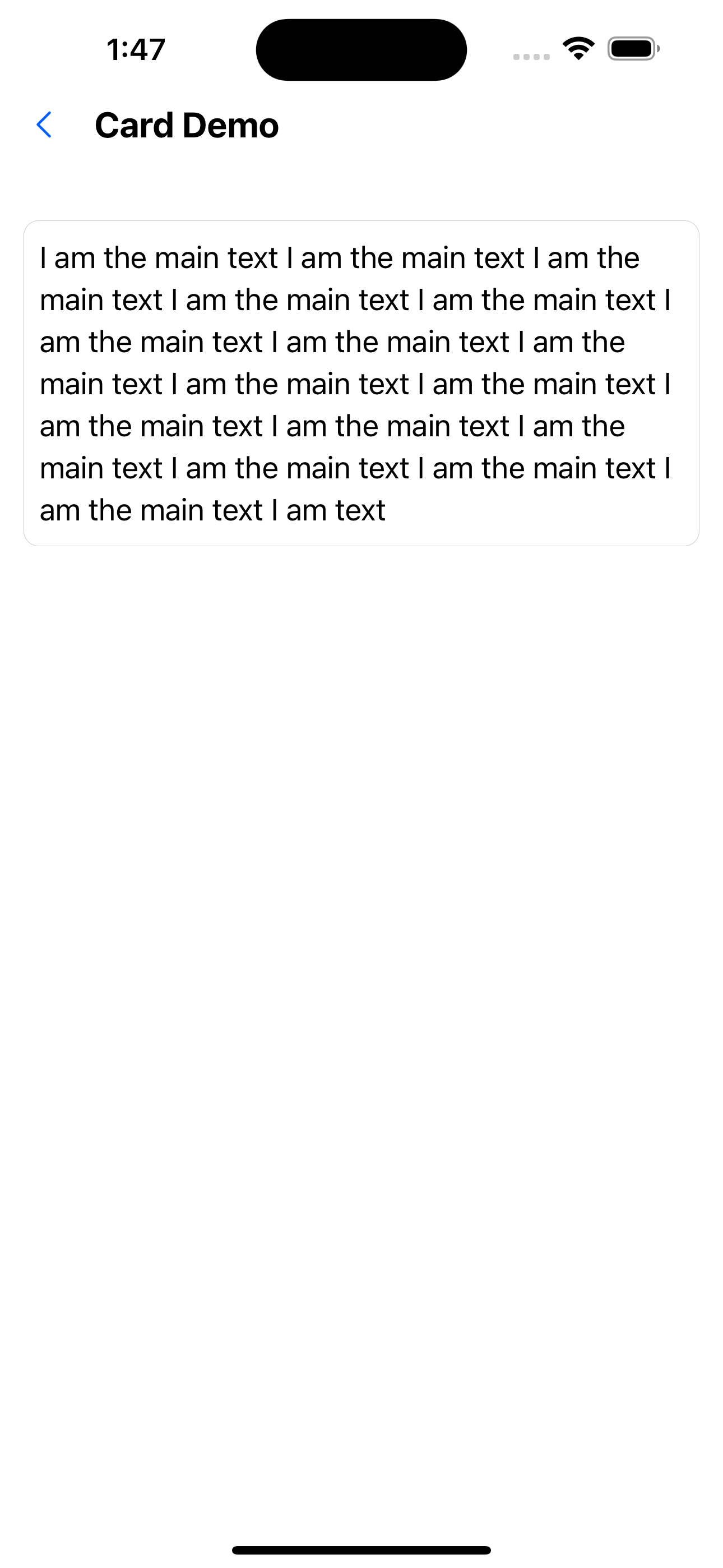
4. Card with only body
<Card
  renderHeader={() => <Text variant="primaryBody">Custom title</Text>}
  hideHeader
>
  <Text variant="secondaryBodyReverse">
    I am the main text I am the main text I am the main text I am the main text
    I am the main text I am the main text I am the main text I am the main text
    I am the main text I am the main text I am the main text I am the main text
    I am the main text I am the main text I am the main text I am the main text
    I am text
  </Text>
</Card>
API
| Properties | Required | Description | Type | Default Value |
|---|---|---|---|---|
| icon | false | The icon to the left of the header | ReactNode | |
| title | false | header text | ReactNode | |
| extra | false | icon to the right of header | ReactNode | |
| renderHeader | false | Custom rendering header | () => ReactNode | |
| hideHeader | false | Whether to hide the title | boolean | false |
| footer | false | Bottom container. Don’t render if not passed | ReactNode | |
| containerStyle | false | Container style | ViewStyle | |
| contentStyle | false | The style of the container body | ViewStyle |