DatePickerItem - Date list form input
Effect demonstration
1. Default effect
<DatePickerItem />

2. Effect in form
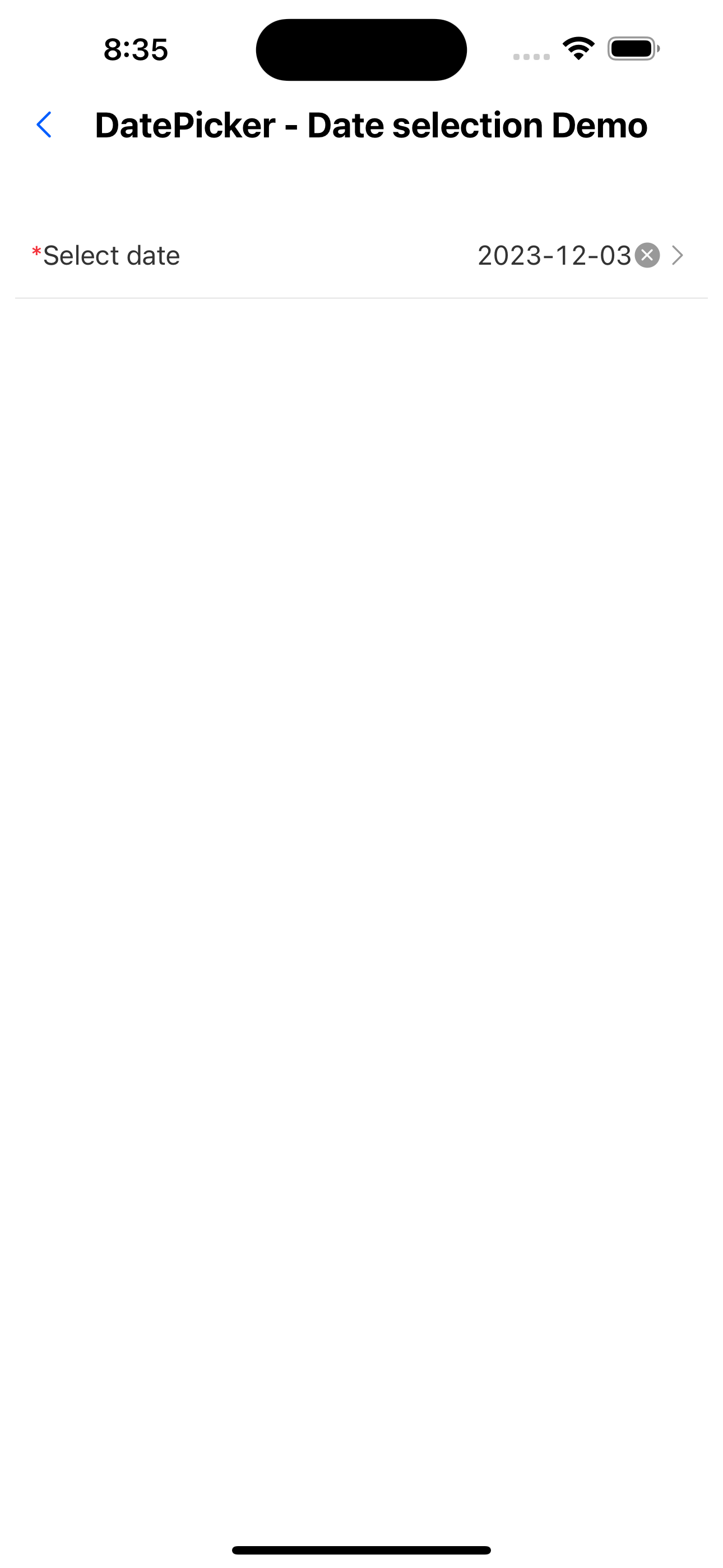
<FormListItem title="Select date" arrow="horizontal" name="date1" required rules={[{ required: true, message: 'Please choose date' }]}>
  <DatePickerItem />
</FormListItem>
API
| Properties | Required | Description | Type | Default Value |
|---|---|---|---|---|
| indicatorBackgroundColor | false | Indicator background color | string | |
| itemTextStyle | false | Data row text style | TextStyle | |
| itemHeight | false | Data row height | number | |
| itemStyle | false | Data row style | ViewStyle | |
| containerStyle | false | Selector container style | ViewStyle | |
| mode | false | display mode | DateMode | |
| labelUnit | false | unit text | LabelUnit | |
| format | false | Date formatting | string | YYYY-MM-DD |
| value | false | Current date | Date | |
| onChange | false | Date modification event | (date?: Date, formatDate?: string) => void | |
| minDate | false | Minimum date | string | |
| maxDate | false | Maximum date | string | |
| title | false | Selector title | string | |
| onClose | false | Pop-up window closing event | () => void | |
| cancelText | false | Cancel button text | string | Cancel |
| okText | false | Confirm button text | string | OK |
| placeholder | false | Default prompt | string | Please select |
| allowClear | false | Whether to allow clearing | boolean | true |
| disabled | false | Whether to disable | boolean | false |
| style | false | Custom style | ViewStyle | |
| activeOpacity | false | Opacity when pressed | number | 0.6 |