DatePicker - Date selection
Effect demonstration
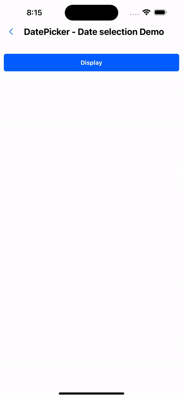
1. Default effect
<Button title="Display" onPress={() => setVisible(true)} />
<WhiteSpace />
<Text variant={'h3'}>{value ? formattedValue : ''}</Text>
<DatePicker
  title="Birthday"
  visible={visible}
  onClose={() => setVisible(false)}
  value={value}
  onChange={(value, formattedValue) => {
    setValue(value);
    formattedValue && setFormattedValue(formattedValue);
  }}
/>
2. Only display year, month and day
<Button title="Display" onPress={() => setVisible(true)} />
<WhiteSpace />
<Text variant={'h3'}>{value ? formattedValue : ''}</Text>
<DatePicker
  title="Birthday"
  mode="date"
  visible={visible}
  onClose={() => setVisible(false)}
  value={value}
  onChange={(value, formattedValue) => {
    setValue(value);
    formattedValue && setFormattedValue(formattedValue);
  }}
/>
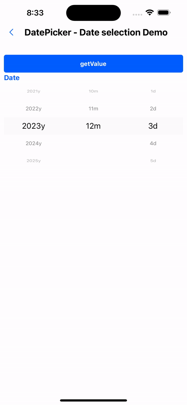
3. Display directly on the page
const datePickerRef = useRef<{ getValue: () => { date: Date; formatDate: string } }>(null);

<Button
  title="getValue"
  onPress={() => {
    if (datePickerRef.current) {
      const { date, formatDate } = datePickerRef.current.getValue();
      setValue(date);
      setFormattedValue(formatDate);
    }
  }}
/>
<Text variant={'h3'} color={value?'warningColor':'primaryTextColor'}>{value ? formattedValue : 'Date'}</Text>
<DatePicker
  ref={datePickerRef}
  title="Please select a date"
  displayType="view"
/>
API
DatePicker properties
| Properties | Required | Description | Type | Default Value |
|---|---|---|---|---|
| indicatorBackgroundColor | false | Indicator background color | string | |
| itemTextStyle | false | Data row text style | TextStyle | |
| itemHeight | false | Data row height | number | |
| itemStyle | false | Data row style | ViewStyle | |
| containerStyle | false | Selector container style | ViewStyle | |
| mode | false | display mode | DateMode | |
| labelUnit | false | unit text | LabelUnit | |
| format | false | Date formatting | string | YYYY-MM-DD |
| value | false | Current date | Date | |
| onChange | false | Date modification event | (date?: Date, formatDate?: string) => void | |
| minDate | false | Minimum date | string | |
| maxDate | false | Maximum date | string | |
| title | false | Selector title | string | |
| displayType | false | Selector display type | view | modal | modal |
| visible | false | Control pop-up window display | boolean | |
| onClose | false | Pop-up window closing event | () => void | |
| cancelText | false | Cancel button text | string | Cancel |
| okText | false | Confirm button text | string | OK |
| activeOpacity | false | Opacity when pressed | number | 0.6 |