Slider component
Effect demonstration
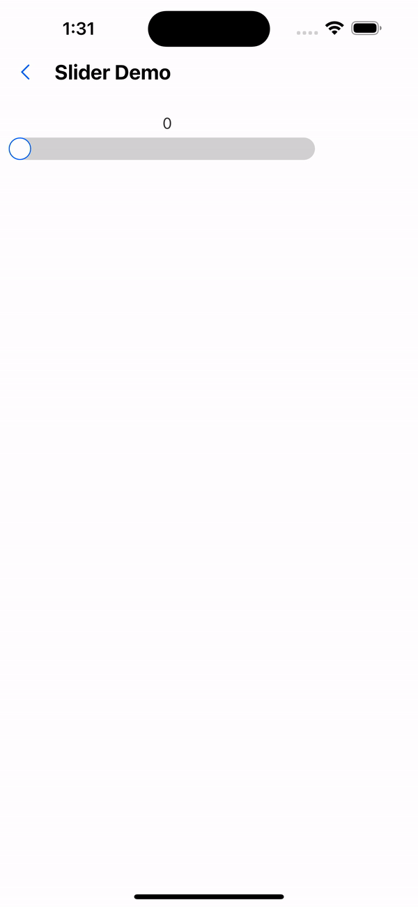
1. Default effect
<Slider />
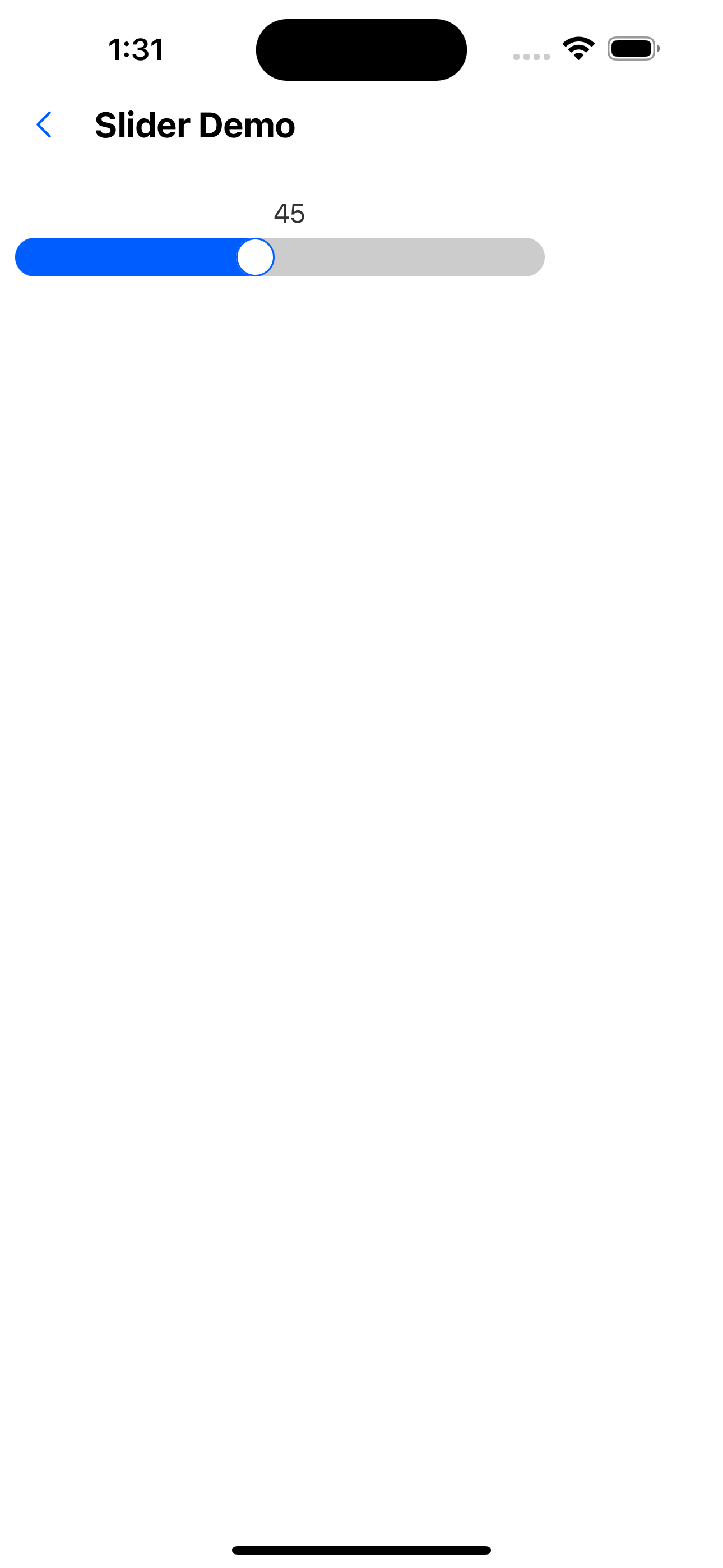
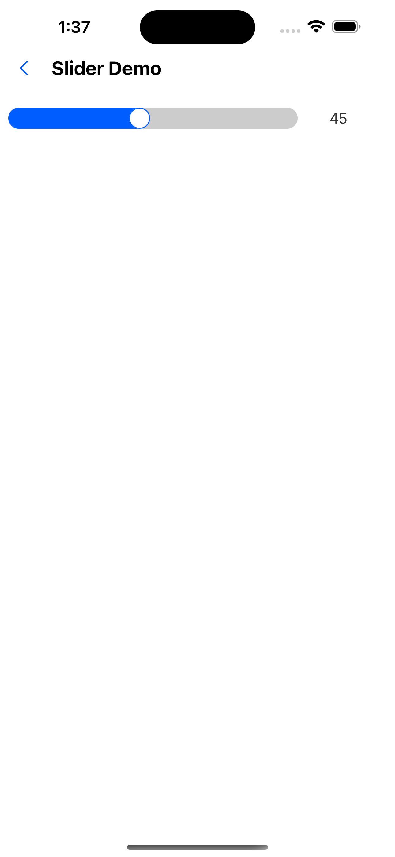
2. Default value 45
<Slider value={45} />
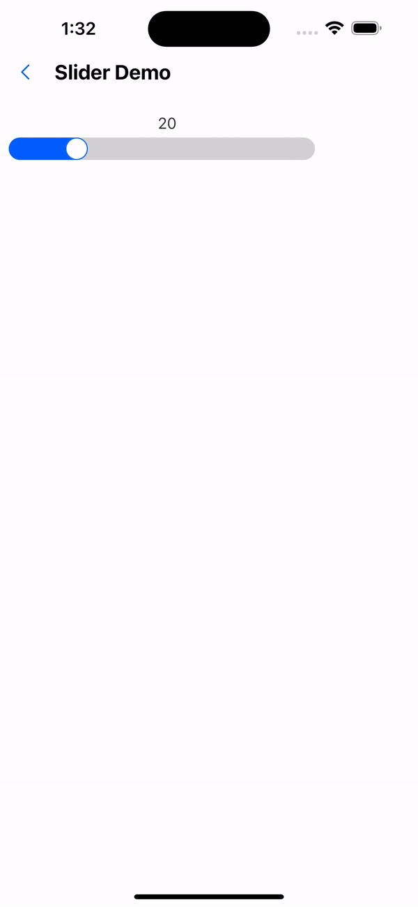
3. Maximum and minimum values
<Slider min={20} max={80} />
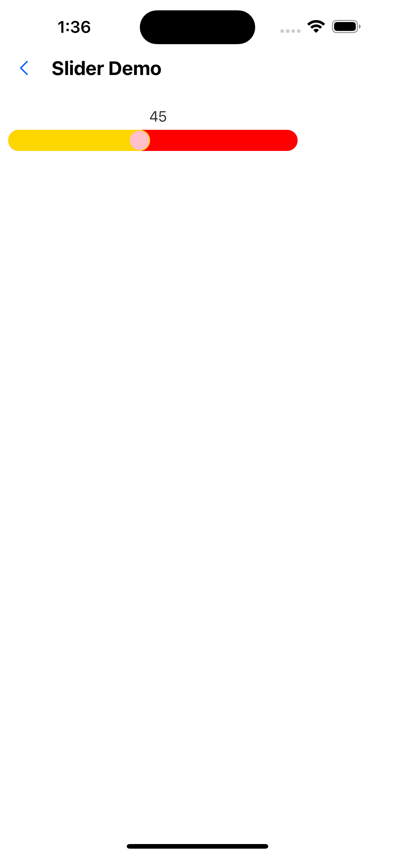
4. Custom colors
<Slider value={45} foregroundColor="gold" backgroundColor="red" borderColor="blue" handleBackground="pink" />
5. Do not display slider numbers
<Slider value={45} showLabel={false} />

6. Numbers are on the right
<Slider value={45} labelPosition="right" />
API
| Properties | Required | Description | Type | Default Value |
|---|---|---|---|---|
| min | false | minimum value | number | 0 |
| max | false | maximum value | number | 100 |
| value | false | current value | number | 0 |
| width | false | width | number | deviceWidth -100 |
| height | false | height | number | 20 |
| onChange | false | Event triggered after the slider is dragged | (value: number) => void | |
| foregroundColor | false | The color of the left side of the slider | string | theme color |
| backgroundColor | false | Color of the right side of the slider | string | #fff |
| handleBackground | false | Slider background color | string | #fff |
| showLabel | false | Whether to display the slider number | boolean | true |
| labelPosition | false | Slider number display position | top | left | right | bottom | top |
| labelStyle | false | text style | TextStyle |