Input - TextArea
#Input - TextInput component
Effect demonstration
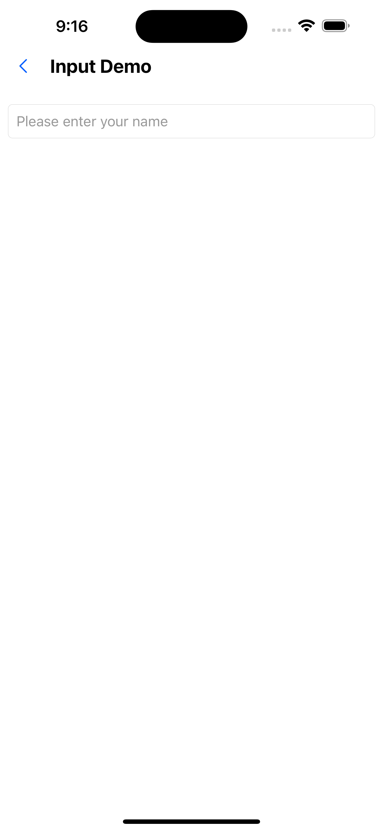
1. Only one input box
<Input placeholder="Please enter your name" />
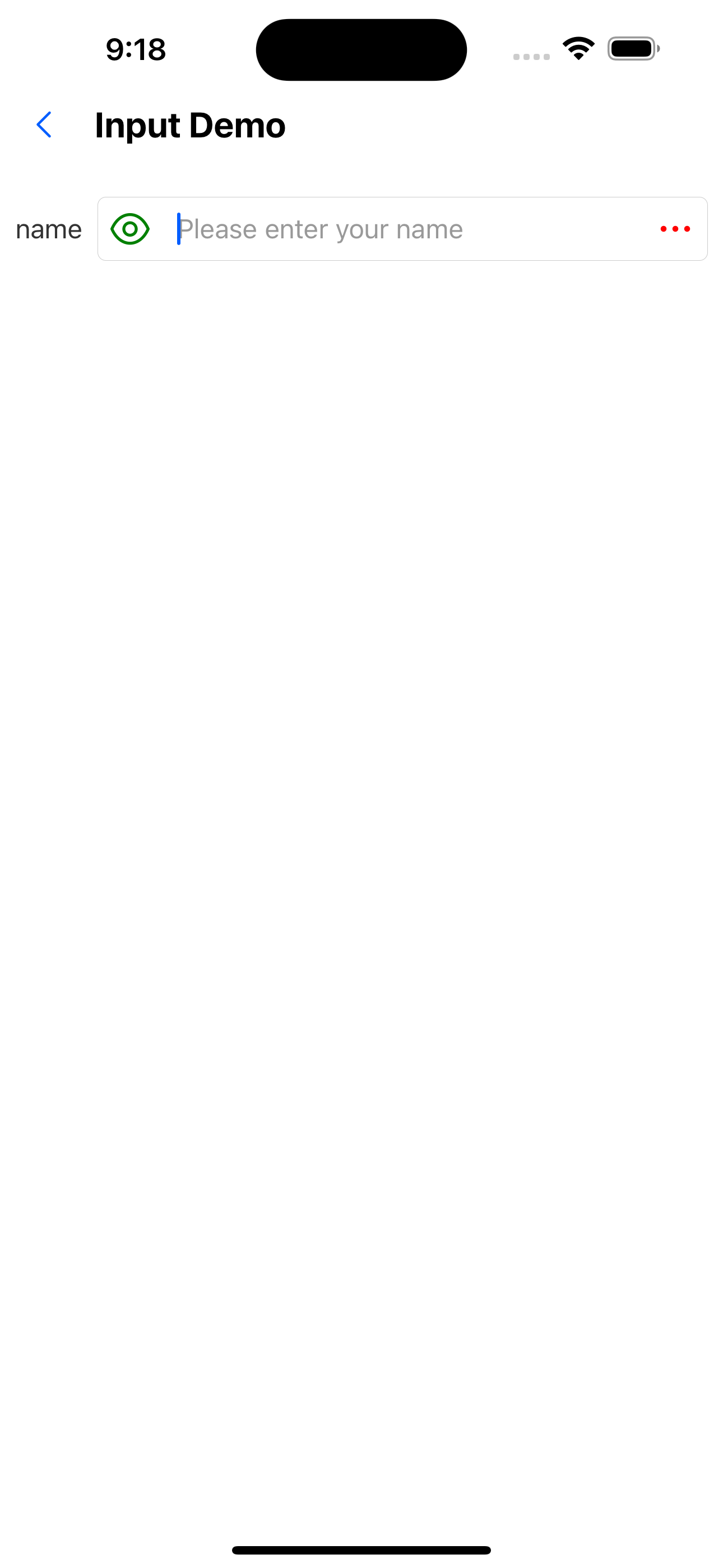
2. Input box with labels and left and right icons
<Input
  value={value}
  onChange={setValue}
  label="name"
  placeholder="Please enter your name"
  leftIcon={<SvgIcon name="eyeopen" color="green" size={28} />}
  rightIcon={<SvgIcon name="ellipsis" color="red" size={28} />}
/>
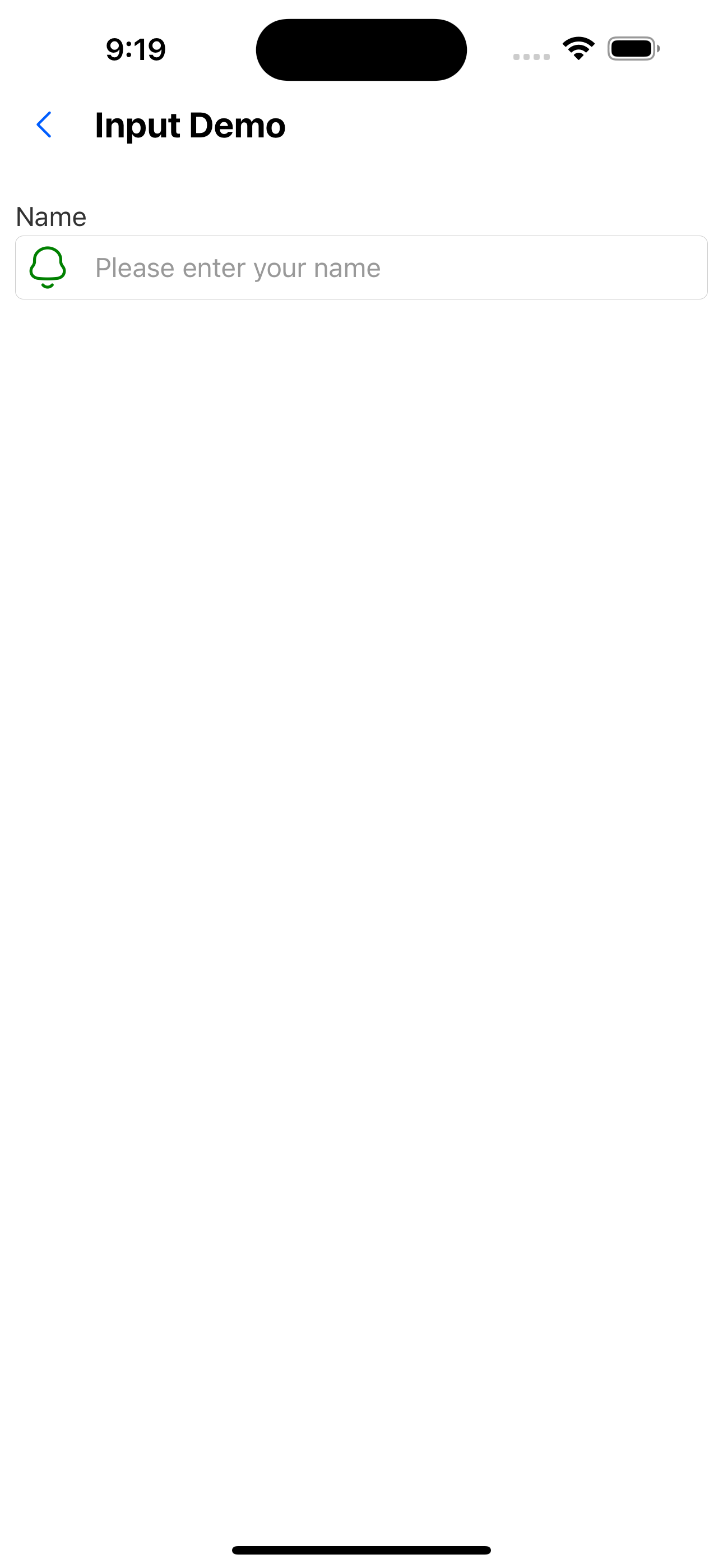
3. The label is above the input box
<Input
  label="Name"
  placeholder="Please enter your name"
  labelPosition="top"
  leftIcon={<SvgIcon name="bells" size={28} color="green" />}
/>
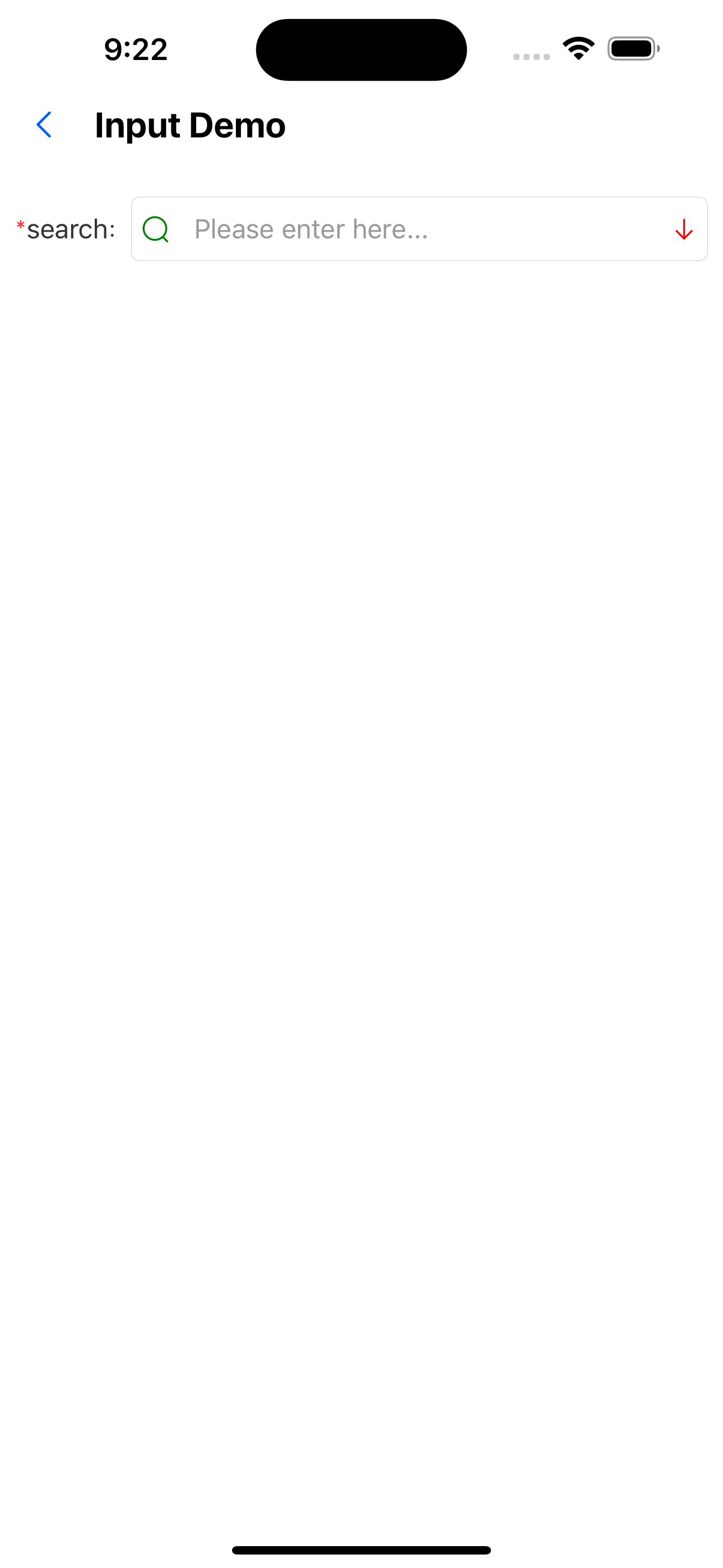
4. With colon and required mark
<Input
  colon
  required
  value={value}
  onChange={setValue}
  label="search"
  placeholder="Please enter here..."
  leftIcon={<SvgIcon name="search" color="green" />}
  rightIcon={<SvgIcon name="arrowdown" color="red" />}
/>
5. TextArea effect
<TextArea label="Name" placeholder="Please enter your name" />

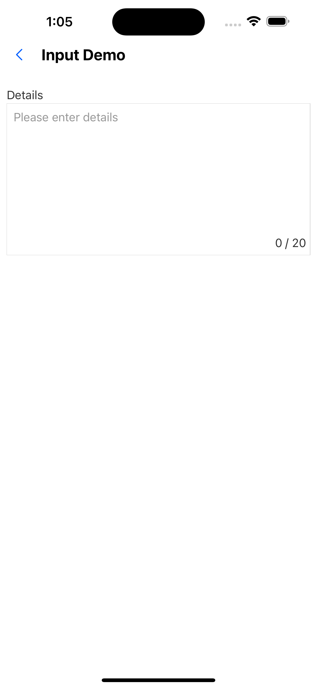
6. TextArea with character limit
<TextArea label="Details" placeholder="Please enter details" limit={20} />
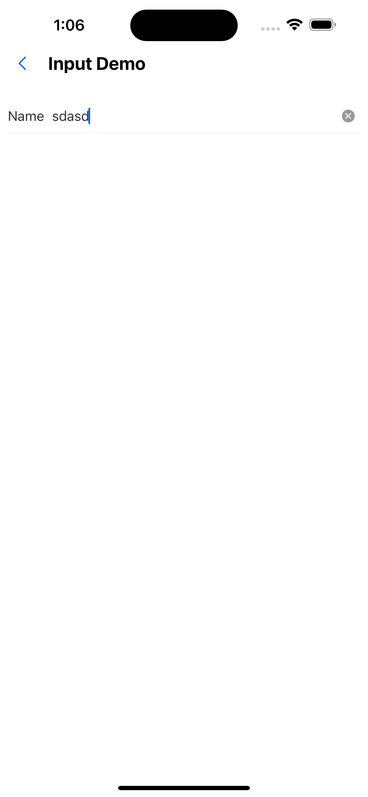
7. InputItem effect
<InputItem label="Name" placeholder="Please enter your name" />
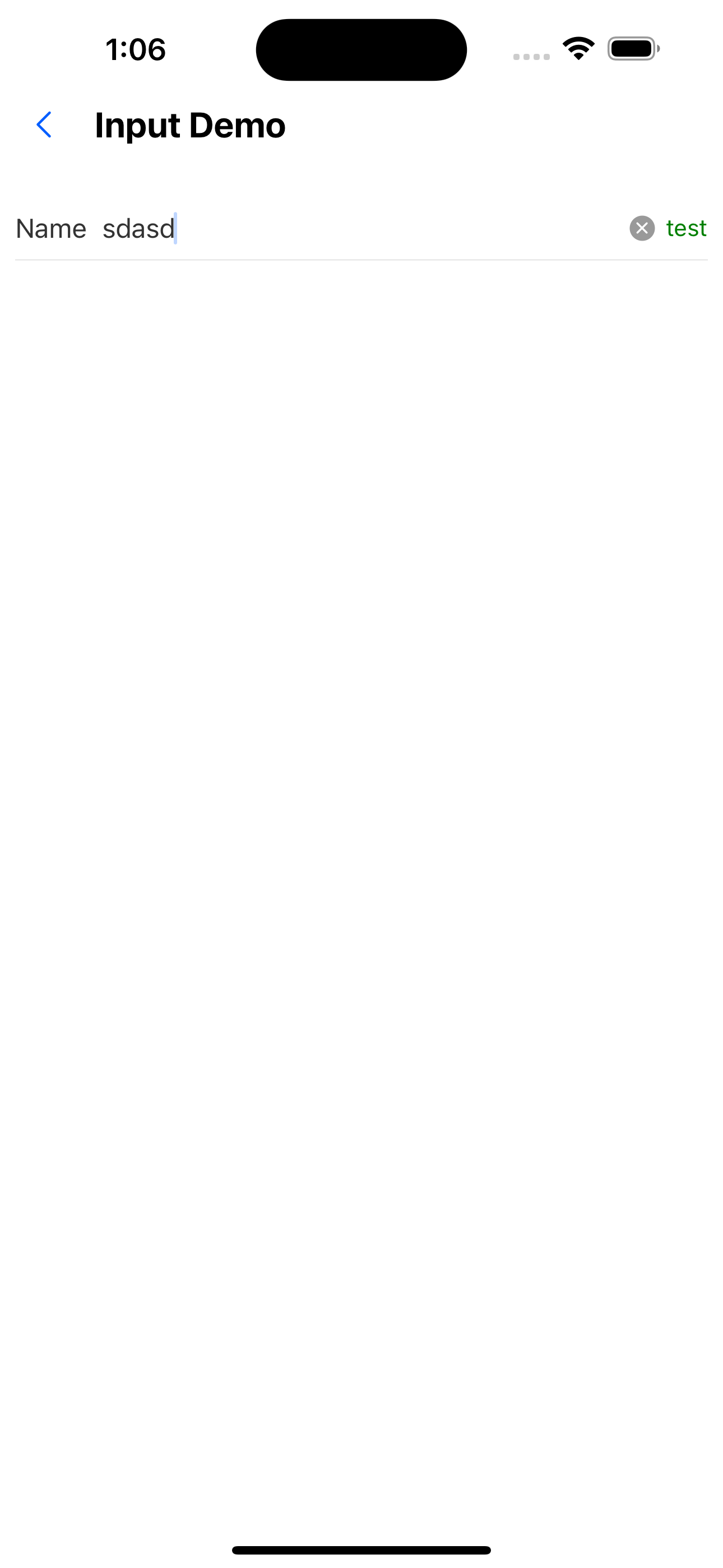
8. InputItem sets extra attribute
<InputItem
  label="Name"
  placeholder="Please enter your name"
  extra={<Text style={{ color: "green" }}>test</Text>}
/>
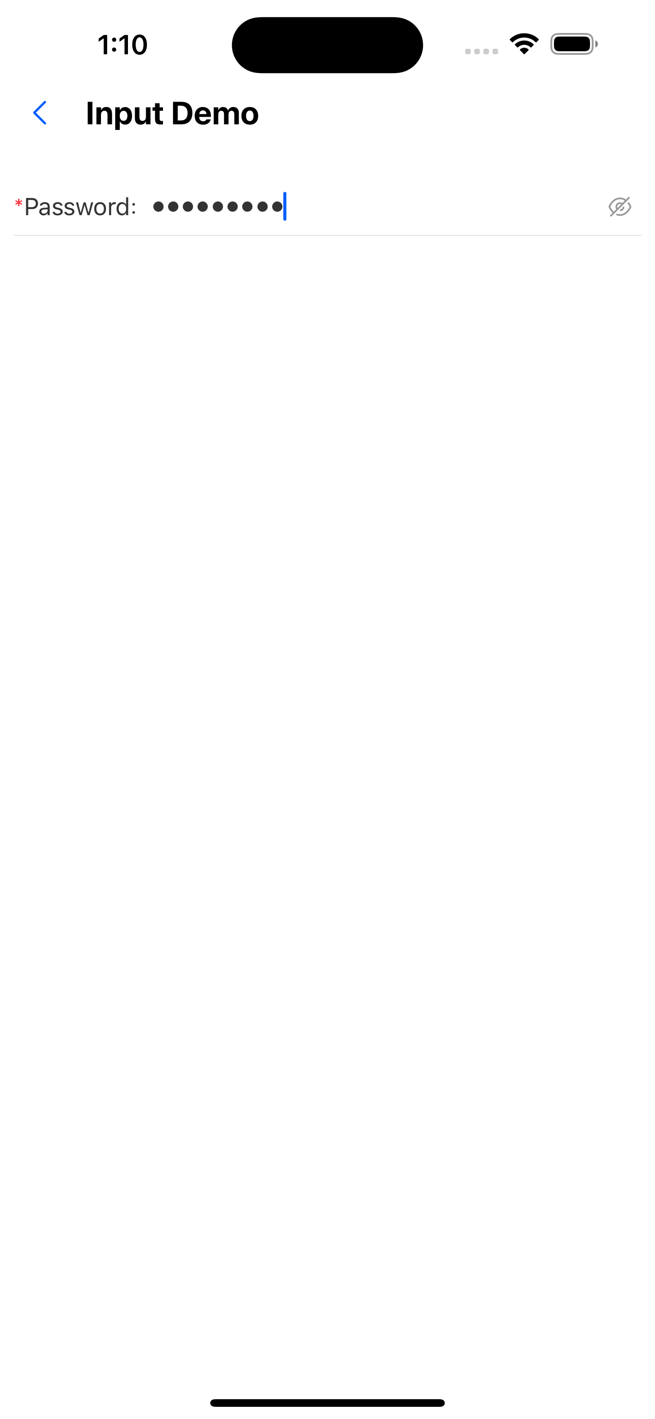
9. Password input box
<InputItem
  label="password"
  placeholder="Please enter password"
  allowClear={false}
  inputType="password"
  required
  colon
/>
API
Input attribute
Inherits the properties of the TextInput component, but removes the placeholderTextColor, onChange, and onChangeText properties.
See: https://reactnative.dev/docs/textinput
| Properties | Required | Description | Type | Default Value |
|---|---|---|---|---|
| label | false | label | ReactNode | |
| labelPosition | false | Label position. The left or top side of the input box | left | top | left |
| inputType | false | Input box type. Text input box or password input box | input | password | input |
| inputStyle | false | Input box custom style | TextStyle | input |
| leftIcon | false | left icon | ReactNode | |
| rightIcon | false | Right icon | ReactNode | |
| allowClear | false | Whether to display the clear icon | boolean | true |
| value | false | The value of the input box | string | |
| onChange | false | Callback for input box value change | (value: string) => void | |
| disabled | false | Whether to disable the input box | boolean | false |
| colon | false | Whether to display colon after the label | boolean | false |
| required | false | Whether to display the required identifier before the label | boolean | false |
| onClear | false | Clear content | () => void | |
| brief | false | Other content | ReactNode |
InputItem Properties
| Properties | Required | Description | Type | Default Value |
|---|---|---|---|---|
| label | false | label | ReactNode | |
| inputType | false | Input box type. Text input box or password input box | input | password | input |
| inputStyle | false | Input box custom style | TextStyle | input |
| extra | false | ReactNode | ||
| allowClear | false | Whether to display the clear icon | boolean | true |
| value | false | The value of the input box | string | |
| onChange | false | Callback for input box value change | (value: string) => void | |
| colon | false | Whether to display colon after the label | boolean | false |
| required | false | Whether to display the required identifier before the label | boolean | false |
| onClear | false | Callback when the clear button is clicked | () => void | |
| border | false | Whether to display the bottom border | boolean | true |
| style | false | Container custom style | ViewStyle | |
| brief | false | Other content | ReactNode |
_When the onClear event is passed, onChange will no longer be automatically triggered, and the onClear event needs to be processed to clear the value. _
TextArea Properties
| Properties | Required | Description | Type | Default Value |
|---|---|---|---|---|
| label | false | label | ReactNode | |
| value | false | The value of the input box | string | |
| onChange | false | Callback for input box value change | (value: string) => void | |
| height | false | Text field height | number | 150 |
| limit | false | Enter the text length limit. Do not display if not passed | number | |
| required | false | Whether to display the required identifier before the label | boolean | false |
| border | false | Whether there is a border | boolean | true |
| style | false | Container custom style | ViewStyle | |
| brief | false | Other content | ReactNode |