Skeleton
#Skeleton
Before using this component, please install the dependencies in your project:
yarn add react-native-linear-gradient react-native-reanimated
Effect demonstration
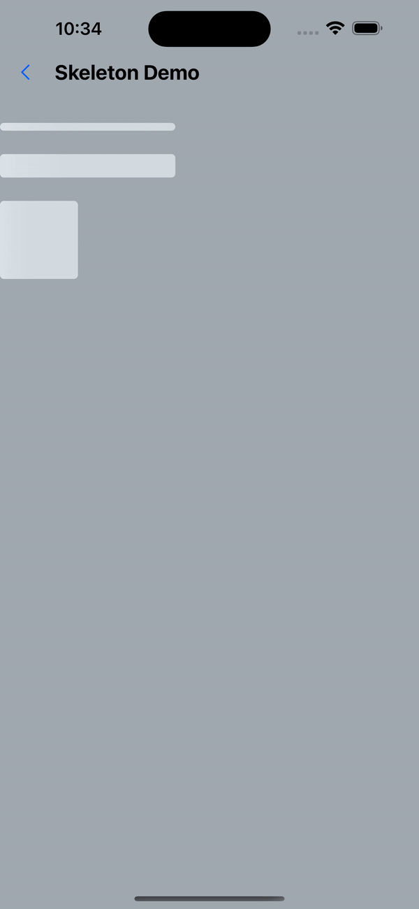
1. Default effect
 const secondLayout = [
    {width: 180, height: 8, marginBottom: 24},
    {width: 180, height: 24, marginBottom: 24},
    {width: 80, height: 80},
  ];
...
<Skeleton
  containerStyle={styles.titleContainer}
  styles={secondLayout}
  loading={true}
  animationDirection="horizontalRight"
>
  <View>
    <Text style={styles.bigText}>Benjamin Franklin</Text>
  </View>
  <Text style={[styles.normalText, { marginTop: 20 }]}>
An investment in knowledge pays the best interest.
  </Text>
</Skeleton>
2. animationType="pulse"
<Skeleton
  animationType="pulse"
  styles={thirdLayout}
  containerStyle={styles.descContainer}
  loading={true}
>
<Text style={styles.normalText}>
    “It is easier to prevent bad habits than to break them.“
  </Text>
</Skeleton>
3. 5s display content after
useEffect(() => {
  setTimeout(() => {
    setLoading(false);
  }, 5000);
}, []);

<Skeleton
  containerStyle={styles.titleContainer}
  styles={secondLayout}
  loading={loading}
  animationDirection="horizontalRight"
>
  <View>
    <Text style={styles.bigText}>Benjamin Franklin</Text>
  </View>
  <Text style={[styles.normalText, { marginTop: 20 }]}>
    An investment in knowledge pays the best interest.
  </Text>
</Skeleton>;
API
| Properties | Required | Description | Type | Default Value |
|---|---|---|---|---|
| loading | false | Whether loading | boolean | true |
| styles | true | Skeleton screen style | ViewStyle[] | |
| duration | false | animation execution speed | number | 1200 |
| easing | false | How animation is executed | Animated.EasingFunction | Easing.bezierFn(0.5, 0, 0.25, 1) |
| containerStyle | false | container style | StyleProp<ViewStyle> | |
| animationType | false | Animation type (stripes/pulse/none) | AnimationType | shiver |
| animationDirection | false | Animation direction (valid for stripe animation) | AnimationDirection | horizontalRight |
| boneColor | false | Base color | string | #E1E9EE |
| highlightColor | false | Highlight color | string | #F2F8FC |
export type AnimationType = 'none' | 'shiver' | 'pulse' | undefined;

export type AnimationDirection =
  |'horizontalLeft'
  | 'horizontalRight'
  | 'verticalUp'
  | 'verticalDown'
  | undefined;
_Explanation about the styles attribute: _
-The styles attribute is an array. Each item in the array is a ViewStyle object, which is used to describe the style of the skeleton screen. Each item in the array corresponds to a row of the skeleton screen. The length of the array determines the number of rows of the skeleton screen. .
-The style of styles should be consistent or similar to the style of the elements inside, otherwise the skeleton effect will be inconsistent with the actual effect. for example:
<Skeleton styles={[styles.box1, styles.box2]}>
  <View style={styles.box1}>
    <Text>hello world</Text>
  </View>
<View style={styles.box2}>
    <Text>hello world</Text>
  </View>
</Skeleton>;

const styles = StyleSheet.create({
  box1: {
    width: 200,
    height: 50,
  },
  box2: {
    width: 300,
    height: 120,
    marginTop: 20,
  },
});