ScrollNumber
#ScrollNumber scrolling number component
Effect demonstration
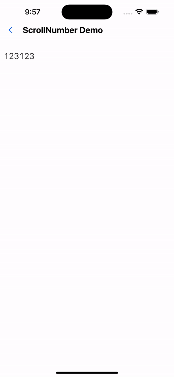
1. Default effect
<ScrollNumber value={value} />
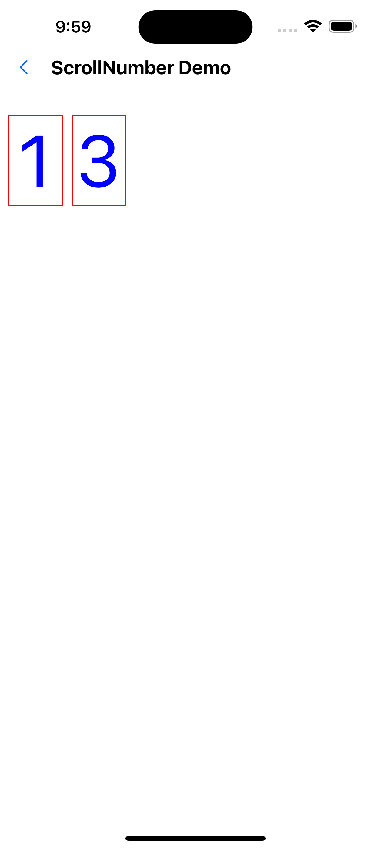
2. Modify style
<ScrollNumber
  value={value}
  height={100}
  containerStyle={{
    width: 100,
    marginRight: 10,
    borderWidth: 1,
    borderColor: "red",
  }}
  textStyle={{ fontSize: 80, color: "#0000ff" }}
/>
3. Modify animation type
<ScrollNumber
  value={value}
  height={100}
  animationType="spring"
  containerStyle={{
    width: 100,
    marginRight: 10,
    borderWidth: 1,
    borderColor: "red",
  }}
  textStyle={{ fontSize: 80, color: "#0000ff" }}
/>
API
| Properties | Required | Description | Type | Default Value |
|---|---|---|---|---|
| numberRange | false | Scrollable text range. The default is a number from 0-9 | string[] | [0-9] |
| value | true | current value | string | |
| height | false | Display height (if not passed, the height of the text will be calculated by default) | number | 0 |
| containerStyle | false | container style | ViewStyle | |
| textStyle | false | Text style | TextStyle | |
| animationType | false | Scroll animation type | timing | spring | timing |