Indicator component
Effect demonstration
1. Ball Indicator
<SafeAreaView style={{ flex: 1 }}>
  <BallIndicator />
</SafeAreaView>

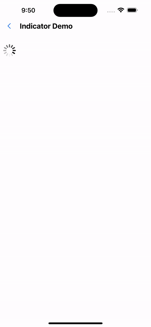
2. UIActivity Indicator
<SafeAreaView style={{ flex: 1 }}>
  <UIActivityIndicator />
</SafeAreaView>
3. Material Indicator
<SafeAreaView style={{ flex: 1 }}>
  <MaterialIndicator />
</SafeAreaView>
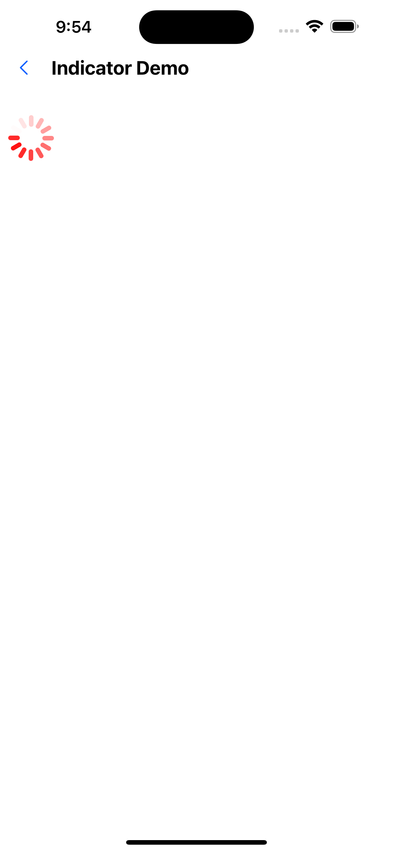
4. Modify size and color
<SafeAreaView style={{ flex: 1 }}>
  <UIActivityIndicator color="#ff0000" size={50} />
</SafeAreaView>
API
Public properties
| Properties | Required | Description | Type | Default Value |
|---|---|---|---|---|
| animationEasing | false | Animation Easing effect | EasingFunction | Easing.linear |
| animationDuration | false | animation execution duration | number | 1200 |
| animating | false | Whether the animation is being executed | boolean | true |
| interaction | false | Whether interaction is possible | boolean | true |
| style | false | Custom style | ViewStyle | |
| hidesWhenStopped | false | Hide when animation is stopped | boolean | true |
BallIndicator /UIActivityIndicator property
| Properties | Required | Description | Type | Default Value |
|---|---|---|---|---|
| color | false | color | string | rgb(0,0,0) |
| count | false | Number of elements | number | 12 |
| size | false | size | number | 36 |
MaterialIndicator Property
| Properties | Required | Description | Type | Default Value |
|---|---|---|---|---|
| color | false | color | string | rgb(0,0,0) |
| size | false | size | number | 36 |