Flow
#Flow step component
Effect demonstration
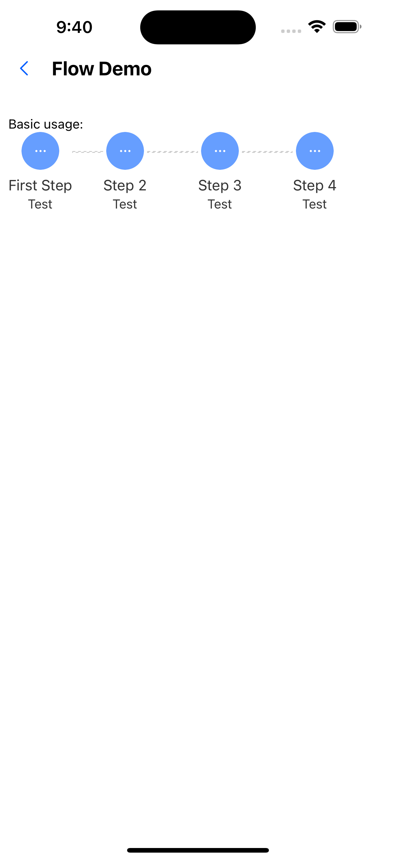
1. Basic usage
  const steps = [
    { title: 'First Step', description: 'Test' },
    { title: 'Step 2', description: 'Test' },
    { title: 'Step 3', description: 'Test' },
    { title: 'Step 4', description: 'Test' },
  ];

  <Text>Basic usage:</Text>
  <Flow steps={steps} />
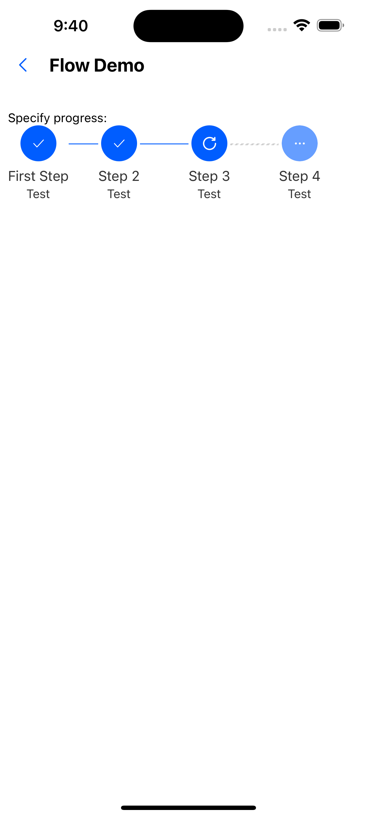
2. Specify progress
  const steps = [
    { title: 'First Step', description: 'Test' },
    { title: 'Step 2', description: 'Test' },
    { title: 'Step 3', description: 'Test' },
    { title: 'Step 4', description: 'Test' },
  ];


  <Text>Specify progress:</Text>
  <Flow steps={steps} current={3} />
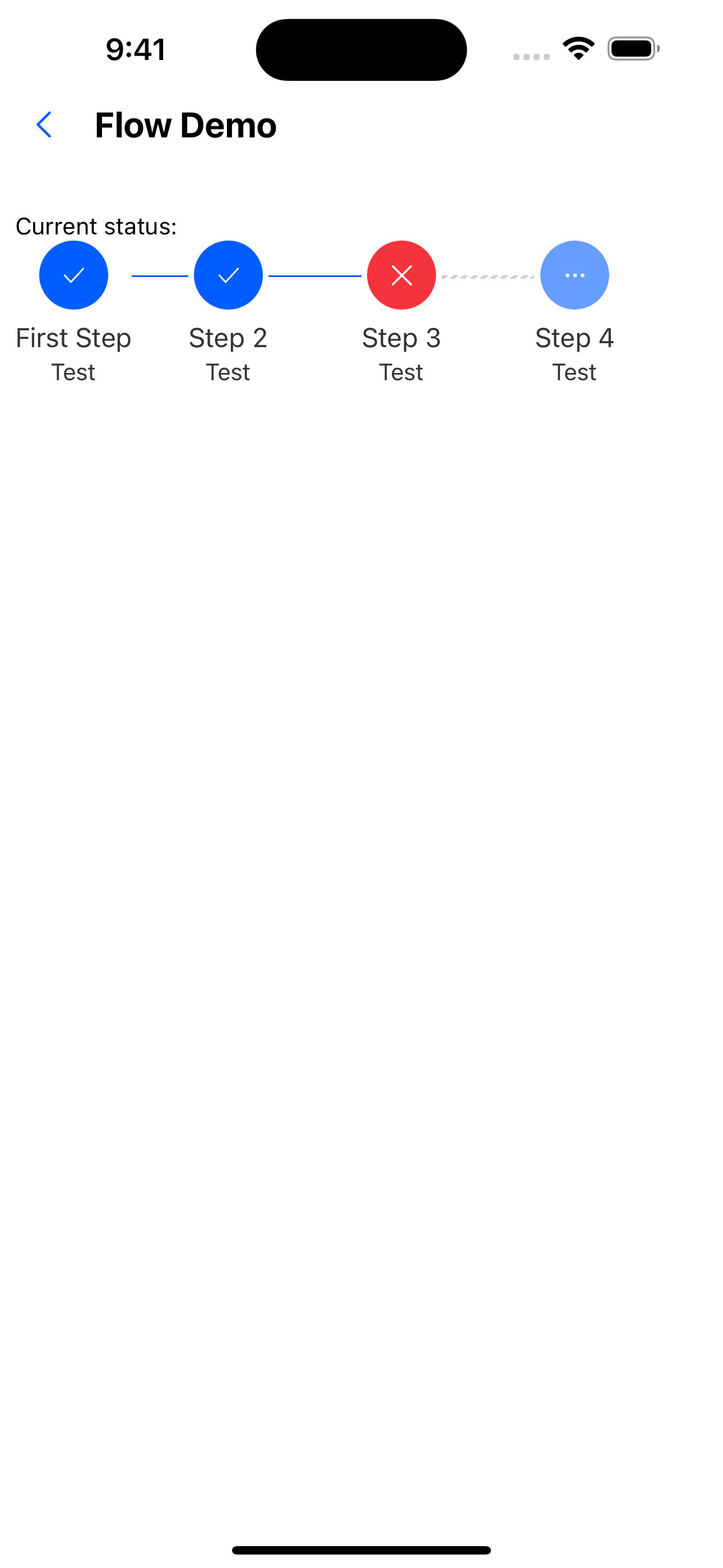
3. Current status
    const steps = [
    { title: 'First Step', description: 'Test' },
    { title: 'Step 2', description: 'Test' },
    { title: 'Step 3', description: 'Test' },
    { title: 'Step 4', description: 'Test' },
  ];

  <Text>Current status:</Text>
  <Flow steps={steps} current={3} status="error" />
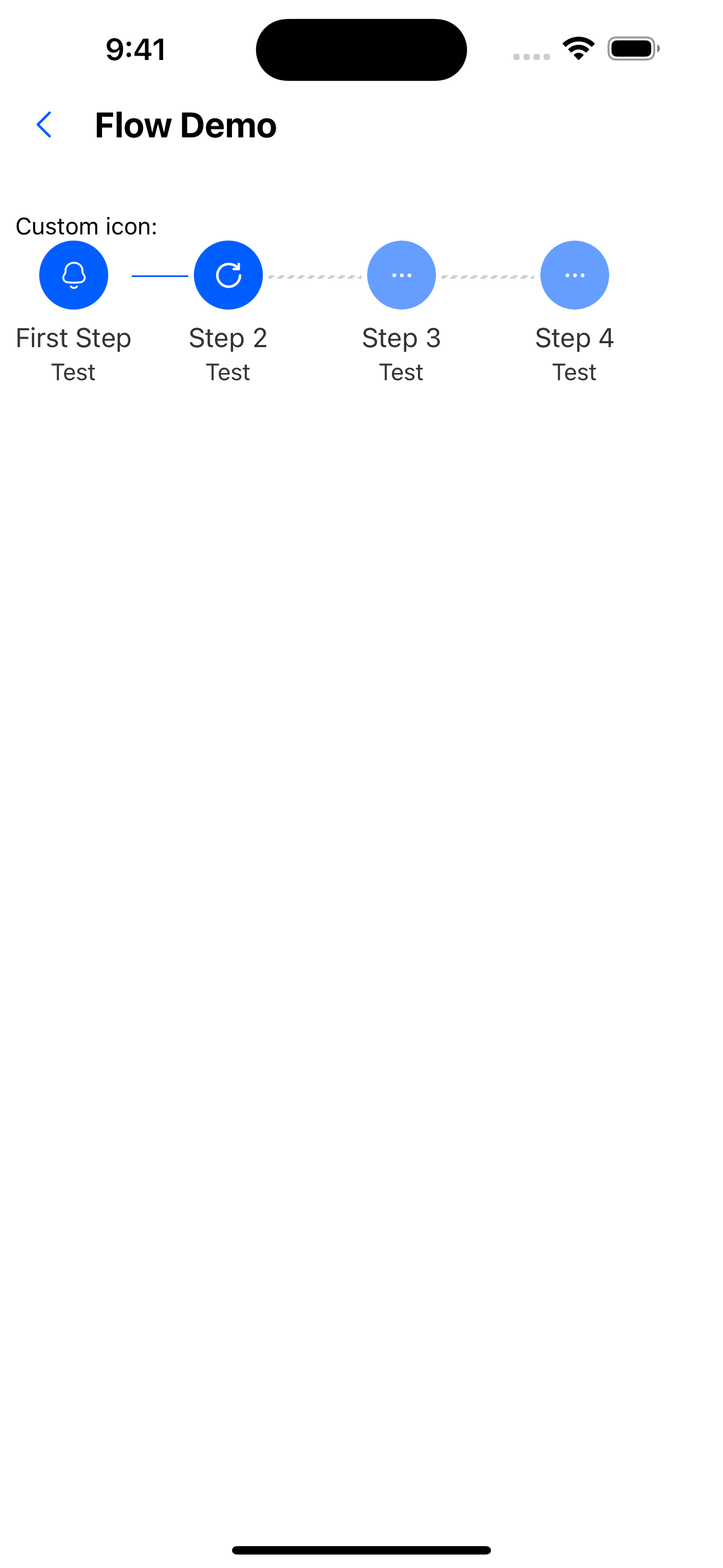
4. Custom icon
  const steps = [
    { title: 'First Step', description: 'Test', icon: <SvgIcon name="bells" /> },
    { title: 'Step 2', description: 'Test' },
    { title: 'Step 3', description: 'Test' },
    { title: 'Step 4', description: 'Test' },
  ];
<Text>Custom icon:</Text>
  <Flow steps={steps} current={2} />
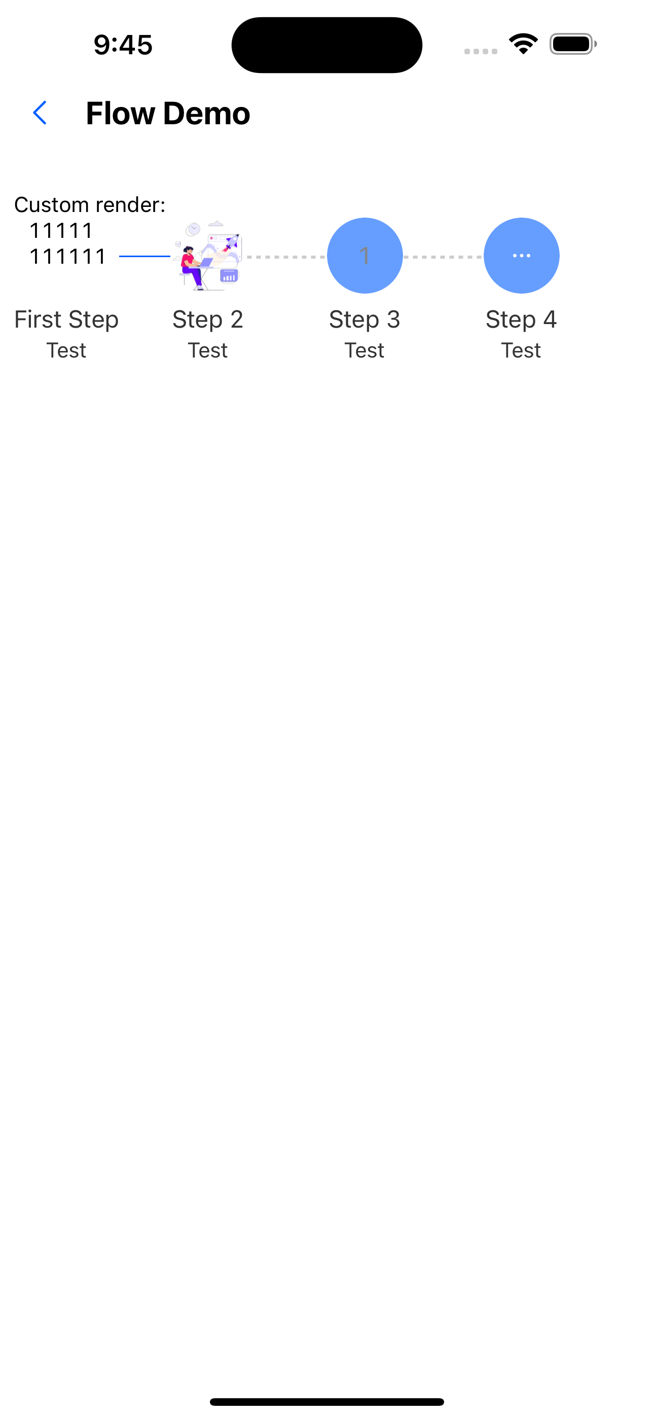
5. Custom render
  const steps = [
    { title: 'First Step', description: 'Test', stepRender: <Text>111111111111</Text> },
    {
      title: 'Step 2',
      description: 'Test',
      stepRender: (
        <Image style={{ height: 50, width: 50, borderRadius: 25 }} source={require('../../assets/images/img-01.jpg')} />
      ),
    },
    { title: 'Step 3', description: 'Test', label: '1' },
    { title: 'Step 4', description: 'Test' },
  ];

  <Text>Custom render:</Text>
  <Flow steps={steps} current={2} size={50} />
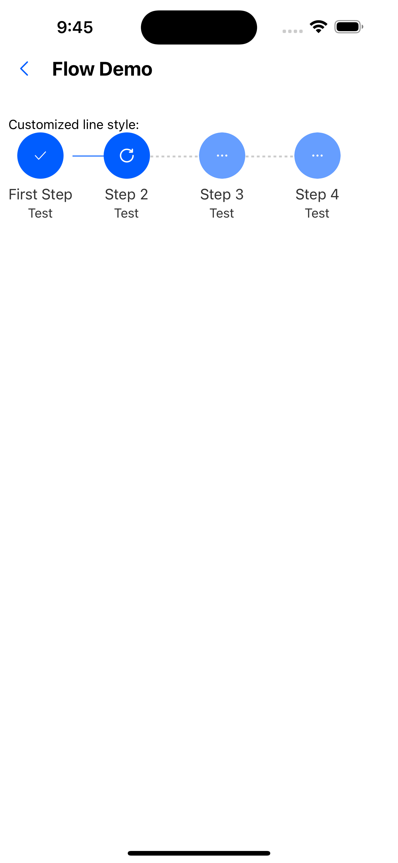
6. Customize line style
 const steps4 = [
    {
      title: 'First Step',
      description: 'Test',
      activeColor: 'green',
    },
    {
      title: 'Step 2',
      description: 'Test',
    },
    { title: 'Step 3', description: 'Test' },
    { title: 'Step 4', description: 'Test' },
  ];
<Text>Customized line style:</Text>
   <Flow steps={steps4} current={2} />
API
Component properties
| Properties | Required | Description | Type | Default Value |
|---|---|---|---|---|
| status | false | Current status | wait | process | finish | error | process |
| steps | false | step data | Array<StepProps> | [] |
| size | false | The size of the icon of the step bar | number | px(36) |
| current | false | Current progress | number | 0 |
StepProps Properties
| Properties | Required | Description | Type | Default Value |
|---|---|---|---|---|
| title | false | The title of the step | string | |
| description | false | Introduction to steps | string | |
| label | false | The label of the step bar | string | |
| size | false | Node size | number | px(36) |
| iconSize | false | icon size | number | px(16) |
| status | false | The status of the icon | wait | process | finish | error | wait |
| icon | false | The customized icon size will be overwritten. It is recommended to use size to specify the size | ReactElement | |
| stepRender | false | Custom component | ReactElement | |
| active | false | Whether the current node is fully processed | boolean | false |
| isCurrent | false | Whether it is the current progress | boolean | false |
| isLast | false | Whether it is the last one | boolean | false |