Progress -Progress bar component
Effect demonstration
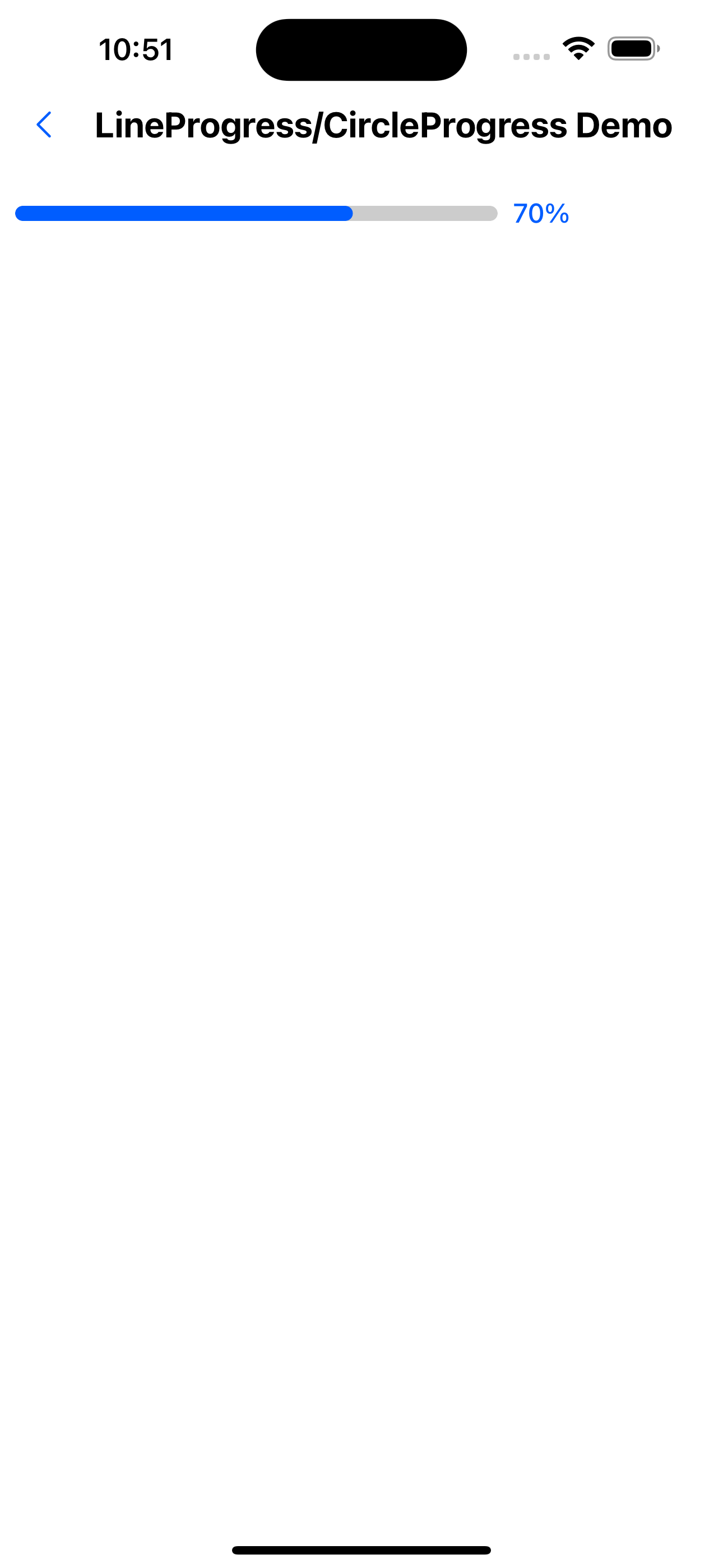
1. LineProgress default effect
<LineProgress value={70} />
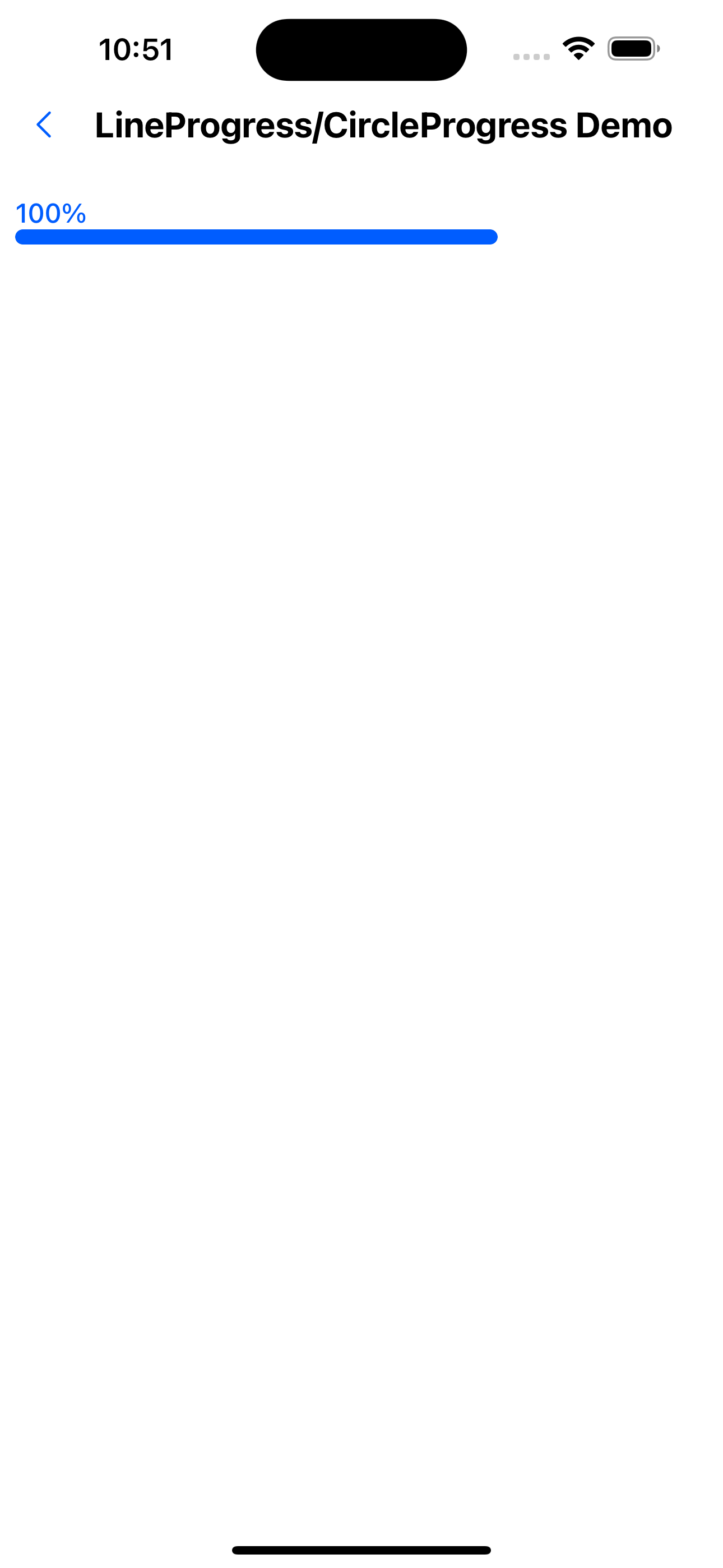
2. LineProgress value text at the top effect
<LineProgress value={100} labelPosition="top" />
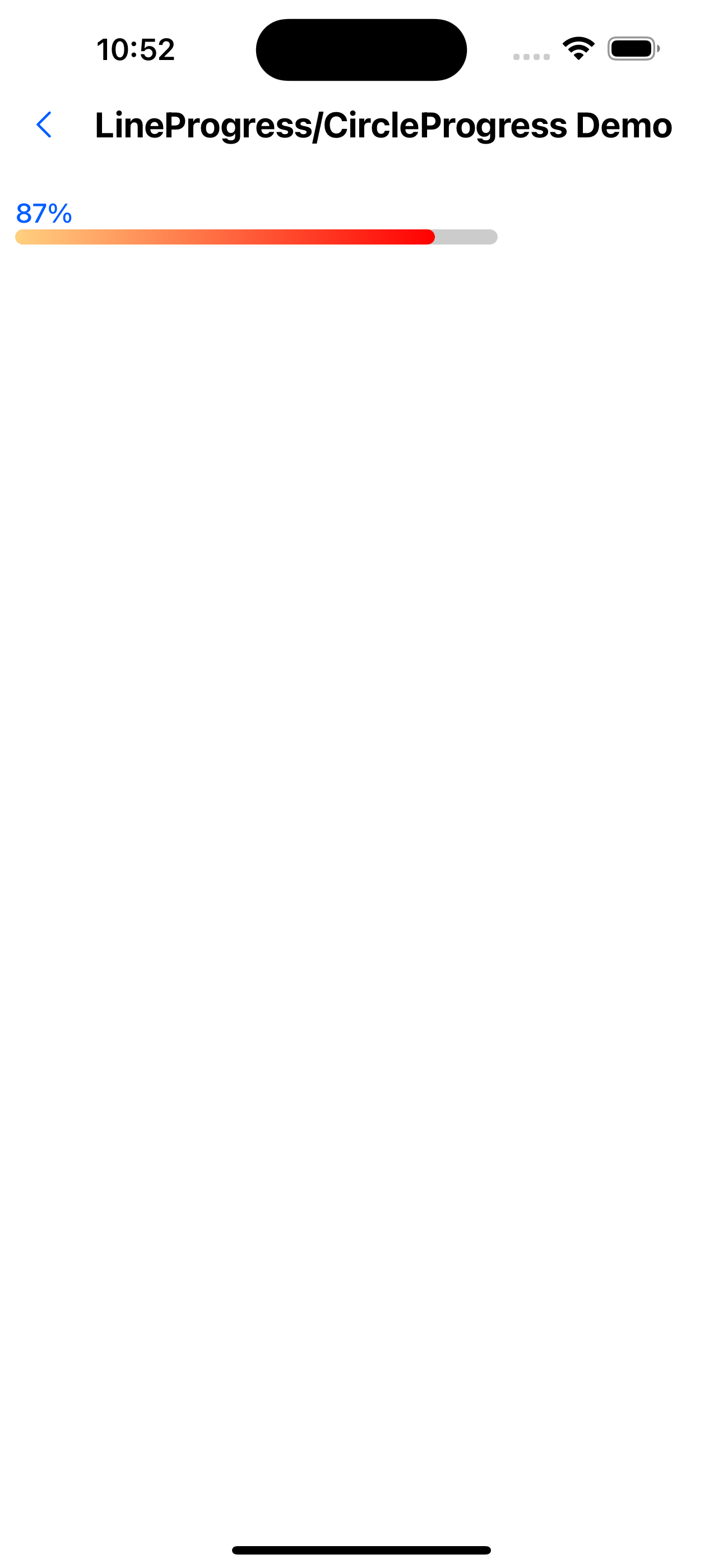
3. LineProgress Gradient color effect
<LineProgress value={87} color={['#FFD080', 'red']} showLabel labelPosition="top" />
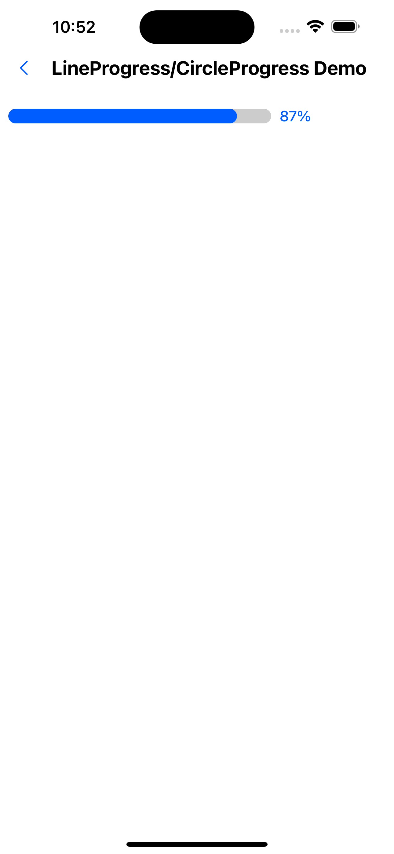
4. LineProgress Modify width effect
<LineProgress value={87} strokeWidth={16} />
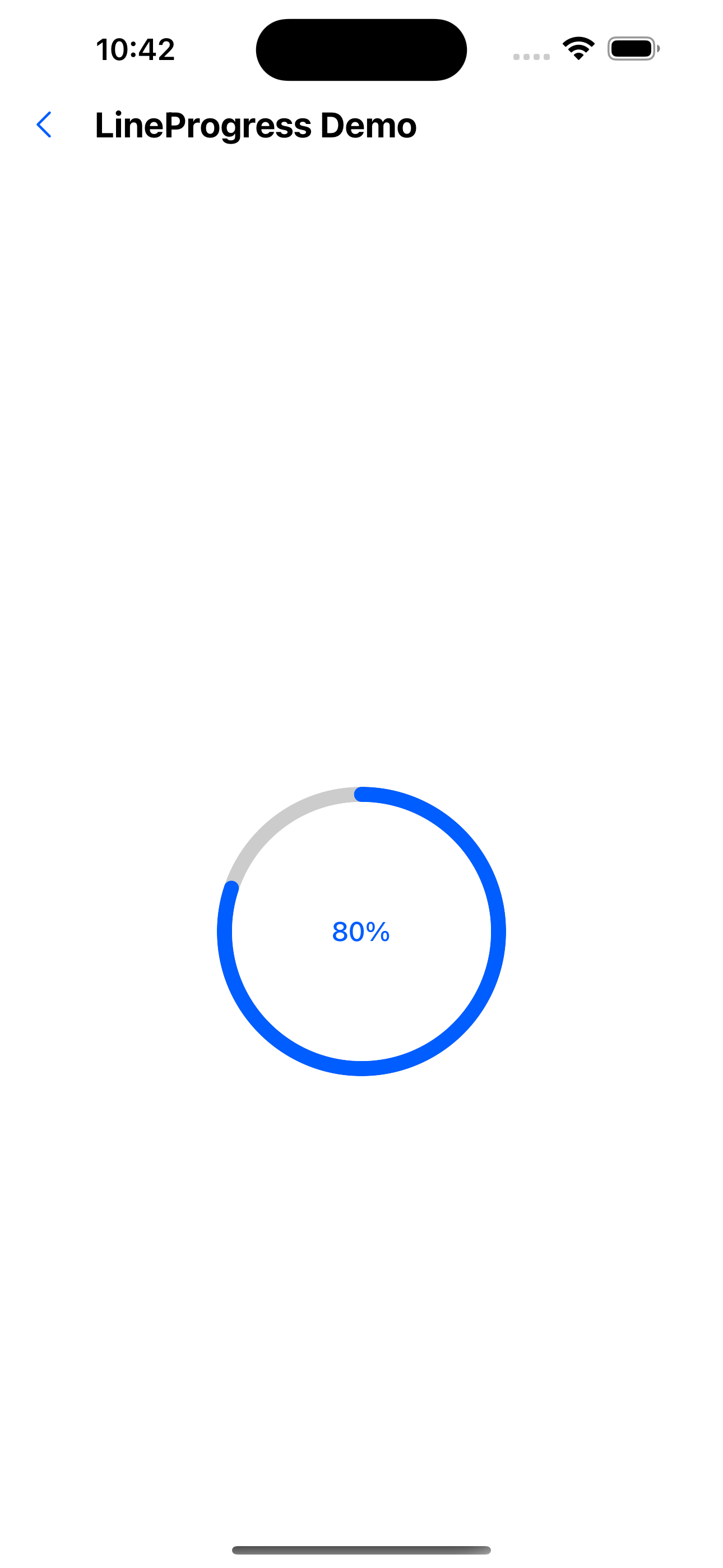
5. CircleProgress default effect
<CircleProgress value={80} />
6. CircleProgress does not display value text effect
<CircleProgress value={40} showLabel={false} />

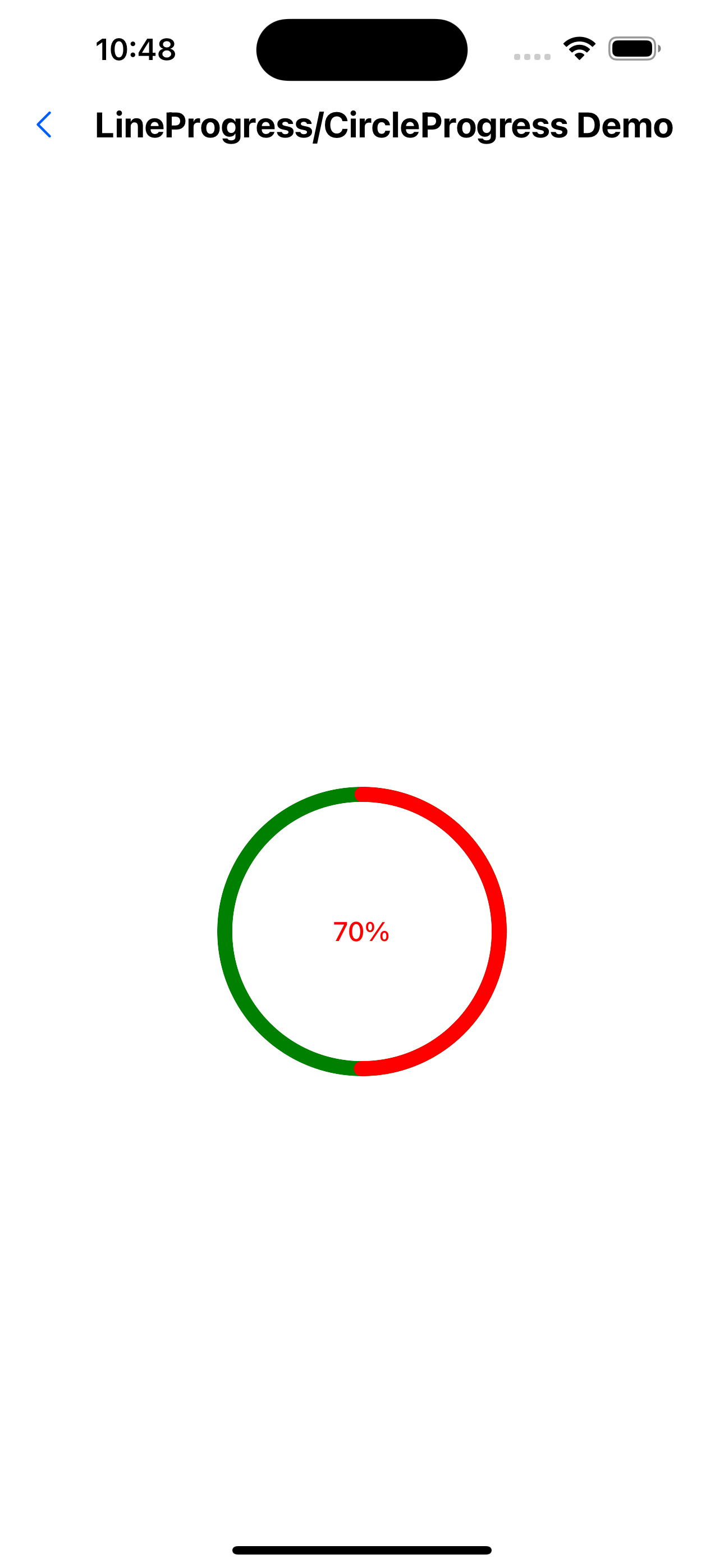
7. CircleProgress Custom color effects
<CircleProgress value={50} color="red" bgColor="green" />
8. CircleProgress Gradient color effect
<CircleProgress value={70} strokeWidth={16} />
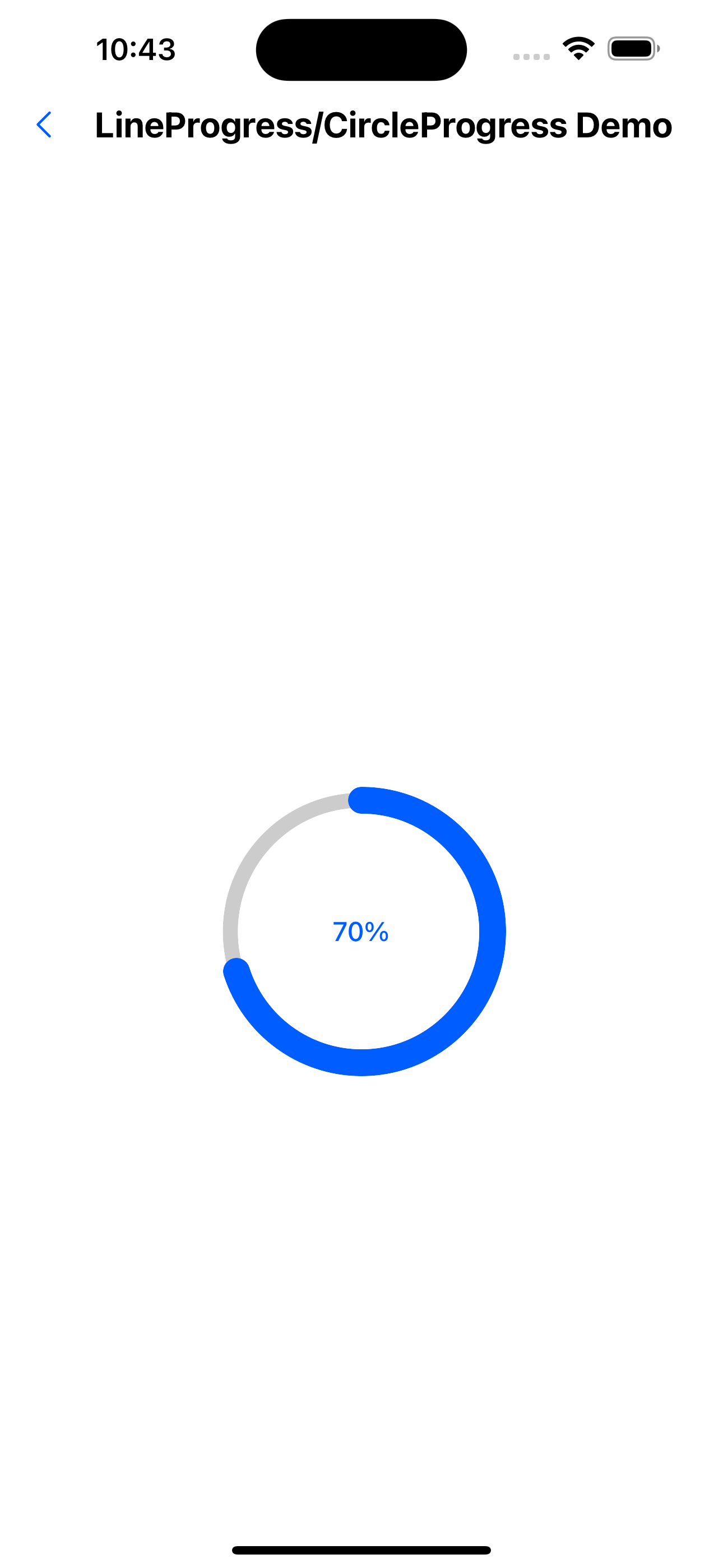
9. CircleProgress Modify width effect
<CircleProgress value={70} strokeWidth={16} />
API
LineProgress Attributes
| Properties | Required | Description | Type | Default Value |
|---|---|---|---|---|
| width | false | length | number | 250 |
| color | false | color | string | [string, string] | theme.colors.primary200 |
| bgColor | false | Background color | string | theme.colors.gray200 |
| strokeWidth | false | Outer ring width | number | 8 |
| value | false | value | number | 100 |
| showLabel | false | Whether to display the value text | boolean | true |
| labelPosition | false | value text position | right | top | right |
| label | false | Custom label | ReactNode | |
| showUnit | false | Whether to display the unit | boolean | true |
CircleProgress Property
| Properties | Required | Description | Type | Default Value |
|---|---|---|---|---|
| width | false | length | number | 150 |
| color | false | color | string | [string, string] | theme.colors.primary200 |
| bgColor | false | Background color | string | theme.colors.gray200 |
| strokeWidth | false | Outer ring width | number | 10 |
| innerWidth | false | inner ring width | number | 10 |
| value | false | value | number | 0 |
| showLabel | false | Whether to display the value text | boolean | true |
| label | false | Custom label | ReactNode | |
| showUnit | false | Whether to display the unit | boolean | true |