Passcode -Password/Verification Code Component
Effect demonstration
1. Default effect
<Passcode clearTextOnFocus onChange={handleChange} keyboardType="phone-pad" ref={otpRef} selectTextOnFocus={false} />
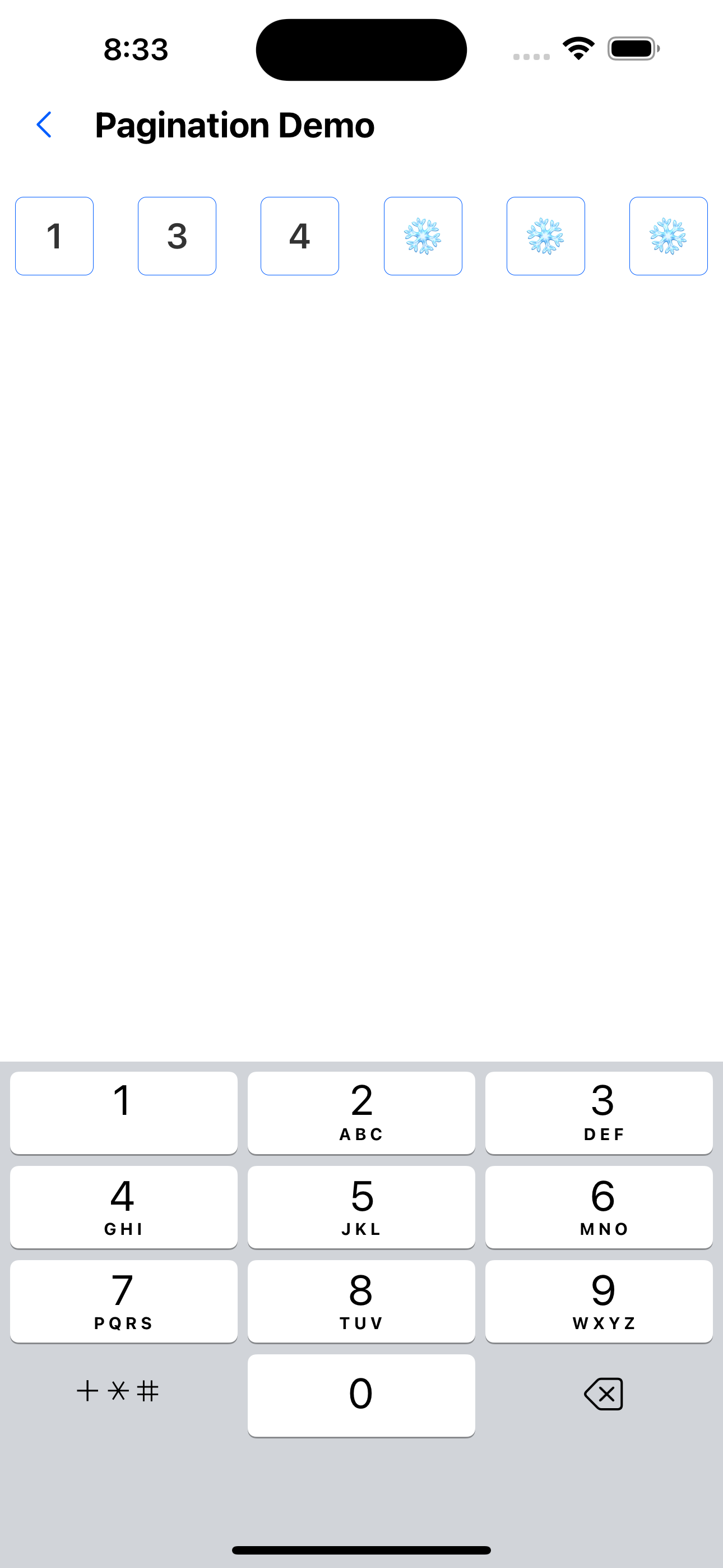
2. Modify the number of digits in the verification code
<Passcode
  clearTextOnFocus
  onChange={handleChange}
  keyboardType="phone-pad"
  count={4}
  ref={otpRef}
  selectTextOnFocus={false}
/>
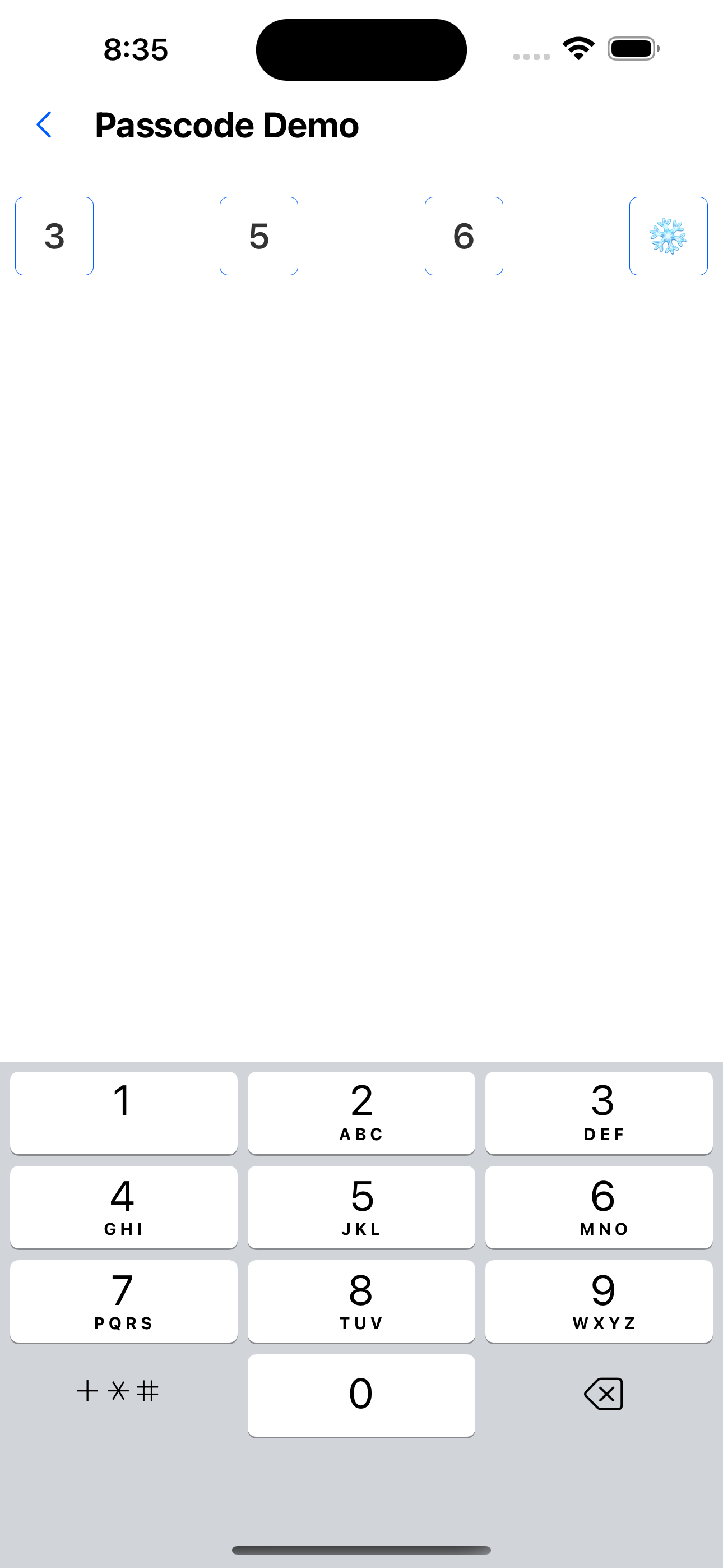
3. Custom style
<Passcode
  secureTextEntry={false}
  ref={otpRef}
  style={{ margin: 20 }}
  inputContainerStyle={{ borderWidth: 1, borderColor: 'green' }}
  focusStyle={{ borderWidth: 1, borderColor: 'red' }}
  onFinish={() => console.log('222')}
/>

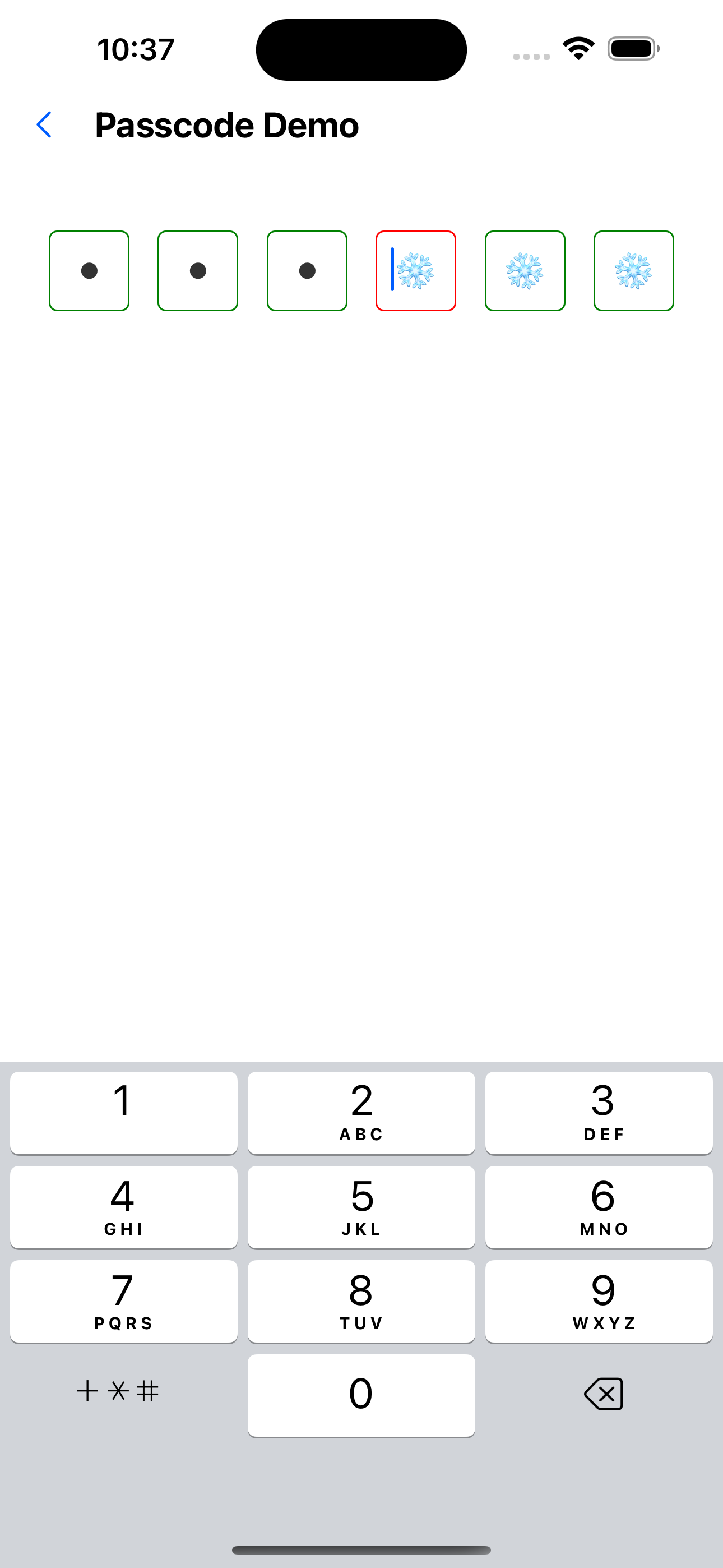
4. Password input style
<Passcode
  secureTextEntry={true}
  ref={otpRef}
  style={{ margin: 20 }}
  inputContainerStyle={{ borderWidth: 1, borderColor: 'green' }}
  focusStyle={{ borderWidth: 1, borderColor: 'red' }}
  onFinish={() => console.log('222')}
/>
API
Passcode (inherited from TextInputProps)
| Properties | Required | Description | Type | Default Value |
|---|---|---|---|---|
| keyboardType | false | keyboard type | KeyboardType | phone-pad |
| style | false | Container style | ViewStyle | |
| focusStyle | false | The style of a focused input box | ViewStyle | |
| value | false | Currently entered verification code | string | |
| onChange | false | Verification code input callback | (code: string) => void | |
| inputContainerStyle | false | Input box container style | ViewStyle | |
| inputStyle | false | Input box style | TextStyle | |
| count | false | Verification code length | number | 6 |
| onFinish | false | Callback after verification code input is completed | () => void |
PasswordInputRef
| Properties | Description | Type |
|---|---|---|
| reset | Reset verification code | () => void; |
| focus | Focus verification code | () => void; |
| getValue | Get the currently entered verification code | () => string; |