Modal pop-up component
Modal
Modal effect demonstration
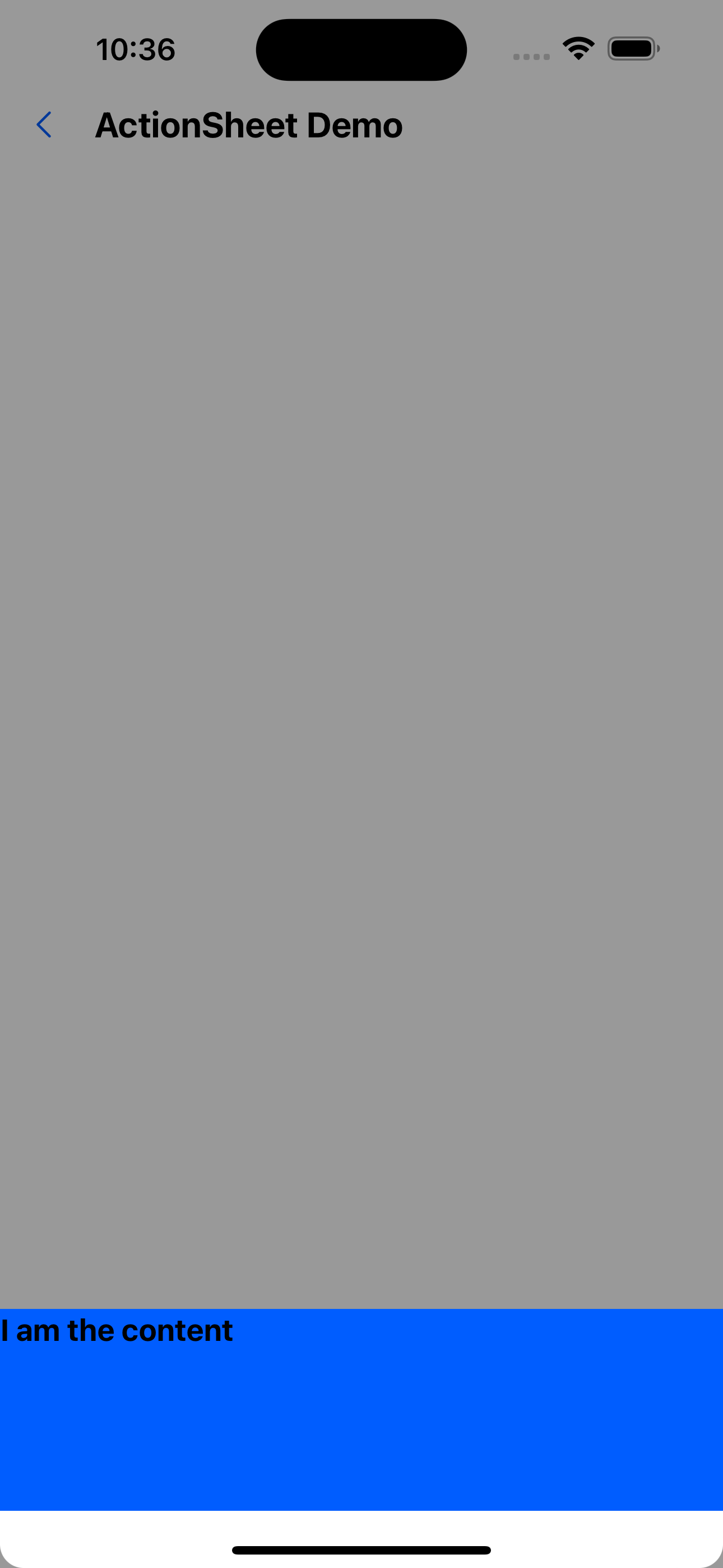
1. Content at the bottom
<Modal visible={visible} onClose={() => setVisible(false)}>
  <Box height={120} backgroundColor="primary200">
    <Text variant="h2">I am the content</Text>
  </Box>
</Modal>
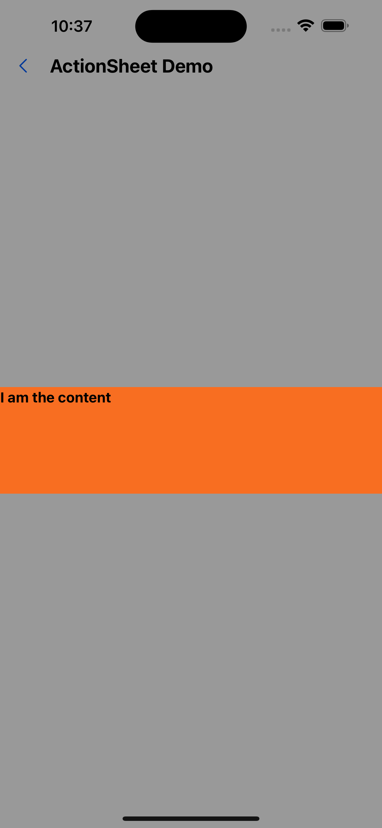
2. Content in the middle
<Modal visible={visible} onClose={() => setVisible(false)} position="center">
  <Box height={120} backgroundColor="warningColor">
    <Text variant="h3">I am the content</Text>
  </Box>
</Modal>
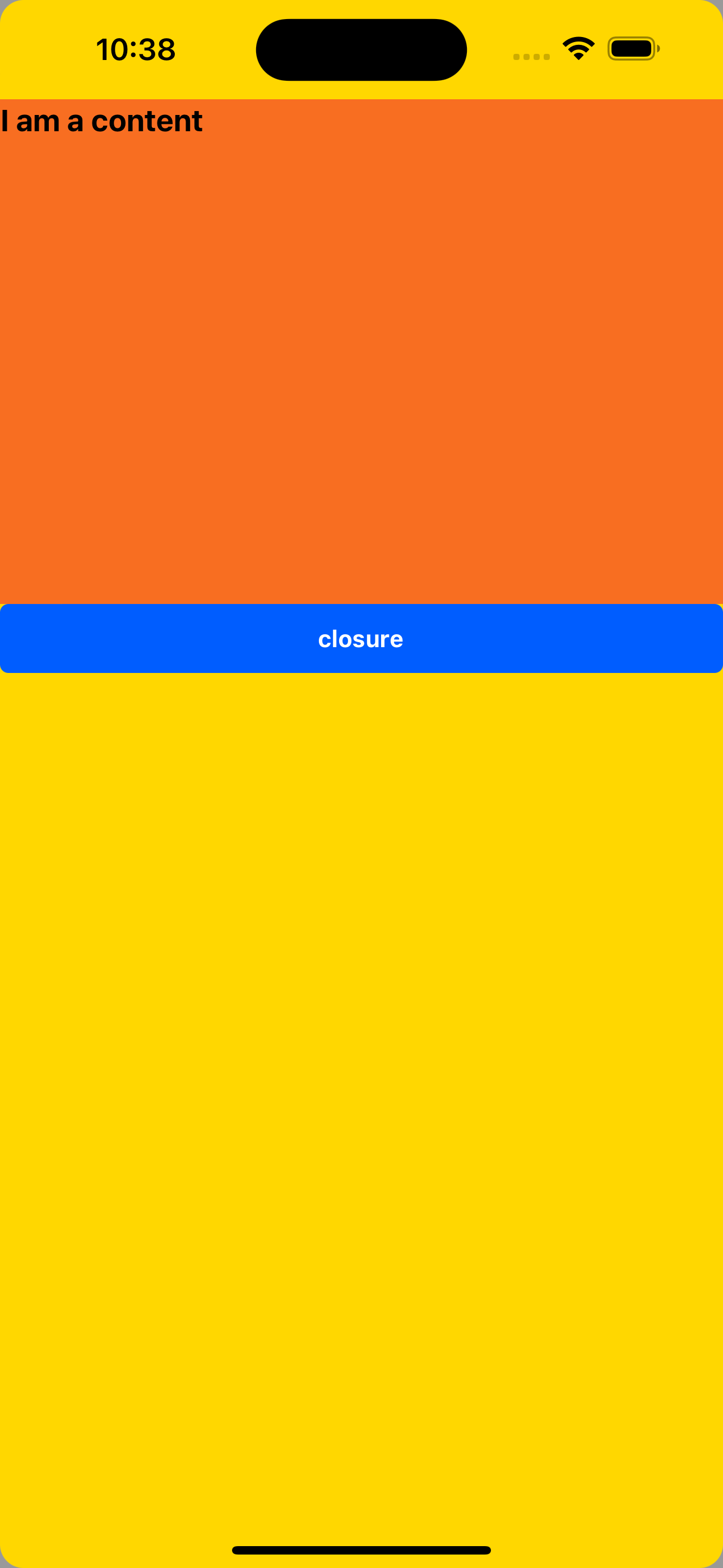
3. Content full screen
<Modal
  visible={visible}
  onClose={() => setVisible(false)}
  position="fullscreen"
  bodyContainerStyle={{ backgroundColor: "gold" }}
>
  <Box height={300} backgroundColor="warningColor">
    <Text variant="h2">I am a content</Text>
  </Box>
  <Button title="closure" onPress={() => setVisible(false)} />
</Modal>
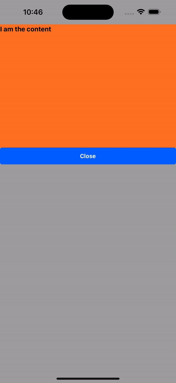
4. Clicking on the mask layer does not allow closing
<Modal
  visible={visible}
  onClose={() => setVisible(false)}
  position="fullscreen"
  bodyContainerStyle={{ backgroundColor: "gold" }}
>
  <Box height={300} backgroundColor="warningColor">
    <Text variant="h3">I am the content</Text>
  </Box>
  <Button title="Close" onPress={() => setVisible(false)} />
</Modal>
API
| Properties | Required | Description | Type | Default Value |
|---|---|---|---|---|
| visible | true | Whether to display the pop-up window | boolean | |
| onClose | true | Close pop-up window event | () => void | |
| maskClosable | false | Whether the mask layer allows clicking to close the pop-up window | boolean | true |
| maskVisible | false | Whether to display the mask | boolean | true |
| position | false | Content display position | bottom | center | fullscreen | bottom |
| bodyContainerStyle | false | Pop-up content container style | ViewStyle | |
| duration | false | Pop-up window display/close duration (ms) | number | 100 |
| animationType | false | Pop-up animation | none|fade|slide-up|slide-down | slide-up |
| onAnimationEnd | false | Executed after the pop-up animation ends | (visible: boolean) => void | |
| onRequestClose | false | Triggered when the user presses the back button on an Android device | () => void |
Modal.alert
Effect demonstration
const handlePress = () => {
  Modal.alert({
    title: "I am a pop-up window",
    content: "I am the content",
  });
};
return (
  <Container>
    <Button title="pop-up window" onPress={handlePress} />
  </Container>
);
API
| Properties | Required | Description | Type | Default Value |
|---|---|---|---|---|
| icon | false | warning icon | ReactNode | |
| title | true | title | string | |
| content | false | content | ReactNode | |
| onPress | false | Click callback event | () => void | |
| confirmText | true | button text | string | OK |
Modal.confirm
Effect demonstration
const handlePress = () => {
  Modal.confirm({
    title: "I am a pop-up window",
    content: "I am the content",
  });
};
return (
  <Container>
    <Button title="pop-up window" onPress={handlePress} />
  </Container>
);
API
| Properties | Required | Description | Type | Default Value |
|---|---|---|---|---|
| icon | false | warning icon | ReactNode | |
| title | true | title | string | |
| content | false | content | ReactNode | |
| onOk | false | Confirm event | () => void | Promise<void> | |
| onCancel | false | Cancel event | () => void | Promise<void> | |
| okText | false | Confirmation text | string | OK |
| cancelText | false | Cancel text | string | Cancel |
Modal.prompt
Effect demonstration
const [value, setValue] = useState<string>();
const handlePress = () => {
  Modal.prompt({
    title: "I am a pop-up window",
    content: "I am the content",
    input: <Input placeholder="Please enter" />,
    onOk: setValue,
    onCancel: () => console.log(123),
  });
};
return (
  <Container>
    <Button title="pop-up window" onPress={handlePress} />
    <WhiteSpace />
    <Text>What you entered is: {value}</Text>
  </Container>
);
API
| Properties | Required | Description | Type | Default Value |
|---|---|---|---|---|
| title | true | title | string | |
| content | false | content | ReactNode | |
| onOk | false | Confirm event | (value: string) => void | Promise<void> | |
| onCancel | false | Cancel event | () => void | Promise<void> | |
| okText | false | Confirmation text | string | OK |
| cancelText | false | Cancel text | string | Cancel |
| input | false | Custom input box component | ReactElement |
Modal.tip
Effect demonstration
const handlePress = () => {
  Modal.tip({
    img: require("../../assets/images/island.jpg"),
    height: 400,
    title: "I am a pop-up window",
    content: "I am the content",
  });
};
return (
  <Container>
    <Button title="pop-up window" onPress={handlePress} />
  </Container>
);
API
| Properties | Required | Description | Type | Default Value |
|---|---|---|---|---|
| title | true | title | string | |
| content | false | content | ReactNode | |
| img | true | background image | ImageSourcePropType | |
| height | true | height | number | |
| closeIconActiveOpacity | false | Turn off the opacity of the icon | number | 0.6 |