ActionSheet action item component
Effect demonstration
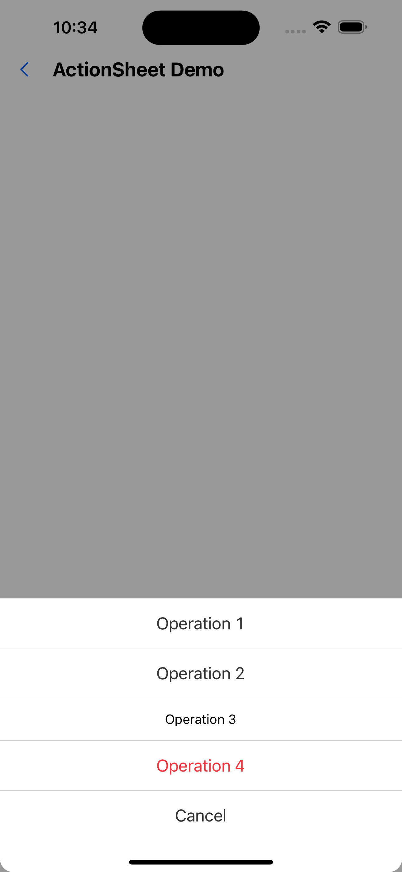
<ActionSheet
  data={[
    { text: 'Operation 1', onPress: () => console.log(1) },
    { text: 'Operation 2', onPress: () => console.log(2) },
    { text: 'Operation 3', onPress: () => console.log(3), render: (text, type) => <Text>{text}</Text> },
    { text: 'Operation 4', onPress: () => console.log(4), type: 'danger' },
  ]}
  onCancel={() => setVisible(false)}
  visible={visible}
/>
API
ActionSheet Properties
| Properties | Required | Description | Type | Default Value |
|---|---|---|---|---|
| items | true | Action item list | ActionSheetItem[] | [] |
| visible | true | Whether to display the operation panel | boolean | |
| activeOpacity | false | Opacity when pressed | number | 0.6 |
| onCancel | true | Close the operation panel | () => void | |
| cancelText | false | Close button text | string | Cancel |
ActionSheetItem Properties
| Properties | Required | Description | Type | Default Value |
|---|---|---|---|---|
| text | true | Action text | string | |
| onPress | true | Action item click event | () => void | |
| type | false | Action item type. danger represents a warning operation | default | danger | |
| render | false | Custom rendering operation items | (text: string, type?: 'default' | 'danger') => ReactNode |